My First paid Logo Job

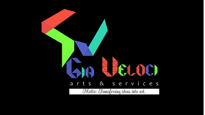
Hi guys, I started learning graphics design about a month ago and wanted to have a real life practice with logos. I got a paid job (though small) to design a logo for a garage startup.
The client didn’t leave much detail as to what he wants so I just designed the logos based on what the company is all about.

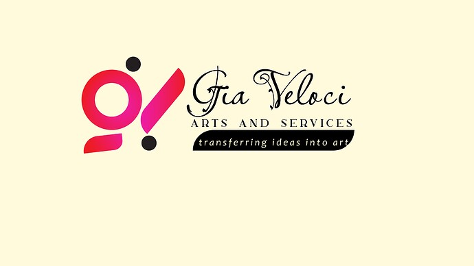
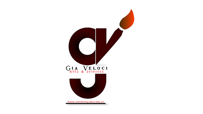
The name of the company is Gia Veloci Arts and services, the client is into artworks like sketching of portrait, framing of photographs. He also mentioned that he is partly into real estate and swimming instructor. His main business is artworks though.

I designed 3 logos with 3 things in mind

  1. Time and accuracy: I want to be as fast and meticulous as possible.
  2. Color: I want to know how to properly apply the principle of coloration.
  3. Relevance: if it matches the client’s expectation.


I want to hear my flaws please, I really need it to improve.

Say you walk into a doctors office, you tell the doctor, “look I’ve been having some pain in my chest, what do you think it is?” And the doctor responds, “I’ve only been getting into doctoring about a month ago and I need some patients”

The same situation can be applied to mechanics fixing your car, dentists working on your teeth, and so on. The reason I started out with that story is because there are foundational elements to graphic design that you have skipped over in all three logos.

I would advise you to start these concepts with real pen and paper. Write the name out, print out a font you think works and trace it, draw, and sketch until you think it’s done. Then put the project down, come back the next day look at your sketches and start the process again.

Narrow those concepts down. Then bring it into the computer.

Logos can get really tiny. Can those logos be very small and still work? Can you still red the thin fonts?

If these logo was seriously printed the gradient and multiple use of colors would be very pricey to the client. The drop shadow you used on one would also be a challenge.

As I’m sure you’ve figured out, it’s not easy to design something really good. I would focus on research, sketching and typographic rules.

2 Likes

You just saved a confused soul. Thanks a bunch

All three are too complex. Too much type and too many fonts. The tagline isn’t good enough to be included in the brand design basis, especially with “Motto:” preceding it. A motto/tagline can be used in other skinning elements of the business, but forcing it into the logo is nearly always a mistake, and turns what should be instant recognition into a reading exercise. Simplify.

3 Likes

What about the designs and backgrounds? kindly comment on those too. How can I improve them?. I appreciate your comments and I’m putting them into use.

I’ve been debating how to respond. Part of me thinks that I should temper my response given that you just “started learning graphics design about a month ago.” But I’m not sure pulling punches is going to do you any good. Designing a logo with one month of, presumably, self-directed learning is a recipe for disaster. None of these are anywhere approaching pro quality. Sorry, but I can’t phrase it any other way. Nor can I suggest what you should do to improve them. These need to be scrapped. I think you should refund the client’s deposit, apologize, and tell them you can’t do the job. If you’re sure graphic design is the career path for you, take your time, figure out a path forward, and get a lot more learning and experience before you start billing clients for work.

4 Likes

Don’t forget to add the word “Logo” on top of the logo.

2 Likes

I really like them.

Least fav is the 1st one
Too much and it’ not clear

2nd one
Like it
too many fonts
Simplify fonts and remove motto
make the text with the motto larger
It’s nice, personally I like it

Number 3
Has too much going on
I like it. But font choices are odd.
And would have issues at smaller sizes.

Good luck.

Not knowing your age range or background makes giving advice to you very difficult. So, I will just say this: Pay very close attention to the advice you’ve been given on this forum.

You have a long way to go before you ever (I cannot emphasize “EVER” too much for you) before you ever hang out your graphic designer shingle for paid work.

You cannot possibly know within one months time, what it takes to create an acceptable graphic design, much less, one that you deserve to be paid for.

Working professionals constantly have to deal with amateurs in the marketplace who muddy the water for them and make their job harder. Go to school. Study from the best in the business. Then you can decide if you are ready to create paid works.

@Dannya, it was only in my senior year of my university design program that we tackled logo design. I’m assuming you’re a self-learner and not in a formal design program. If that’s the case, you likely don’t understand what a logo is supposed to be, so I’ll mention a few things.

I think you already understand that a logo must represent whatever organization it’s meant to represent. In addition to that, however, a logo needs to set just the right tone for that organization and do so in a way that produces the best possible impression on the target audience. In this case, that target audience is the potential customers. You listed only three things you had in mind, and what I just mentioned is a big one that you missed.

A logo needs to be flexible. For example, it needs to work in color, grays, and black and white. It needs to be easily recognizable to people passing by in automobiles who aren’t paying much attention. It needs to be legible and readable when reduced to fit on the barrel of a promotional pen.

The best logos are simple and based around one idea — not several ideas crammed together, which usually produces incoherent and jumbled logos.

The typography must be simple and highly readable.

With all this in mind, I’ll go through each of your logos.

First logo — The typography is cluttered and awkward. One or, at most, two typefaces should be used in a logo. Every word in the logo must be clear and highly legible. You’ve chosen to use three separate typefaces. I don’t know what the red circle with wings or arms is supposed to be. I don’t know what the black dots are meant to represent. Gradients don’t usually belong in logos — especially the initial concepts, which should be simple and unadorned. In general, your logo is a mismatched group of shapes and typography that do not work together.

Second logo — Get rid of the tiny, illegible line of type at the bottom. As already mentioned, lose the gradient. Use simpler typography for the company name, and make it larger, so people can easily read it. Combining the initials of the company into a logo is a common thing to do, but that thin white line separating the g from the v will disappear at smaller sizes. Turning one side of the v into a brush might not be a bad idea, but remember what I said about building a logo around one idea. The brush, instead of being the main idea, is just something you’ve added to everything else

Third logo — Again, the typography is not good. You really need to study typography if you want to design logos. I also have no idea what any of those shapes represent. As in the other logos, you have more than one idea fighting for attention. The tiny typography and extremely thin lines in the words, do not work — the typography won’t be readable at small sizes, and the lines will blur together and disappear at almost any size when printed.

You’re just starting out, and you’ve courageously posted what you’ve done here. After only a month of self-taught learning, I wouldn’t have expected your work to be good. You have much to learn.
Thanks @Just-B
I must really say, from your observations, I have a long way to go.
Most of what I did was trying to combine various logo ideas I saw on the internet, then adding mine to create something different.
From here on, I will try to pipe down and read books
Thanks again