Hey everyone,
This is my first portfolio as I’m still a student, looking for some feedback. I am still working on the copy as I’ve got a friend who is a successful copywriter who has agreed to help me out with it so ignore the lorem ipsum ect. for now.
There are some positive things about your website. It’s easy to navigate and read. Your work stands out, sort of. More on that later. The site is responsive. When you click on a work sample, it brings up a new page with a description and more details. You have a clear call to action after the work samples. The black and white color palette puts the visual emphasis on the work samples.
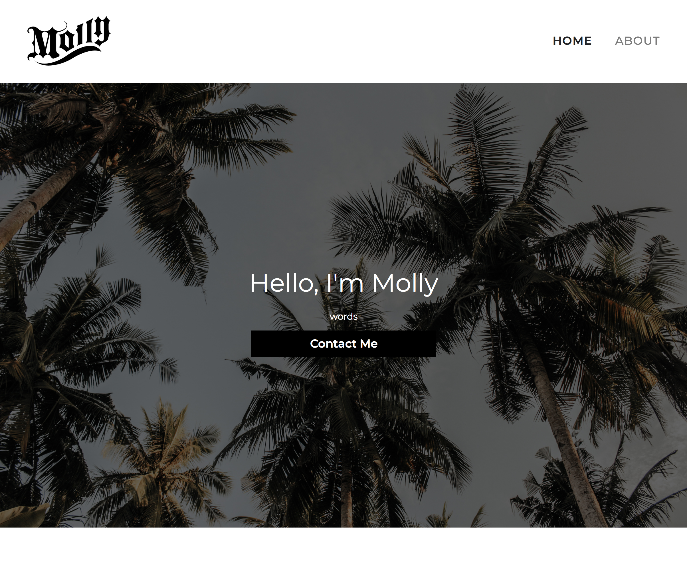
My biggest hangup is with the above the fold content on the home page. Here’s what I see when I first pull up your website:
There is zero indication of what you do, what the benefit to me is or why I should stick around. Okay, you’re Molly. So what? Do you sell palm trees? Are you a landscape architect? Is this a site with travel photos? Do you sell time share condos? Even if the “words” is replaced with a description, I don’t think the above the fold content is strong enough The photo of palm trees really doesn’t say very much to me. What if the palm tree image was replaced with a slider of work samples? This is why I said your work stands out, sort of. You have to scroll down to get to your work samples. I’d like to see work – or something to give me a quicker impression of what you do – above the fold.
Consider what type of work you’re going after. The first work samples presented, especially on mobile, are illustration work and a photomontage. If that’s what you really want to be doing and there’s a strong market for that where you live, great. If you’re more interested in branding work, you may think about moving the branding samples up. Side note: the MICDA logo is very nice.
The last thing I’d touch on is your portrait. It’s a nice portrait of you, but the cropping, with your face dead center in the frame and all of the space above your head, is fairly horrible. Take a look at this video that explains the rule of thirds in portraiture. Watch to the end where he talks specifically about eyes. Bottom line, I think you can take this photo and re-crop it to make it much better.
I like your work. I don’t often see student work with this much sensitivity. Nice!
Steve makes some good points about the portfolio design, which I agree with. Dedicating so much front page, above-the-fold space to a contact link before you’ve even established what the site is about seems backwards. You did it on purpose, however, so I’m wondering about your reasoning.
About the individual pieces in the portfolio… I like how you’ve explained the work. I like how you’ve created variations of your logos with the realization that the complex and colorful logos won’t always be appropriate. I also like how you’ve focused your logo/branding efforts on the logo that will most often be used before creating simpler secondary choices. This violates the old rule of thumb about designing logos in black and white first before adding color and complexity, but in my opinion that rule has become obsolete for the very reason your work demonstrates.
I really like the version of your flora logo with the vines. The gradient version looks metallic (copper), which is nice contrasted with the black. However, I’m not so sure the way the gradients are working with the flora logotype itself looks convincingly metallic. Maybe that’s not what you intended anyway.
You must attend the same school as others who have visited the forum in the past. Your Smugglers logo and mention of Magnetic Island rang a bell, so I did a quick forum search. Do you know this person: Help with Wine Bar Project ?
Hey, thanks for the reply! I will play around with the gradient in each of the letters of Flora, maybe a different angle on some of the wider letters (o and a) will help with that.
And yes haha, that’s my post lol