More advice and critcs
2 Likes
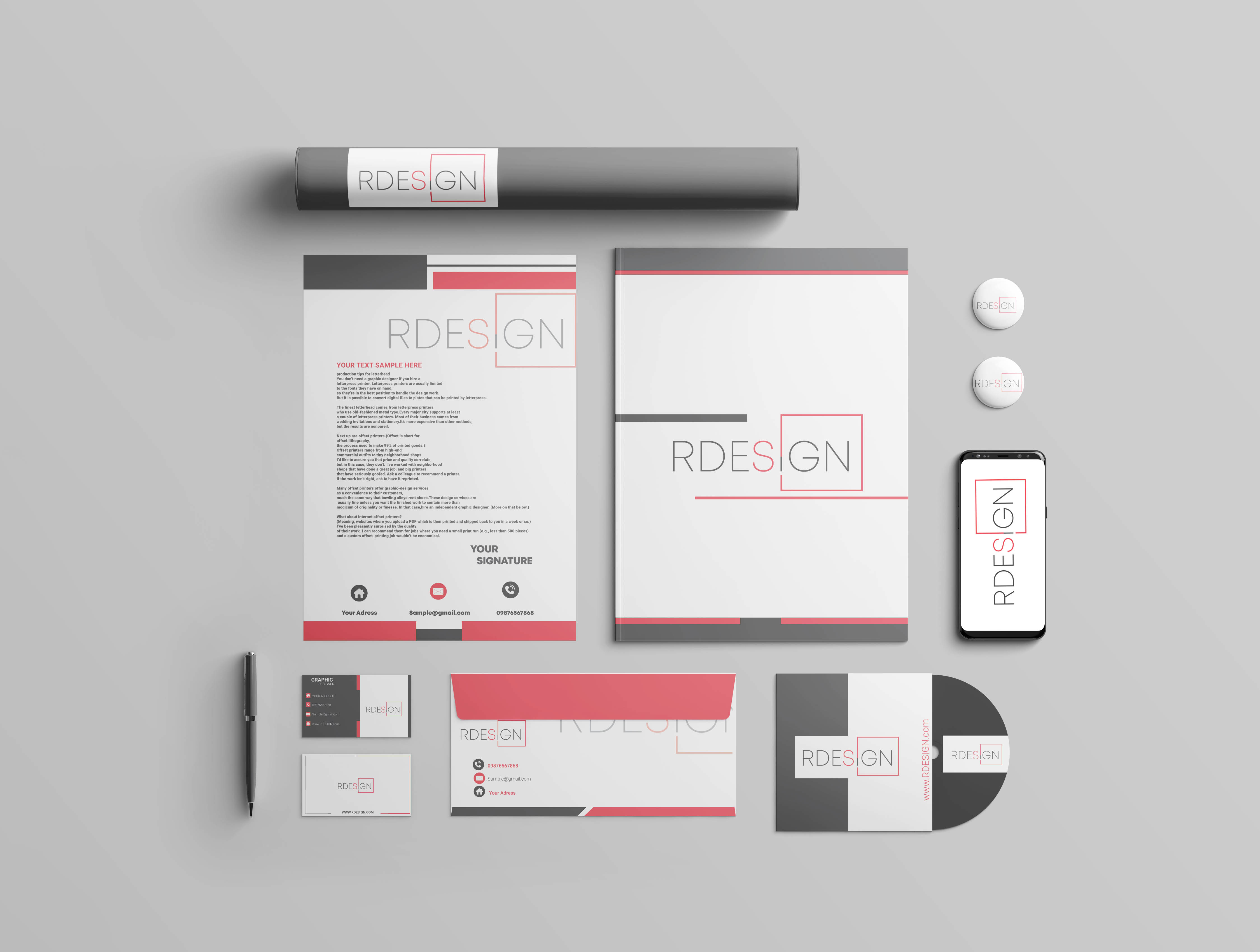
Is this for a design company?
The design elements of grey and red blocks are inconsistent. Have you designed these randomly or is there a system? You’ve introduced diagonal spacing on the envelop but this doesn’t appear anywhere else. Part of branding is creating a consistent look.
Letterhead: the logo is too big. Seriously. Study some real life letterheads.
The logo appears to be grey and red in some pieces and black and red in others. Which is it?
Well, Change the font size as the content is not readable.