What you guys think, how can i make this better?
…
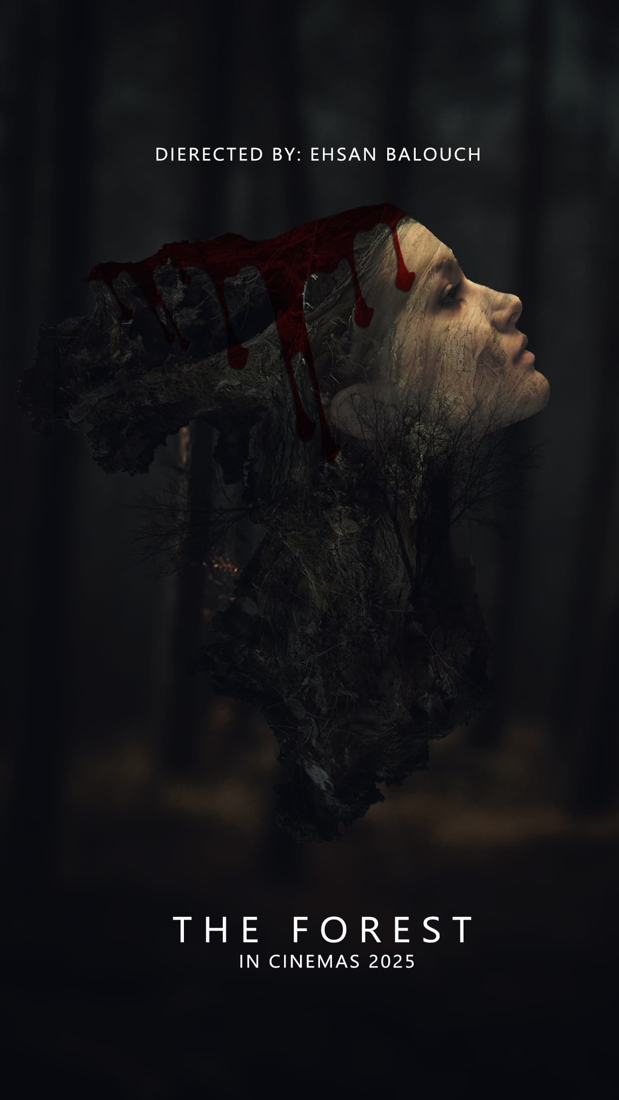
Blood depicted
…
.
.
.
.
.
.
.
.
I’ve added a NSFW tag and given the image some space so folks can opt out if they like ![]()
Also ..Welcome Aboard ![]()
Is there a difference between DIRECTED BY: EHSAN BALOUCH and DIRECTED BY EHSAN BALOUCH?
The blood effect doesn’t look very realistic, which takes away from the impact, maybe try referencing real textures or using blending modes to make it more convincing. Also, the ‘Directed by:’ text is quite harsh and too centrally placed, making it look off-balance. Horror posters often follow a certain composition and typography style to enhance their eerie feel, checking out some successful ones might help refine your design. Here’s a good reference https://www.europosters.ie/horror/?srsltid=AfmBOorT6TF48gCxMN79Bp1_LQrTNsY2GeyT4ObIAJMg2bZqUpnTo-d1
Surprisingly lots of blood effects for photoshop tutorials out there (don’t know why that’s surprising to me (shrugs))
Other than the face, the imagery on the poster is so dark that I can’t make out what it is. The colon after “DIRECTED BY” isn’t needed. Movie posters almost always contain more information
In my estimation, in addition to Just-B’s comment, it needs to leave more to the imagination (creativity) to make the viewer interested in plot and style