One big problem (among others) with crowdsourcing is there’s very little back-and-forth interaction with clients. Designers end up trying to read the minds of people they’ve never met and deliver solutions to problems they have insufficient information about.
An important role of designers is that of strategists and consultants who advise and provide direction to clients about things they likely haven’t considered themselves. This crucial part of the process is absent in crowdsourcing contests.
What I’m getting at is there’s no way for you or anyone else to know why the coffee shop owner didn’t choose your design. It might have been for a good reason or some totally off-the-wall thing that makes no sense at all.
All we can do here is critique what we — other designers — think about what you came up with, which is of limited value when trying to satisfy the whims of crowdsourcing clients who likely know little about design themselves.
So with that preface out of the way, your design, in my opinion, has several problems.
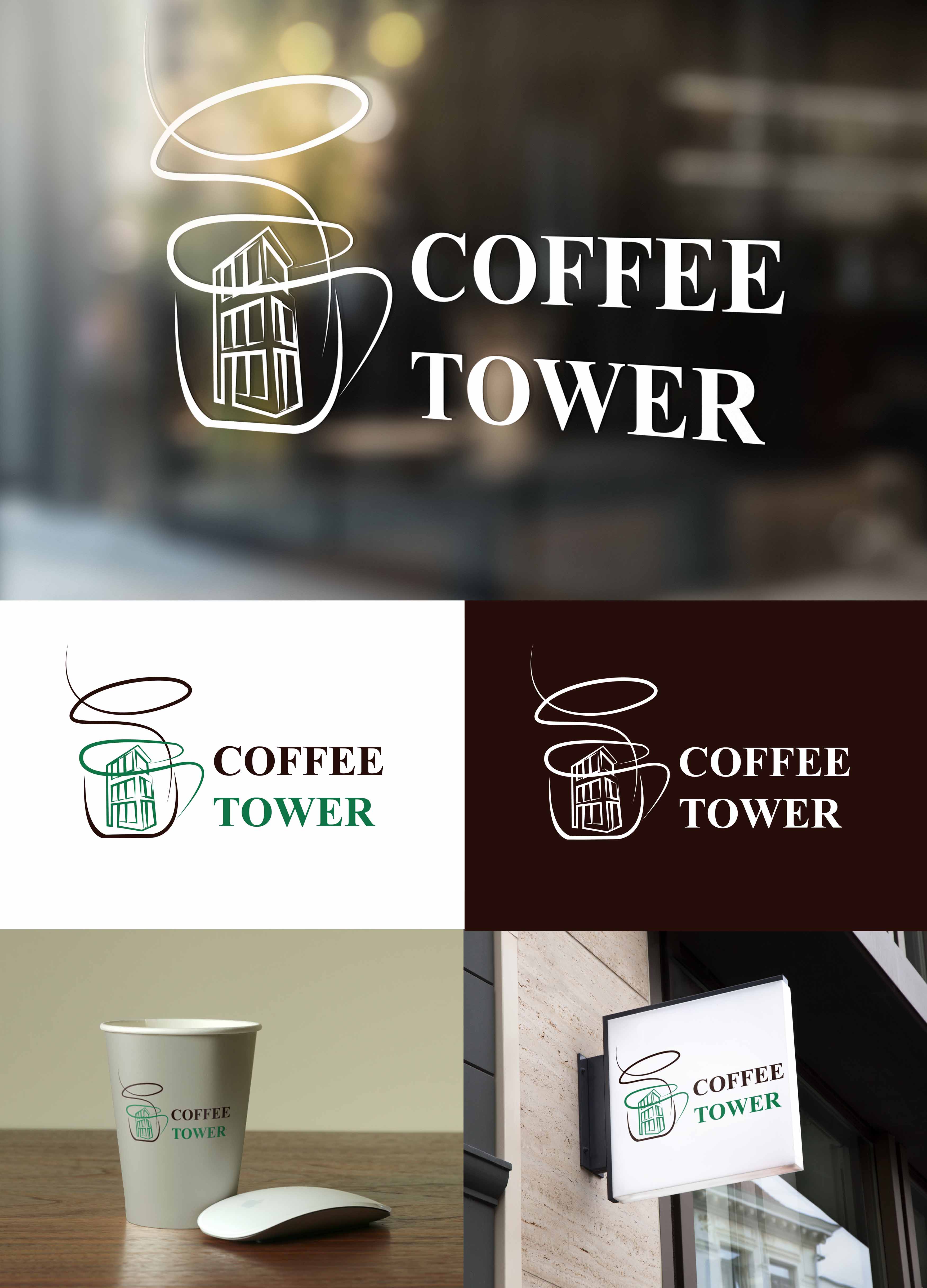
First, the typography is weak. It’s an ordinary, unmemorable text typeface with little personality. This is fine when dealing with long blocks of text in a book where ease of reading is the prime concern. But for a logo, something with a little more character, presence and personality is usually in order.
Second, the relationship between positive and negative spaces is anemic. The logo just sits on the background and disappears into it rather than interacting with it. A logo needs to unambiguously take charge of the space around it. That space needs to look as though it belongs to the logo — not the other way around. In other words, you can’t just position a logo as an afterthought on a generic paper cup or place a strongly horizontal logo in the middle of a squarish sign where it doesn’t fit. You need to consider and design how the logo interacts with the space around it.
Third, the line work in the tower and steam is a bit timid and tends to lose visual coherence from a distance as it turns into something resembling a random scribble. This is especially problematic for a storefront sign that needs to be seen and understood from a distance.
Fourth, the steam (if that’s what it is) really does look a bit more like an awkward scribble than a fluid stream of steam rising from a cup of hot coffee. One could almost interpret the building as a drawing you didn’t like, so you scribbled over it. Are you sure the tower you’ve drawn resembles the tower-like building in which the coffee shop resides? If not, that alone could be the reason your logo was rejected.