Starting a series, showing my logos.
Craving for your critique.
This is Volume 1.
Run a spell check.
The text language is quite underdeveloped, I’m wondering what age you are here, it’s coming across very much like a teenager.
Logos - none of them work.
Even the last one - can’t read the last line of it at the size it is.
The detail in some of them is too small for smaller size reproduction.
Drop shadows on logos are a nightmare (how do you embroider that?) Just adds to the costs or it will be dropped from the embroidery.
Stick to a theme when describing your logos.
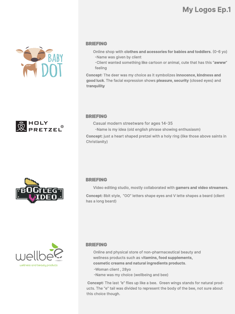
Briefing
What is it?
Who is it for?
What does the client say?
Who colloborated?
Brief description of the concept
Nobody cares who came up with the name.
Don’t say things like ‘just a …’ - say
Pretzel twisted into the shape of a heart - with a halo above to signify Holy.
Don’t say holy ring - learn the proper name for it.
Nobody cares about the age of the client.
Don’t start sentences with a space.
Overall - it comes across extremely amateurish.
With some refinemint it could look really good.
You should rework the logos slightly for your portfolio or volumes or whatever you’re calling it.
Polish it up - fix your mistakes - learn from it.
Can you give a bit more information? Are these for actual clients? Are they practice? Were they part of a crowdsourcing or design contest?
Thanks for your answer.
First of all, I want to clarify that I’m not a native English speaker.
I am Greek and my English are just decent, so I think it’s common not to know the exact terms about the “holy ring” for example.
Of course this presentation is not for a portfolio, I made it quickly just for this forum, explaining in short what is the logo about, nothing official.
In the next volume I’ll try to be more brief.
So don’t focus that much on the text it was made really under pressure due to lack of time, just to save your time asking more info.
When you say “extremely amateurish” you refer to logos? or the presentation?
About the shadow, below the “e” in Wellbee, it worked as long as applicatications was simple and in large scale.
These are for actual clients, most of them 1-2 year ago, when I still hadn’t much experience.
Again, of course this was not the presentation, its a quick draft to share with you the logos.
Thanks for the explanation.
Fair enough, not everyone is a native English speaker, it’s easy to forget that on an American forum.
I meant the presentation looked amateurish - but you’ve explained that - and all is ok.
I completely understand.
I’ve nothing else to say about the logos - they won’t work in every circumstance - but can be worked. So it’s not a deal-breaker.
Aside from legibility at certain sizes and output needs - they are ok.
If your clients liked them - there’s not much else to say.