All these logos are for actual clients.
Any comments/thoughts?
I want to mention that the application/uses for these logos are simple enough, just business cards, labels, trifolds and website.
I don’t f##k up your greek, so please don’t f##k up the English.
Sorry, I’m doing my best.
What exactly was so f###k up?
I’m not sure if you’re just joking, but it’s coming across like you’re serious.
Stefanos isn’t a copy editor and as he explained, the text is simply there to provide context for a critique. He’s asking for a critique of his logos — not his expertise with English writing conventions.
2 Likes
The logos are good. Not sure why we are asked about 2 concepts. Which did the client go for?
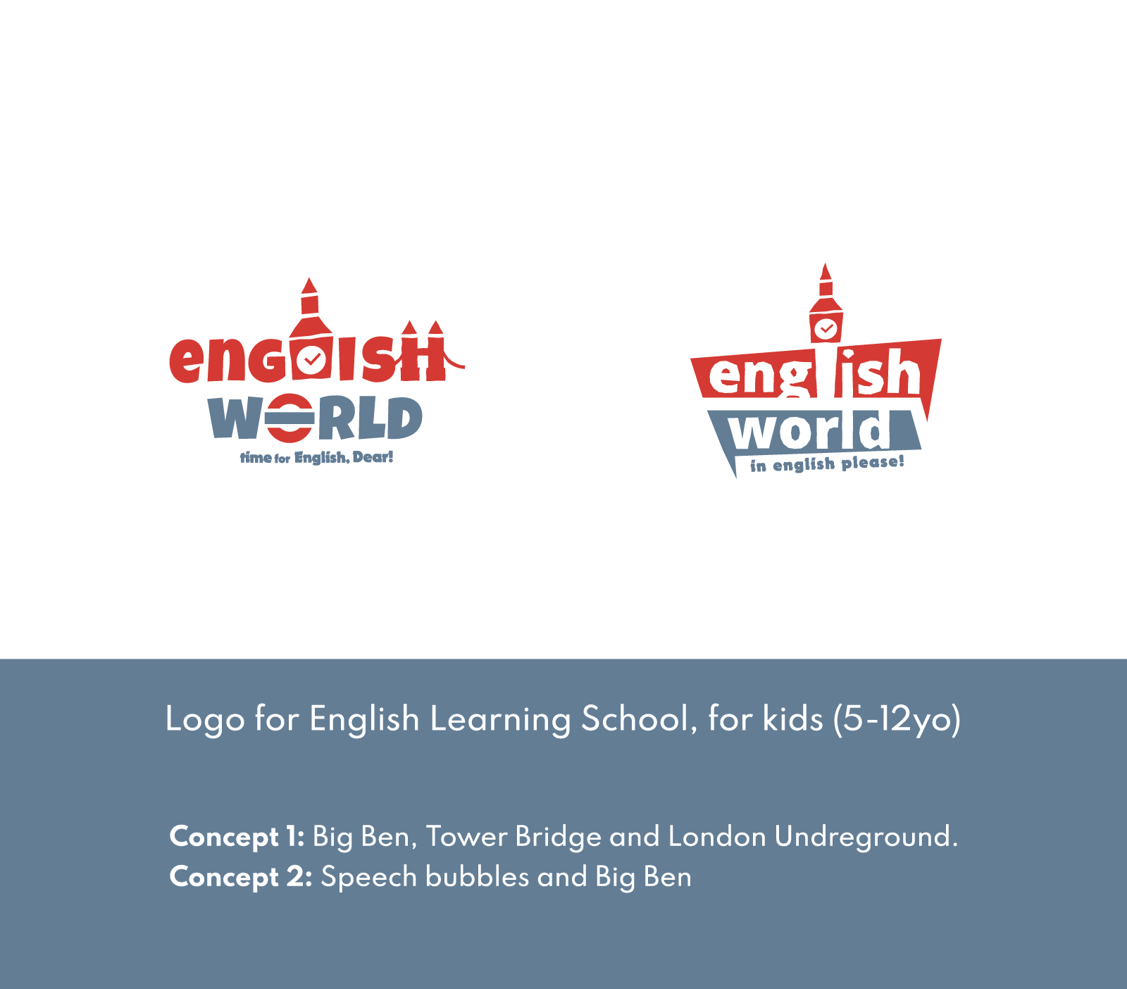
Only one the I am having issue with is the English one, where there is no clear L.
And the underground sign is part of England road signs etc, but different countries would have different signs and it could mean something there.
Where the concept is good, it’s just lacking as you’d need to know these items to place them. And as it’s outside England to attract people it could be lost in translation.
I hadn’t finished …
I’ve seen the speech bubble for language schools often.
It works but not original.
I like the other logos for various reasons.
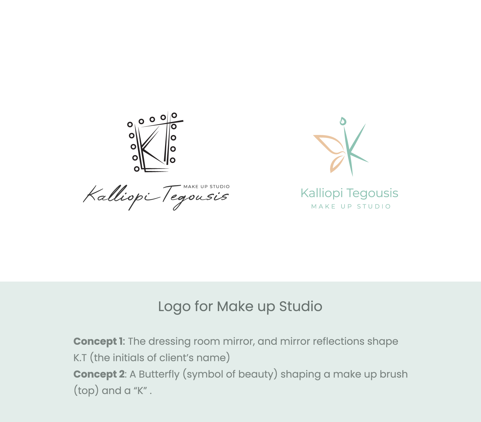
The first one KT - concept 2 might be a better concept for a day spa. Very contrasting concepts.
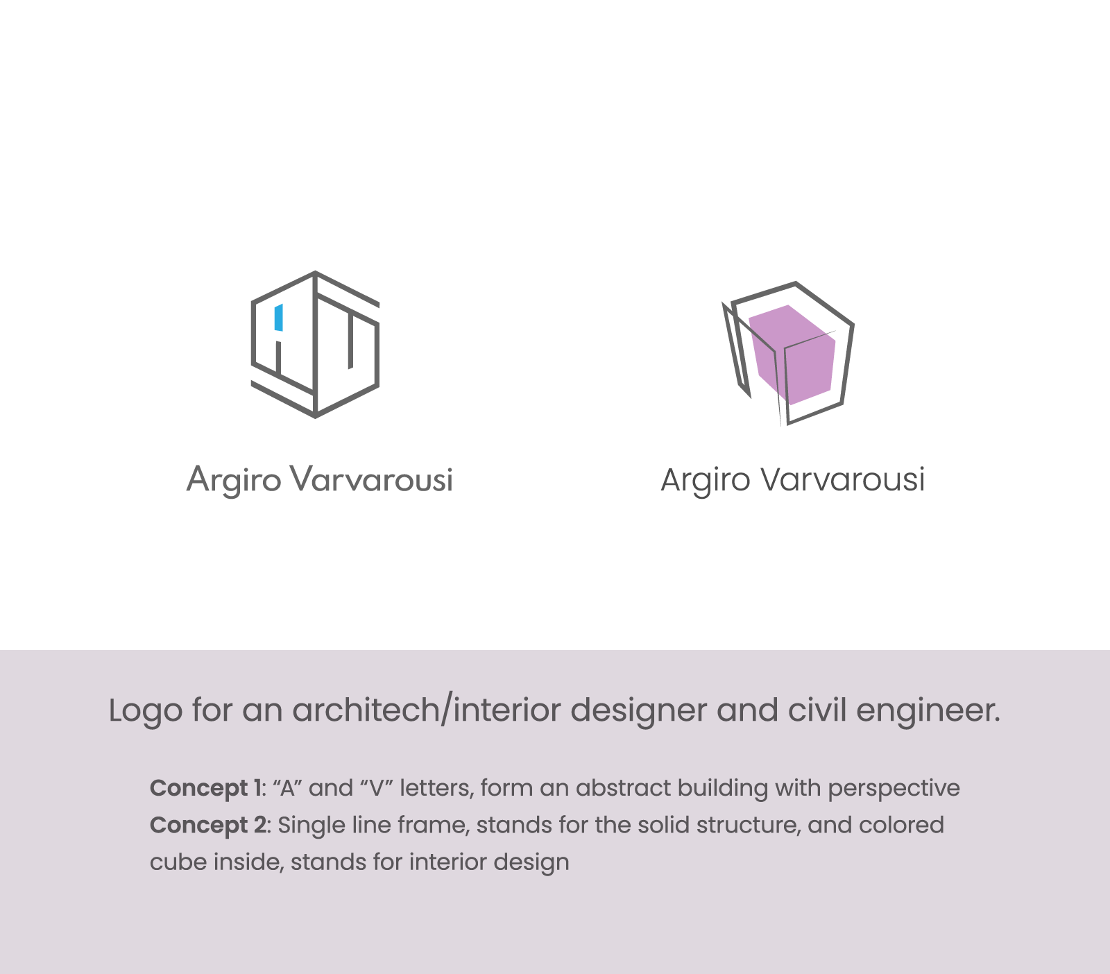
No.3 the concept 1 looks like AU.
2nd concept is a bit better, but very like watercolor or something
Contrasting styles and concepts.
A bit confusing.
I’m hesitant to critique your logos because they reflect trends in logo design that I’m not comfortable embracing.
Logo crowdsourcing has shifted logo design from providing clients with what they need to providing them with what they want. This has moved logo design in a new direction with different criteria for judging what’s appropriate.
So with that said, my preferences don’t necessarily match up with today’s trends. However, I think your work shows some nice sensitivity and convey appropriate personalities for the organizations they represent. I genuinely like the architect logos.
Some of the logos won’t work at extra-small sizes. The typography and some of the detail in the logos won’t be legible at small sizes. Again, though, this reflects a new trend that will cause reproduction issues, but since clients don’t seem to understand the problems… well, I’m on the verge of ranting, so I’ll stop.
On the positive side, you’ve kept the number of colors to a minimum. Even though clients don’t typically understand the importance of doing that, you’ve saved your clients some grief down the road by doing it.
With all that said, I like what you’ve done, even though I have reservations that reflect my personal opinions and philosophies about how logo designs should be approached.
1 Like
Thank you for your answers.
You have no idea how much encouraged and motivated I feel, because (as I said in another topic) I’m starting tomorrow my studies in graphic design to get a degree.
About clients:
They don’t give any instructions, even if I give them a questionnaire, they answer “I don’t know! you’re are the designer! I trust you!” So I end up showing 5, 6 or more concepts with different styles.
I know that is more confusing, now I try to limit my suggestions to 3.
Thank you again, and sorry for my poor English.
PS: The clients chose the second concept in every case.
I agree entirely. I, too, am no fan of the way logos are approached these days. however, it is far more insidious and damaging than personal likes and preferences imply. It is just plain incorrect. The way logos seem to be approached now – spawned of crowd-sourcing, competition sites (and something which is now, sadly, becoming the de-facto norm) simply does not do the job they are supposed to do. It turns them into adornment, rather than being a visual mnemonic for the company or organisation they are designed for, bringing everything down to the lowest common denominator.
A logo on its own is meaningless. I know you know all that, but I just felt the need for a rant in the feint, futile hope that maybe some kids out there who may read this (I know Stefanos is not a kid) might just take some note and perhaps, wish to read up from the experts (Wally Olins, Pentagram, etc) what branding and identity is actually all about.
Rant over. A glass of Bordeaux calls…
1 Like
Clients say that, but they often don’t trust us. Instead, they expect us to read their minds and create something that they fall in love with.
Because of the problems I previously mentioned, I try to stay away from logo design, even though much of my work centered around logos and corporate branding problems earlier in my career.
In addition, clients tend to get much more caught up in their likes and dislikes regarding their logos. They want their logos to embody their personal visions for their companies, even though, as you mentioned, they’re rarely articulate about what those things are. They want their logos to be extensions of themselves, whereas, with collateral materials, such as sales brochures, stationery, or websites, clients are typically more inclined to defer to designers’ judgments.
The effects of crowdsourcing have taken a considerable toll. Working with clients to design logos has always been problematic, but with crowdsourcing, there’s little opportunity to jointly explore their needs or consult with them and explain the pros and cons of this idea versus that idea. Instead, the process has devolved into a race to see who can best cater to the client’s illogical and naive whims.
As @sprout mentioned, the whole crowdsourcing mentality is insidiously worming its way into non-crowdsourcing work, too — especially with small and medium-sized clients. They’re OK with designers offering opinions, but the increasingly common assumption is that our role is to follow directions rather than offer expert guidance. The whole field is sliding in the direction of designers being order takers rather than problem solvers.
I’m almost to the point of asking new clients whether they’ve used crowdsourcing contest sites before I take on work for them. If they answer “yes,” I’m tempted to turn them down out of anticipation that they’ll approach working we me the same way they worked with the contestants on the crowdsourcing sites.
Now, I’ve gone completely off on a tangent. I’m sorry. Good luck with school. I think you’ll do well there. ![]()
It’s more like half-and-half. I was not happy that, for an English learning school for kids, the first thing one sees is “enGisH WORLD” or “english world” plus their mangled tag lines. Definitely not reassuring.
The “greek” was purely sarcasm.
Move along now. Nothing to see here.
1 Like
That response indicates you’re asking the wrong questions. It sounds like you’re asking them what they want in a logo, but you should be asking questions about their business that only they can answer.
Just say it’s not always the case.
I tired the questionnaire thing before - man iterations of it, even to the point of a tick box.
It doesn’t really work. The only time I found it works if you are holding the paper and the client is with you or on the phone - you can breeze through some questions.
And it’s not like you have to go from 1-10.
Basically - I’m filling out the form for them based on the conversation.
I know 1 is about colour - 2 is about taglines - 3 is about style etc.
So when they mention these I can scribble them in.
Emailing a question sheet to them is often ignored.
A conversation goes a long way.
Okay well, my advice wasn’t hinged on printed questionnaire vs. verbal, but since you raised it, I have never presented a client with a questionnaire. That’s mostly because I treat each client differently, according to my read of their personality, factored by the context of my take on the current state of their business, their position within it, and where I’d want it steered, if I were them. Then I talk to them as a fellow stakeholder in their success and get them to give me their take on all that. Gradually we drill down to their market, potential for market growth, a vision of customer experience, etc. All this happens long before I’d ever care or ask whether they want the logo to be a purple choo choo or a green goat.
Quote for truth!
This is my questionnaire.
Of course I don’t ask these questions straightforwardly, but I discuss them with the client in a 1 hour (or more) interview/conversation.
Not all clients are able to be that specific, so many time some questions are skipped.
"What is the name of your business?
Describe in one sentence your business/service. (Difficult but vital!)
What are your business short term, medium term and long term goals?
Who are your main competitors and how do you differ from them?
What do you like or dislike about your competitor’s branding?
Who are your potential clients?
Where will your business be publicized?
Do you have a specific idea in mind for your logo?
Do you want to use a particular range of colours?
Are there any colors that you do not want to use?
Do you have a particular font you would like to use – or ones you definitely do not want to use?
What words should describe your logo?
What message or emotion do you want your logo to portray?
Does your logo have a tag line?
Is your tag line to appear with your logo on all of your branding?
Where will you logo be used (ie. Internet / print) ?
What logos do you like and why?"
As I mentioned before, I fill in the questionnaire by myself, during the conversation, because I don’t want my client to feel that I interrogate him.
My opinion is that tag lines should never be part of the logo. If used at all, they should be considered as separate things that might or might not be positioned in predetermined spots adjacent to the logo depending on the situation.
When they’re part of the logo, they scale up and down with the logo, which creates problems. It’s better to leave them flexible, so they can be positioned in whatever composition works best for the space.
For that matter, I think the same logic (to a lesser extent) applies to the name of the company. It’s often just better to keep the name separate from the logo and supply the client with several different lockups unless, of course, the logo is the name, as in a logotype.
Clients don’t know anything about type. That’s the designer’s job, and it’s a critical part of the designer’s job. If a client, on their own, mentions a preferred typeface, I’d take note of it, but I’d never mention it in a way that made it sound like it was a decision they needed to consider or that I needed their opinion on before choosing one.
It’s fine to have these questions.
But put them in a form for you to use.
Talk to the client and fill it in yourself through conversation.
At the end you circle back on the ones not filled out and ask them.
But if I got that questionnaire I’d move on and wouldn’t fill it out.
Just-B picked up on the things that jumped out at me when I read your questions. It is your job to understand typefaces and their emotional capital, thus which ones best represents your clients’ culture, goals and aspirations.
Also, if you ask those sorts of questions of clients, you will end up down a rabbit hole you really don’t want to be down and you’ll have created a situation where your client, because they think papyrus is friendly, will insist you use it!
It is good to have a framework of questions. That is exactly how I approached when I first started. However, I learned over the years that if you ask specific, closed questions, you get specific, closed answers.
These days, I may start with one or two similar (though more open-ended) questions that client is expecting to hear, but my goal is to get people to open up and talk freely. I sometimes tell them snippets about my own life and experience to get them to open up. This elicits empathy. What you want is a barrage of anecdotes – their dog, their kids, passions, hobbies. Most of it not relevant (though a lot of it is all background insights into the personality of the person who started the company, or drives the ship). In there, will be some of what you need.
You just have to learn to filter. Once they are comfortable with you and talking freely, you can then direct the conversation to areas you need to talk about. Staccato questions make people feel like they are in an exam. They tend to close down emotionally. This is the exact opposite of what you need to achieve.
Ultimately, you are doing thing this to build empathy and trust. That way when you do ask specific questions (though always questions that allow them to elaborate), they will be far more likely to open up with the details that you need, in order to do your job. Once you get empathy and trust, you will be surprised how candid and detailed people will be. If you go in asking straight, confrontational questions about detailed and sensitive aspects of their business, they will close down and you will never get them to open up to you, as you will be seen as adversarial.
Unfortunately, when most people start out as practising designers, after university, they are in their early 20s, so even if they manage to tap into the background emotional content (which, ultimately, is the differentiator and culture and what drives a business), chances are they don’t have the emotional intelligence (EQ) to, either recognise it, be able to interpret it, or know how to represent it visually. You have the advantage of being a bit older, thus, (hopefully) more emotionally astute.
I am not patronising younger people in saying this. It is physiological. The human brain develops at different rates and the last part to fully-develop is the pre-frontal cortex, which deals with emotion. I read something years ago that said, it is not fully developed in adults until around 24 years of age. It is from this point that EQ develops and matures without an age limit, until later in life, as the brain starts to deteriorate, unless you are lucky enough to remain sharp until the day you die – my grandmother did. You could never get anything past her.
[That last part of the previous sentence was what I meant about sharing personal anecdotes to elicit empathy. If you drop things like this into a conversation, people will immediately empathise, or start tell you how their gran got early onset dementia and how awful it was, etc. then you know, they are beginning to trust you, emotionally]
Obviously there are variations both ways and there is also a male/female difference. Females typically develop emotional intelligence earlier and more acutely – though arguably this may have more to do with nurture than nature.
Some men never do develop any sense of emotional intelligence!!
It’s always about people. You have to understand how they tick to be able to tell their stories. Companies selling car parts are never about the parts. They are always about the back-story of the person who started the company. Otherwise, all car parts companies would be the same and all brand identities could be white boxes with Helvetica.
Well… that turned out more verbose than I’d intended. Best I get up and do some actual work now then!
1 Like
If these designs are for “actual clients” then why are there two of them for each???