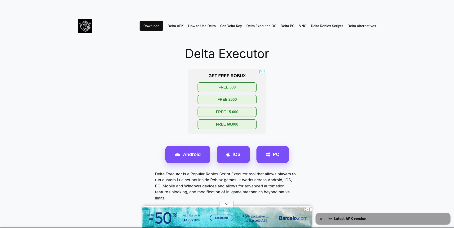
I’ve been working on a website myself (no real design background), and I’ve hit a weird point where I don’t know what’s wrong anymore.
Individually, sections look fine to me. Buttons look fine, cards look fine, layouts seem okay. But when I look at the whole page… it just feels off. Like not polished or not “professional”, but I can’t really explain why.
I built everything using custom HTML + CSS inside WordPress, mostly section by section. At the time I just focused on making each part look good, but now I’m realizing there’s no real system behind it.
Some things I think might be causing issues:
spacing feels inconsistent (but I didn’t follow any spacing system)
fonts are slightly different across sections
I reused elements but didn’t standardize them properly
layout changes depending on section (flex/grid/random fixes)
I probably overused CSS overrides just to “make it work”
It’s not completely broken, but it doesn’t feel clean either.
I think I kept adding sections/banners thinking more info = better, but now it probably just feels cluttered. do you think reducing them overall would be better, or just spacing them out differently?
I totally agree with mluxgd about cutting down those banners. When you have too many things screaming for attention at the exact same time the user just gets overwhelmed and it instantly makes the site feel super cluttered. I would strongly suggest picking just one main primary banner and then relying heavily on empty white space to separate your other content sections. Also try setting up a very basic rule set for yourself with just two fonts and consistent padding across all your blocks. That simple fix alone will instantly remove that amateur vibe you mentioned earlier and make your entire layout breathe so much better.
I’m confused. What banners? I see no banners on the site. In addition, the website uses only two typefaces: a Google variable face called Inter and Times. What am I missing here?
you are completely right, I must have mixed up my tabs and confused this with another project/thread I was looking at. The things I mentioned aren’t actually on this site. My apologies for the confusion
when you guys say ad blocker, what exactly is being hidden on the page? the ads themselves?
because on my side I’m just seeing the normal layout so I’m trying to understand what part is making it feel cluttered for other people. can you plz explain it in simple words
Yes, an ad blocker blocks ads, so I didn’t see them. When switching over to another browser that doesn’t have the ads, I can see that they definitely interfere with the site’s aesthetics.
On the other hand, if you think they will generate enough revenue to justify their existence, I understand their presence.
Aside from the ads, I can’t really relate to the target audience. I don’t know what a Delta Executer, a Roblox Script Executor, or a Lua script is. You mention games, so I assume this Delta executor is related in some way, but I am definitely not your target audience, so I can’t comment on whether the site would appeal to that audience.
What I can say is that the site is very technical, dense, and text-heavy. Again, that might be exactly what your audience needs and expects, but it’s not mainstream design, where simplicity and brevity are valued.
One thing I don’t like about the aesthetics is the unrelenting symmetry that bobs in and out as I scroll down the page. The flush-left, ragged-right typography is the only thing that breaks that symmetry. Even the ads on both sides of the page are symmetrical, not only in content, but in appearance.
Using serif text on some pages and sans-serif on others seems to have no rhyme or reason. I suspect you have a reason, but what that reason might be is totally unclear. A better approach, in my opinion, is to make the headlines sans-serif and use a serif face for the body text, or the other way around. Another thing is that you’ve stuck to using regular-weight type. There’s hardly a bold face on your site except where you’ve chosen to highlight something. Perhaps you’ve deliberately made the site clean and uncluttered to mask the complexity of the subject matter and the messiness the ads bring. I don’t know.
feels “off” mainly because of layout structure, not content.
ads + dense text + weak hierarchy can make everything look cluttered even if the info is solid. fix spacing, typography consistency, and grid alignment to improve clarity.
I would agree that you have a lot of banners in your design, which makes it a little hard to follow. I also would suggest staying consistent with only a couple fonts or staying within one font’s variations. This might help make it look more professional as well. Otherwise great work!
I think you’ve already identified the main issue: the individual sections may be fine, but there isn’t a consistent visual system tying them together.
I’d fix the spacing and typography first, then standardize things like button styles, card padding, border radius, and heading sizes. After that, check the page as a whole rather than section by section.
A simple spacing scale and a small type hierarchy can make a surprisingly big difference. I’d avoid adding more CSS overrides until those fundamentals are consistent.
I think you’ve already identified the main issue: the individual sections may be fine, but there isn’t a consistent visual system tying them together.
I’d fix it in this order:
Typography — choose one primary font and establish a small set of consistent sizes for headings, body text, buttons, etc.
Spacing — create a simple spacing scale and apply it consistently between sections, cards, headings and buttons.
Component consistency — standardize repeated elements such as cards, buttons, borders, shadows and corner radii.
Layout rules — decide on a consistent max-width and grid/container system instead of solving each section independently.
Remove CSS overrides — once the design system is established, go back through the stylesheet and remove the one-off fixes that are no longer necessary.
I’d resist the temptation to redesign everything at once. Pick 2–3 representative sections, establish the visual rules there, and then apply those rules across the rest of the site. That usually makes a bigger difference than adding more visual effects.