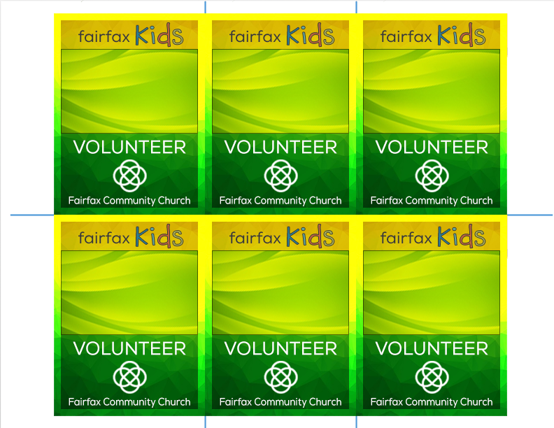
I’d like people’s input on this little graphic I whipped up for nametags. ![]() Please and thank you!
Please and thank you!
1 Like
You’re going to have bleed problems the way you butt the art together. Even if you trim them by hand, you still need bleed.
The space reserved for name can be quite a bit lighter.
^Yes,
and don’t be too surprised when the printed output is considerably less vibrant.
1 Like
Will the name be in black? Personally, I would prefer more contrast for the name area. It’s a bit busy where the name will sit.
Will the names be printed on or handwritten? When designing something like this, I always design with an example of the longest name and the shortest name to see how the font looks in the allocated space. You may find that a landscape orientated tag will fit better for lengthy names.
2 Likes
And if you print on it with certain ink, you may not be able to write on it. Even a sharpie might just smear around
I’m sure you’ve thought of that already, though.
Everyone above me has summed up exactly what I was going to write, so I’ll just say that I agree.
Since you did an imposition layout here, I have to point out that your piece does not have a proper bleed. These will be impossible to cut properly.
You’ll also need room at the top, so that the piece can be punched. Or make sure it sized appropriately for a pre existing laminate pouch or ID tag holder.
Last, if this is a student project, or portfolio item, It would be impressive if you had the data merge for the names in place. it would show off a lucrative skill set that many designers don’t possess
Woops. First comment mentioned the bleed issue. let it stand as a second reminder of exactly how critical that is to produce your work.