I am making a cover for a naughty puzzle book. The naughty is more wink wink innuendo rather than anything explicitly erotic.
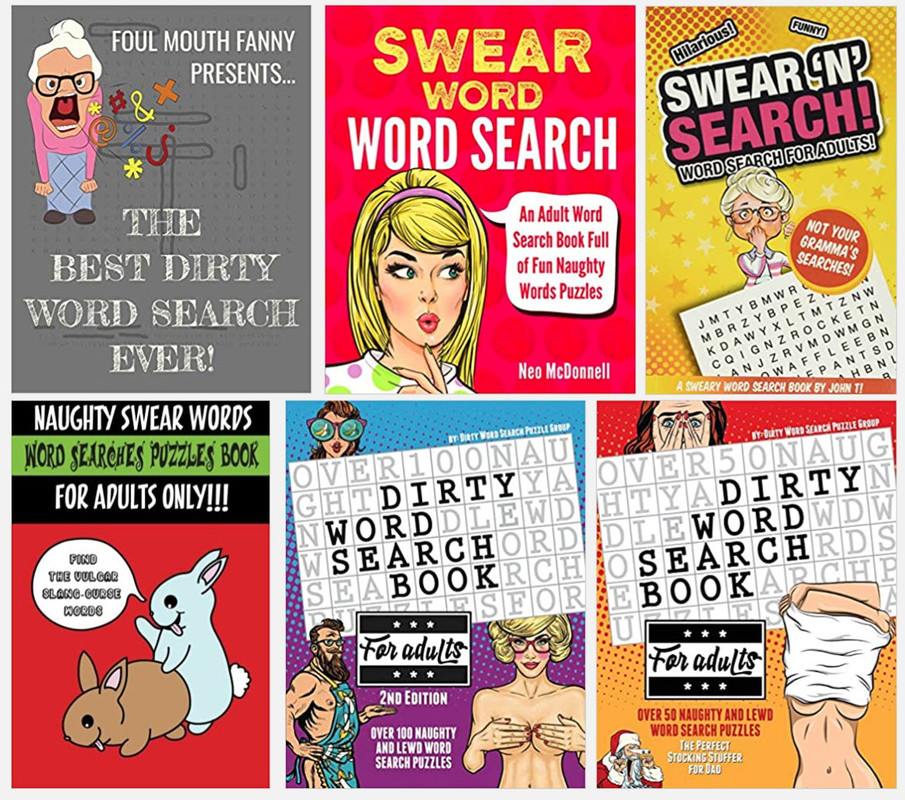
Here are covers of popular existing books: link (Contains playfully suggestive drawings).
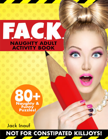
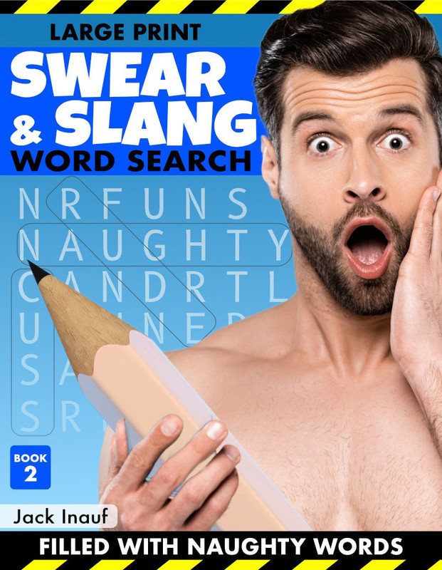
Here is my attempt so far (Click to make bigger):
I think it almost works but I feel the balance is off, but I can’t put my finger on it.
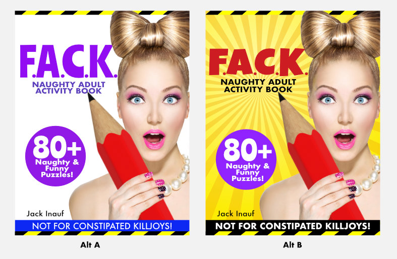
I’ve tried some alternates but they feel off too:
Any ideas? Thanks!
(Also, the title is actually spelt F.U. instead of F.A, I’ve just changed it here to avoid offending any one on this forum who might not be expecting such words!).
Over all I think it’s ok. I prefer the yellow version.
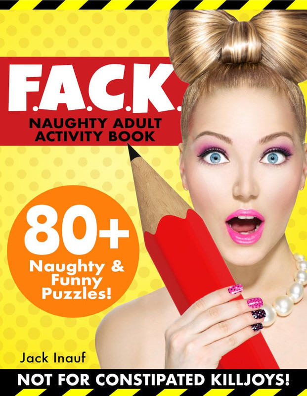
The one thing that does bother me is the F.A.C.K.
That gives it a feel of an acronym. I would be expecting that next line to be the explanation and it’s not. I personally would remove the periods. Unless your letters do represent something else (other than the obvious) then I would have that written out underneath.
Is that a pencil in yer pocket?
Why yes, yes it is!
It says right on the label “Naughty Adult Activity Book” and “80+ Puzzles.” Not sure how you get more descriptive? Make it bigger?
All those pencil puzzle books have a big pencil on the cover. The expression - and the way the pencil is held - It actually made me laugh.
However, not a lot of stores are going to display that title in the magazine rack, no matter how much you argue it is an acronym for something clever. Maybe a smoke shop or possibly a liquor store. Is that where your audience is? Or relying only on online sales in a strangely niche market?
I’m actually not exactly sure what you said in that first sentence. Or what “it” is that you need a more clear description of.
It’s Friday, I’m working in a tin can that is about 180 degrees and 100% humidity and I really just do not care.
It’s an acronym for two reasons. It stands for something, which customers find out when they read the book. But also, because it’s actually spelt FU–, it won’t be allowed for sale without the dots.
I assume you mean the first yellow one (with the dots and red box).
It’s online only in a strange niche market. As long as it’s an acronym, it’s fine (Some of the best sellers do this, I just didn’t include examples of them because they have horribly designed covers). Thanks!
Basically, it’s a puzzle book with a variety of puzzles. But they all have a naughty twist on them (e.g. Drawings of naked people with the puzzle covering their unmentionables). There is also lots of innuendo in the instructions for the puzzle. All the naughty stuff is implied and plays on the reader’s (dirty) imagination, there isn’t anything explicitly visual inside.