Hi Nihal and welbme to the forum.
However…
With absolutely no context, there is nothing to say, I’m afraid.
What is it? Even the piece itself doesn’t tell you what it is for, so it falls at the very first hurdle, I’m afraid.
If you give us some context and the brief you were working to, we may be abe to help.
Are you sure you know what graphic design is? Are you a beginner?
Almost all graphic design involves marketing something, whether an idea, a service, or a product. To do this, a message needs to be effectively communicated in a way that resonates with the target audience.
Graphic design is not a pretty picture, even though an attractive image or layout is usually one of the necessary ingredients for communicating the message effectively.
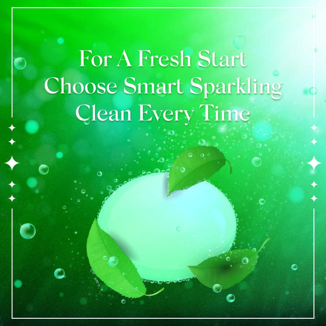
You’ve shown us a pretty picture but haven’t told us the product you’re marketing or its name. Is this an advertisement, packaging, or something else? There’s no way to tell what it is, what it’s about, or to whom it’s aimed.
Regardless of the purpose of the design, it has a relatively low contrast, so making out individual elements isn’t as easy as it should be.
The flare in the upper right corner is the most attention-grabbing element of the design and makes the slogan even harder to read, which isn’t right.
It looks more like a motivational / spiritual quote than an ad, which I think it is supposed to be.
Yeah, I need a motivational quote to choose to be Smart Sparkling Clean every time…
Without commas.
I agree with others, not enough information to know what we’re looking at. Even without context, there are problems.
– As @Just-B suggested, there is no clue what the product is (if there even is a product). Denture cleanser, tooth paste, laundry detergent, dish soap, body soap, something else?
– As @Jakub_Trybowski suggested, the bright highlight is distracting, and the type is hard to read.
– Punctuation matters.
– Line breaks matter. If this is for a product called “Smart Sparkling Clean,” I would have the product name on one line.
– The border rule and stars are superfluous.
– There is no CTA.
– Contrast is one of the designer’s tools to create interest and draw attention.
– How does this interest me into buying the product?