Soooo… I’m a musician and I’m starting a new ** contest site removed ** gig where I create piano tracks for people upon request. I need 3 images for my ** contest site removed ** gig. It’s my first time on there, so I gotta make sure I leave a good first impression on potential clients, besides many other factors of course.
I’d hire a pro, but that would be boring and pricey. Just asking for another set of eyes cause I’m really curious to see what could be considered, improved or changed (Especially the first one). And then, I will try to make those changes and learn along the way. Please share your honest thoughts! Thanks! I can also clarify anything if needed.
Disclaimer: This is not a personal promotion. There will be no way to find my services through here… Assuming that isn’t allowed lol
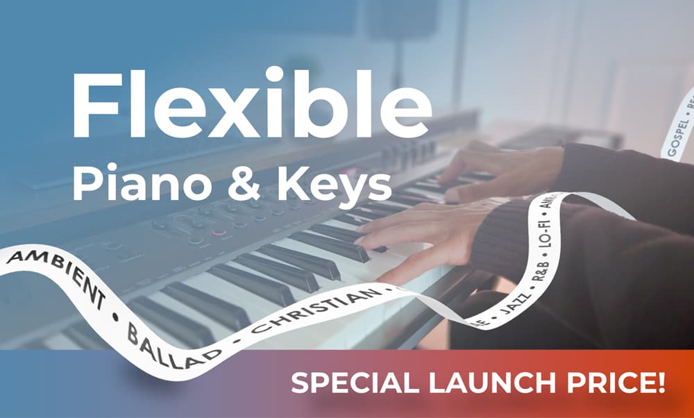
Just to clarify and add (in case it helps): Photo
The photo in the first graphic is of my own hands. I think that is important for authenticity and to build trust with clients. Clients would know for sure by watching a separate promo video of me playing.
Ribbon
The ribbon lists all the genres I play, but I list that separately on my page description and in my promo vid. It’s supposed to be more of a visual element and a metaphor for the idea of “flexibility.” Made it in Blender. Thoughts?..
Ooo nice, more feedback! Thanks for the suggestion and example! I haven’t thought of using musical notes. hmm I wonder if I should keep it slightly more implied in this case since I’m already under the music category.
Just to note ♪ lol, on the other images, I have a small logo with a flexing piano icon. On those same pages, I also have a blurred flexing genre ribbon in the background to keep the music theme, but it’s very faint. Too faint?
Hi again BlueSky, if you accept a suggestion, I would add the music notes near the piano (to make the feeling) but in another case, they would be nice ner the letters “Flexible piano and keys” (they would be better here).
Good plan. Rely on those instincts. Musical notes are an easy cliché and tend to cheapen (apologies mluxgd, but I have to beg to differ here), in much the same way, lightbulbs for thoughts and ideas and jigsaw puzzles for problem-solving do. Awful clichés to be avoided at all costs.
To be honest, the text on a ribbon is something that implies music more. Personally, I think it is an idea that needs a little more development. Perhaps even look at doing it typographically. Losing the ribbon and have the type twisting and weaving might be more effective.
As to the logo; I think this needs more work and deeper thought. Piano keyboards can be a little cliché too – and not just a touch cheesy. Think embarrassing uncle with piano tie. Dig deeper.
Thanks for your detailed thoughts! I’ve experimented with using just winding text without the white ribbon in a much earlier discarded design but I think I was struggling with contrast. I’ll play around.
As for the logo, I can also play around with that. I wanted to make one that kind of speaks for itself, so I made it very literal. My service is Flexible Keys so I made flexing piano Keys.