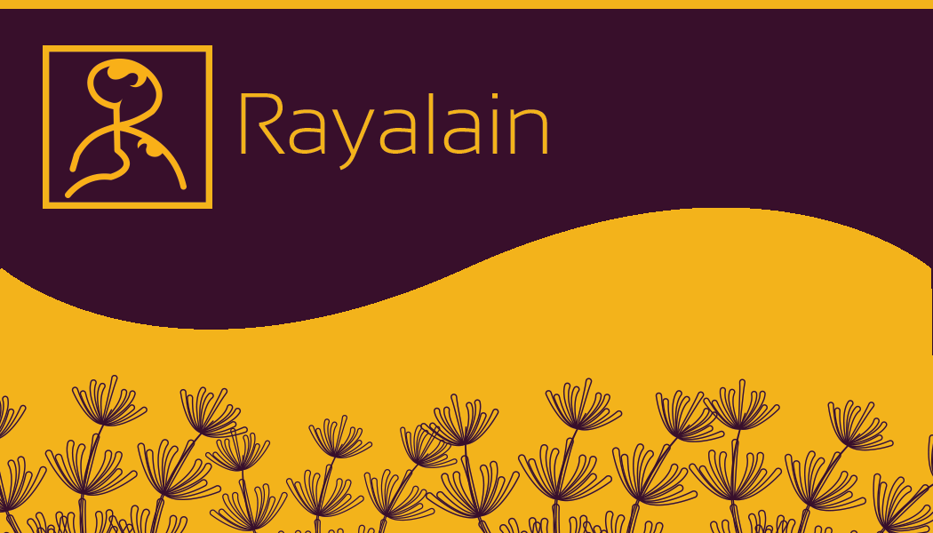
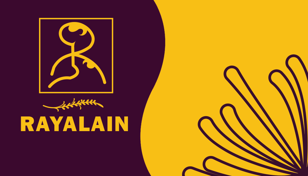
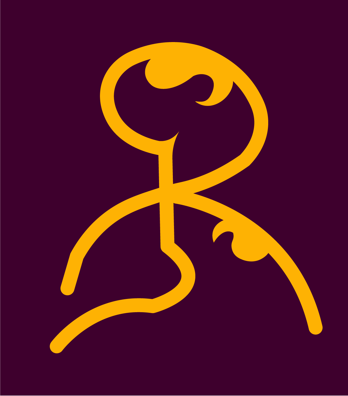
I just created this Symbol logo for my personal branding..So I created this R symbol of my name for my logo.Its handwritten symbol..Can you please tell me that hows it?
Student work, right?
The R is camouflaged by all the other lines. In addition, the craftsmanship could be improved, as in the lines are crooked. Most important, though, is it really doesn’t make much logical sense. What is it? a stick drawing of yourself, maybe?
Honestly, this is one of the 50 or so preliminary drawings in a sketch book that should be eliminated as other, better ideas are sparked by even more sketches. It takes time to get it right.
Don’t spend too much time on an idea that isn’t panning out — even when it works in your mind and you want it to work on paper or on your computer. The best ideas are usually obvious right up front. You can kill lots of time trying to get things to work that might be better spent coming up with another idea.
1 Like
Logos are not good or bad, but rather effective or ineffective in communicating a brand. Tell us more about your personal brand so that we can understand if this symbol is communicating what you’re trying to say. Aside from you saying it’s the letter R, I need to understand the reason you made these design choices to give a real critique.
1 Like
My first thought was leaches attacking the hangman.
i do tend to see this planet differently though
1 Like
Thank you so much..You are right ![]()
Your feedback really means to me and It really helps me
yes it is student work…
I am practicing to make branding of my own..so I made this..as a logo symbol of my own name…But I think I have to think more better..