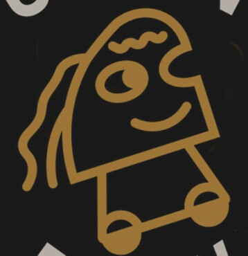
I need feedback on this logo. Green brew is a cofee shop. Please tell me things that work and those don’t work. Colos, font and graphics elements all critiqued will be appriciated. Also give me tips and suggestions on presenting my work. I am always stuck at what essential elements to make for evey brand so make a checklist.
Finally ![]()
![]() thanks for feedback
thanks for feedback
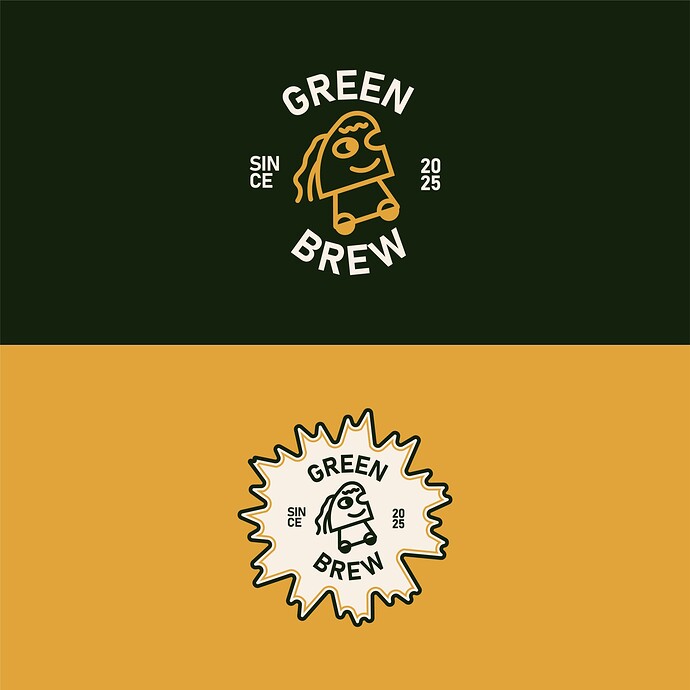
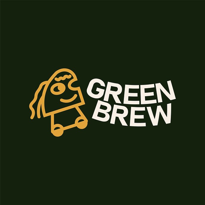
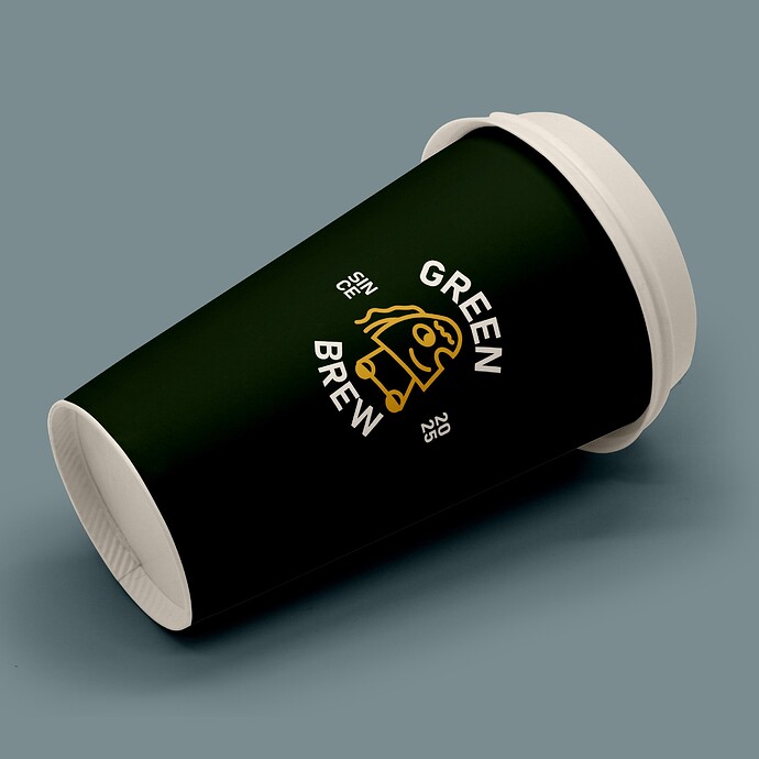
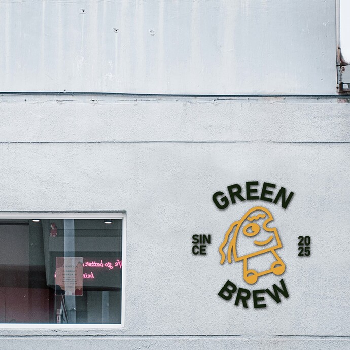
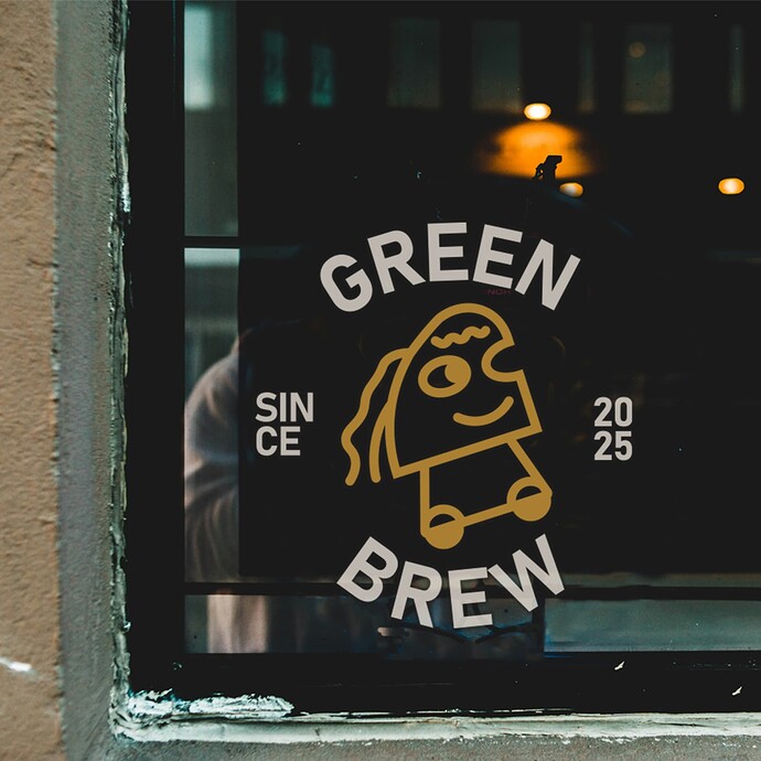
I don’t understand the one eyed wheel head.
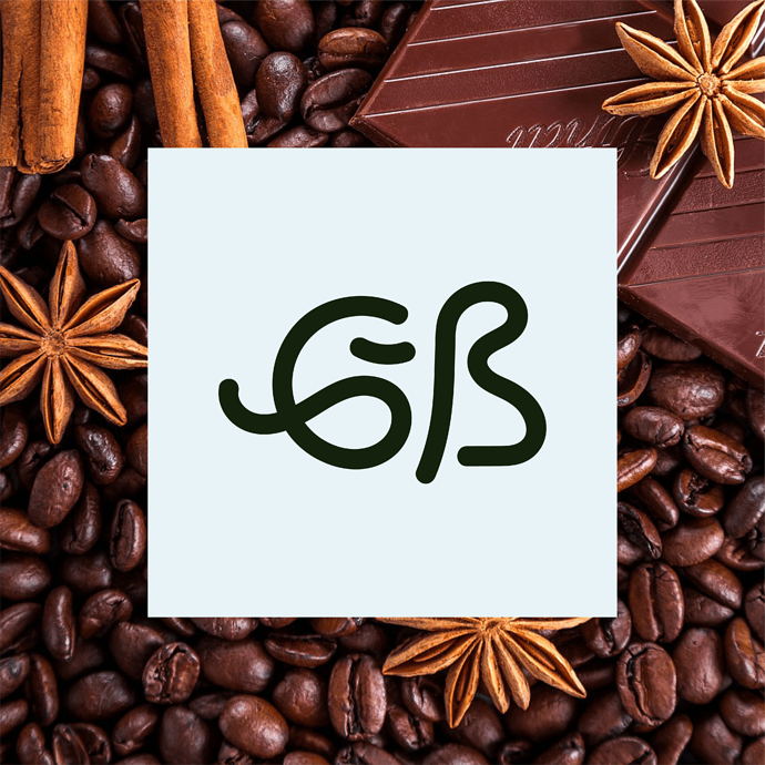
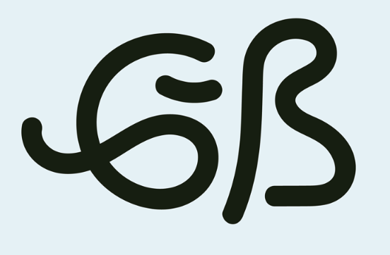
Monogram thing looks nothing like the ‘logo’ which looks like some sort of monster from Frakenstein.
The letter spacing is awful - did you just angle and rotate the letters? They look like they’re typed on a curve.
We have no idea what the brief is, if it’s suitable for this brand, or the ethos of the company.
All it is a picture you drew placed on some items with no context.
It’s not my taste anyway - I don’t particularly like the goofy childlike drawing - as I think it’s targeting younger people - and younger people shouldn’t be drinking coffee at early ages.
So I think it misses the demographic slightly in it’s childishness appearance.
I could swear it’s a propane grill.
And what is this SIN 20, CE 25 stuff?
@Smurf2’s evaluation is spot on.
What is this? I’m guessing it’s supposed to be a G and a B, but I don’t understand your reasoning.
This little creature is peculiar. Is it supposed to be half of a coffee bean? Why does it have wheels? Are they relevant in some way? Why is it drawn like that?
Breaking words, as you’ve done with SINCE, just isn’t done. And why are you pointing at that the coffee shop has been in business since, well, this year?
To sum up things. I don’t understand why you made the decisions you did in the designs. They seem random, gratuitous, and without any readily apparent purpose.
Is it "mushroom coffee”? The icon sort of looks like a mushroom with wheels. But you show traditional coffee beans in the presentation, so I am guessing it’s not mushroom coffee.
