I’m new to this so I would love some feedback. This is my re-design of my high school emblem. Someone told me that I don’t know what i’m doing and that an emblem cannot look like that. But I don’t see what I did wrong. Please feel free to give your me your opinion. Thanks.
Please give more context including supporting conversations and the brief.
What else did they say about the emblem - did they expalin why it can’t look like that?
Have you researched school emblems?
1 Like
Without more context, it’s impossible to say whether your redesign accomplishes anything new or communicates the school’s character and values effectively.
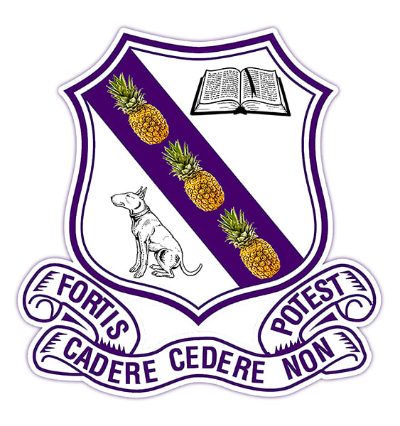
Mechanically, I see a number of things I’d call “mistakes” or elements that could be improved. A graphic for this purpose should be 100% vectors, and 100% original. You really can’t get away with incorporating photographs like those pineapples or commercially available, raster-format clipart like the book and the dog. The motto type on the banner needs a lot more work. The position of every character could be improved. I can’t find one I wouldn’t adjust.
1 Like
Unfortunately, they were right.
Your design is full of basic mistakes:
-
It’s way too detailed. Once you scale it down to a smaller size, it will become completely unrecognizable.
-
You can’t use bitmaps - such as those pineapples - as part of a logo. A logo must be infinitely upscalable, which raster images are not. Once you make the design large, the pineapples will get pixelated and blurry. Even at he current size, you can tell that the bitmaps are of poor quality,
-
It’s unclear whether the slogan is “fortis cadere cadere non potest” or “fortis potest cadere cadere non”. I know it’s the former, but a random viewer is going to have a problem.
A good logo is simple and easy to memorize.
Just have a look at these (top-level) designs:
2 Likes
Thank you
Thanks
There’s no brief. It’s just my re-do of what they have. And someone has a problem with the photos. But what do you think, just based on what you’re seeing?
@Smurf2, @HotButton, and @Jakub_Trybowski mentioned several things wrong with it. You can infer from what they wrote (and I agree with them) that what we’re seeing isn’t working out.
In other more roundabout words, “Nancy, how do you like my new dog.” “Well Bill, its tail is broken. It only has one eye. Big patches of its fur are missing, and it has no teeth.” Bill pauses for a second and says, “Yeah, but what do you think, just based on what you’re seeing”?
1 Like
What do I think just on what I see ----- i think It’s awful.
- Photo of pineapple not good for emblem - all should be vector as pointed out
- Book with fake letters - this will need to be embroidered maybe - the detail is too much and would cost a fortune - or just not possible
- Dog - same issue
- Escroll - very detailed but doable - I’d loose all the frills to simplify
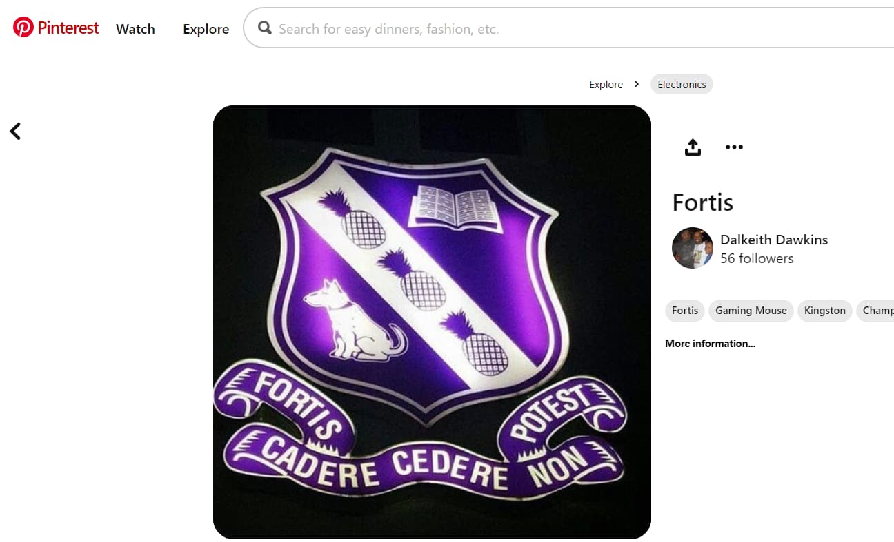
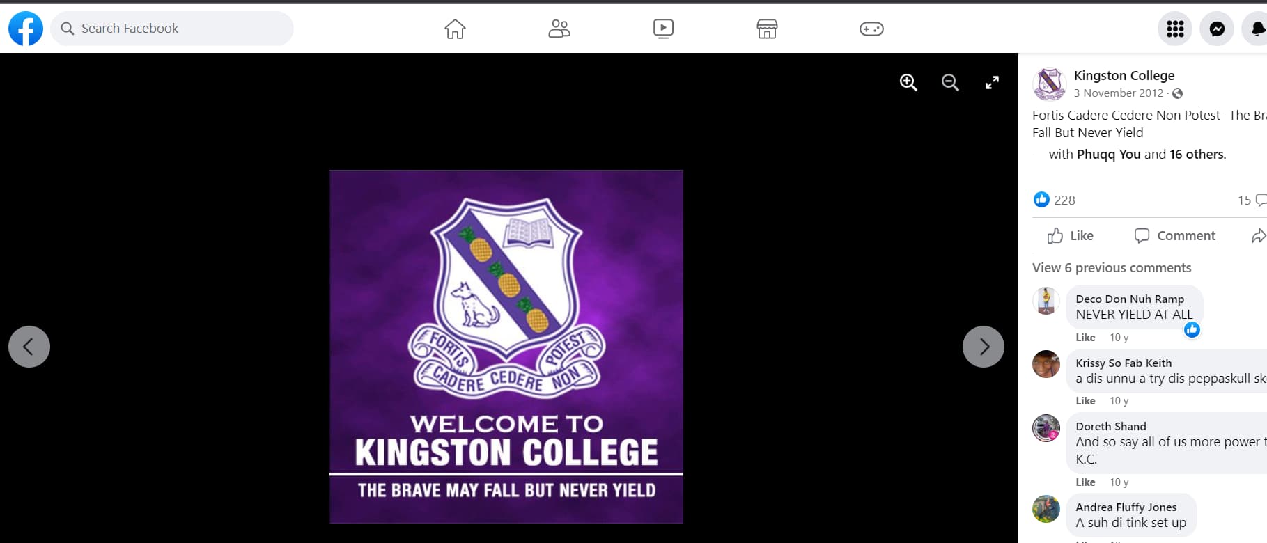
Why so many of this online?
https://kcobauk-europe.org/?page_id=161
What did you actually change? The style of dog - the style of book.
Change some pineapple images???
It’s hardly a rework - it’s just changing something that is already awful to changing it to something more awful.
Final thoughts
Too much detail - simplify.
Why 3 pineapples?
Why a bull terrier? Why is it looking away?
Why a book?
Why a purple stripe at that angle?
Why that type of Escroll?
Answer these questions and you’ll be able to do a much better emblem.
Wow. I’m amazed that you took the time to even go and find those other versions online. And there are actually more versions. I’m going to be honest with you. Everything that you and @HotButton @Jakub_Trybowski @Just-B have said I am aware of. I’m not the one who did it. It’s been a literal headache for me to see this image, as I am an alum, and I have tried to explain the problems with it, only to be completely ignored. I even did a whole 90 minutes video explaining everything in detail … demonstrating everything in Illustrator and Photoshop, breaking down in detail the differences between raster and vector artwork, and so on and so on. I’m actually a Prepress guy, so I would have even broken down a whole lot of details pertaining to all the various digital production issues and impossibilities with this image. So, because I don’t know what else to do, and it really frustrates me, I was wondering if … maybe I could show what other persons who were real designers had to say, then it might mean something to the persons responsible for this nonsense. But, I don;t know. I appreciate the comments from you guys though. Take care.
You cannot post other people’s work here for critique.
It’s against the forum rules.
What you do is
Say your piece - tell them it’s crap
Tell them you won’t stand over it
Get a signature and date on it from whoever signs it off
Walk away.
You cannot manage stupid.
1 Like
You tricked us. ![]()
I felt a little bad about giving such a brutal critique, but I’m glad that’s what you hoped to get. Putting on my moderator hat for a second, you did arguably break the forum rules about posting other people’s work, but that’s water under the bridge.
As for other people’s stubbornness, school and sports teams’ logos often get so caught up in tradition, nostalgia, and strong emotions that changing them is almost impossible.
This one, though, has the added technical and reproduction problems of those bitmapped pineapples, which as a prepress guy, you already know about. The weird thing is that the most serious issues are fixable without seriously altering what others apparently love about it. Sometimes, you’ve just got to shake your head, mumble a few things under your breath, and walk away.