Hi, this is my third design which I made keeping in mind the facts that I was told earlier. waiting for the valuable feedback’s.
I like the design… but can you please look on word “Cool”, It can be more impressive
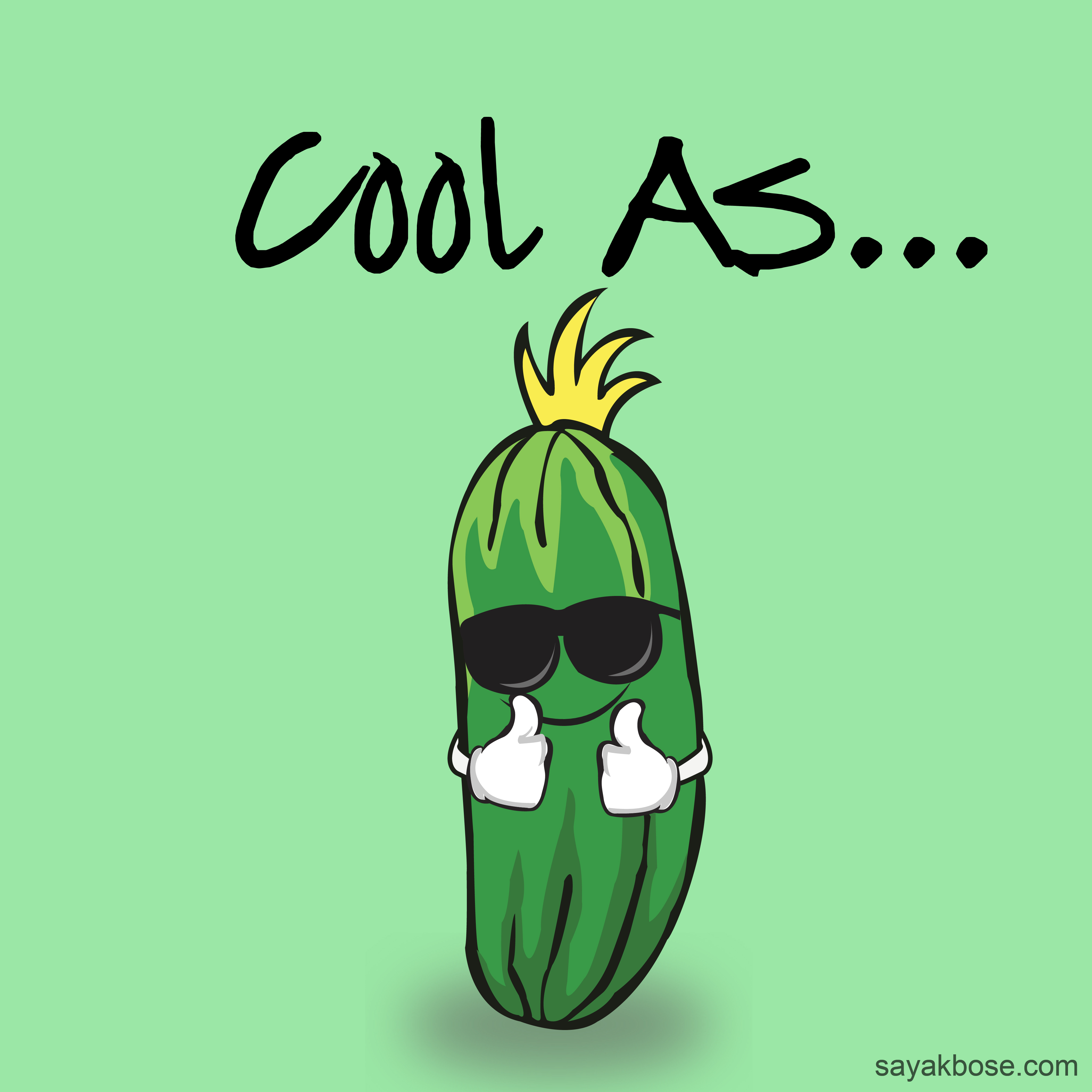
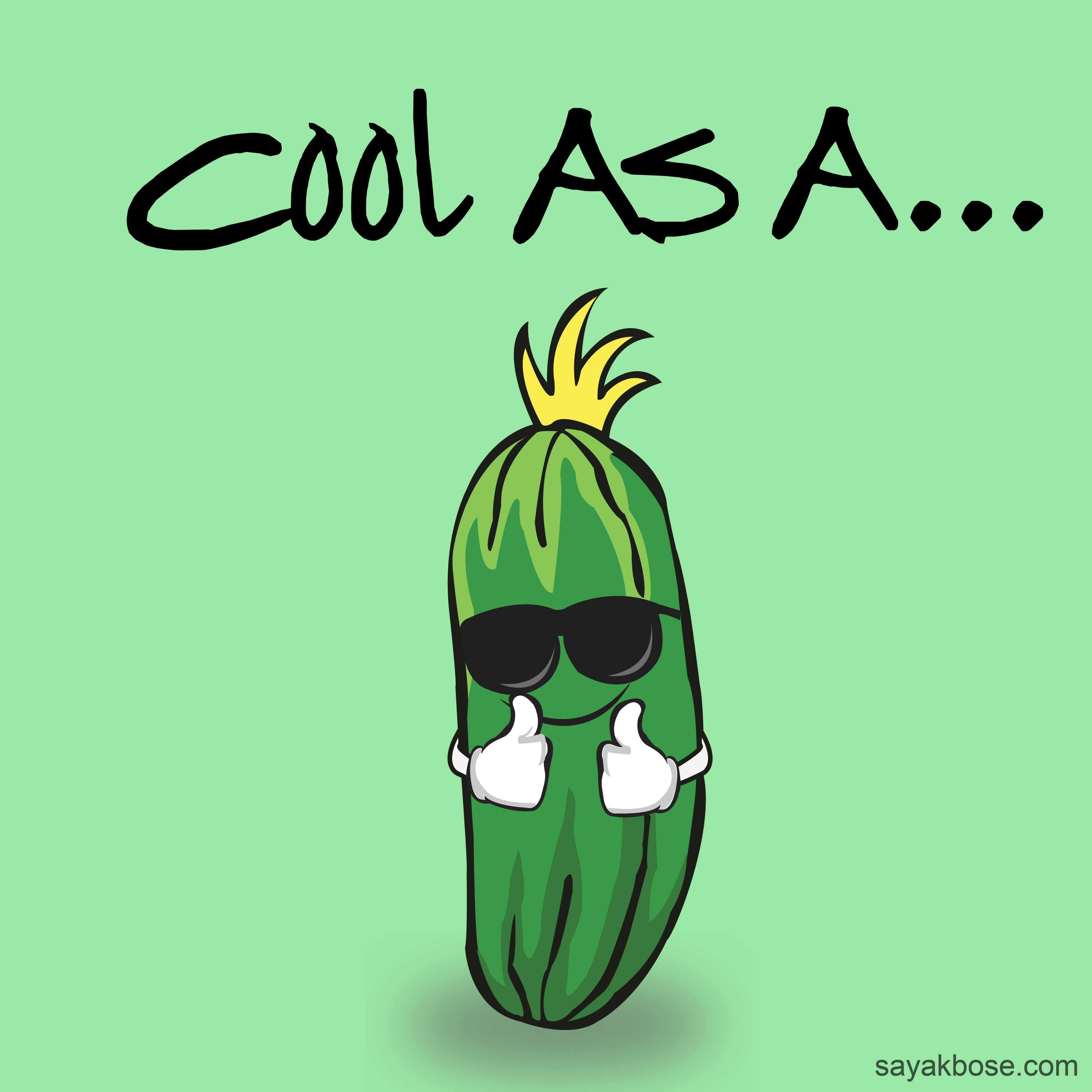
It reads “Cool as cucumber” It should read “Cool as a cucumber”
![]()
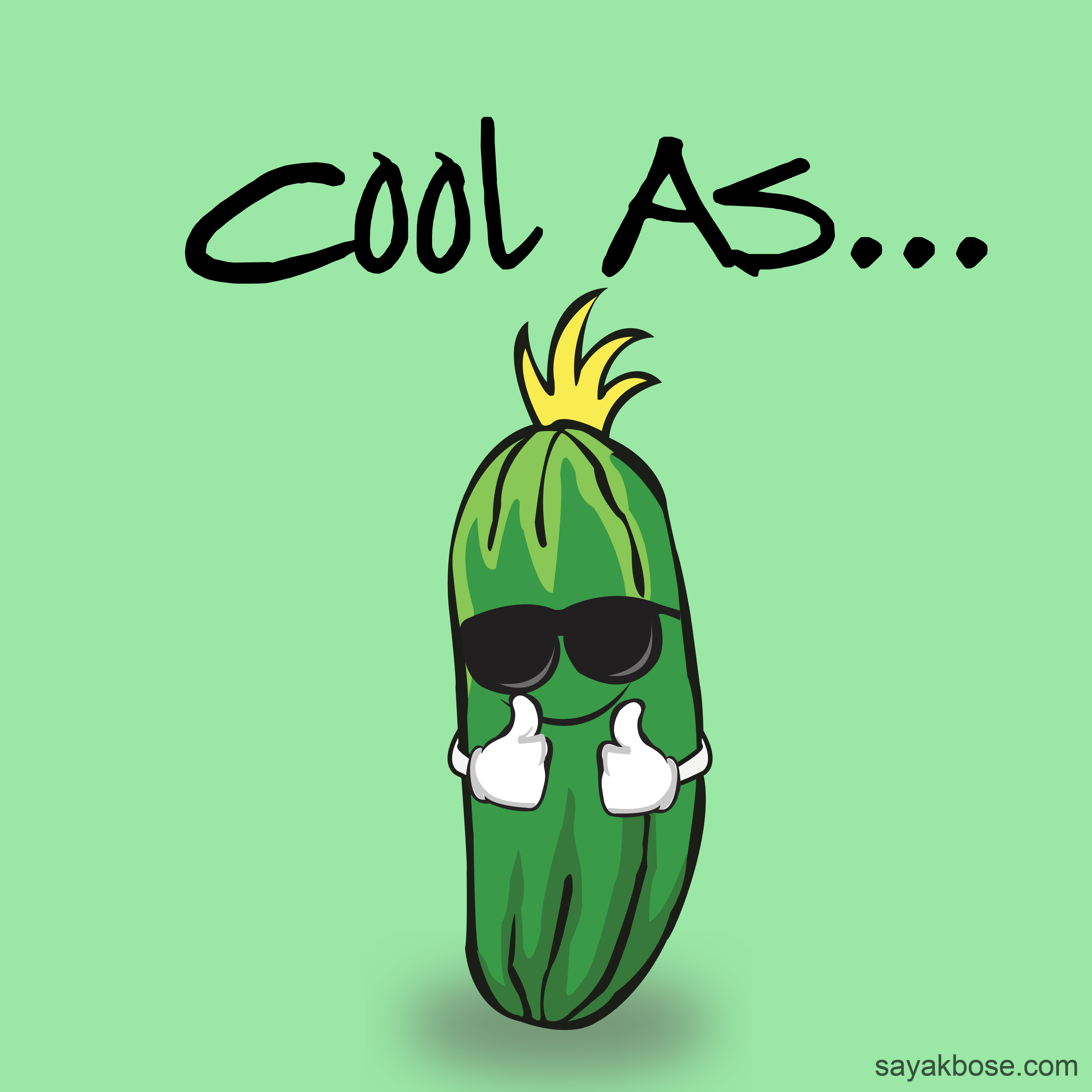
You are one cool cucumber SBOSE3 ![]()
I dig this design, it’s simplistic, the message is there, you already know what it’s saying. I dig the font you used, feels like school cool level stuff. I would expect to see this hung up in a teachers classroom or in a fun area like a kids playzone. Idk why, that’s just what I think of.
Great coloring, though he does seem to feel just a bit too indented, which in my mind does make it seem a bit more like a pickle. But other than that, great work ![]()
1 Like
It always looks a bit awkward when handwriting typefaces are used in ways where the glyphs repeat themselves and break the illusion of handwriting. For example, the two adjacent o’s are the same, as are the dots in the ellipsis and the two uppercase A’s. In other words, if you want a handwritten look, consider writing it out by hand.
For what it’s worth, I’d probably lowercase all but the first cap — especially the second A.
It’s a nice cucumber, though, but I’ll suggest either deliberately centering it or not. Right now, it’s in that awkward middle ground of sort of being centered, but not quite. It might be best to either make it one or the other.
The shadow beneath the cucumber isn’t convincing. It makes the cucumber appear to be floating in the air instead of anchored to the ground. If you look at an actual, real-life object sitting on a surface, the shadow at the point where the object meets the surface is always nearly black.