Need feedback in this logo

This logo is for a company that makes research of color with multiple menbers of difrent nationalities.

The target market are scientists designers aritist people who study psycology and marketing.

The keywords i used as core were:
Professionals, multinacionality, color, research (knowledge) and comunity.

I decided to go with geometric shapes that convey order and precision.

I wanted to use circle shape for logo mark, thought i intend firstly to go just with letter mark type.

Font i decide go with sans serifs that are inovatin modern and universal uppercase indicate power.

Colors i decide to go with was blue that convey competence, knowledge, porfessionalism and intigrity.

Font chosen was century gothic beased on futura that is a grometric style intencifying the order and precision.

I integrated a cmyk registration print mark to intencify the precision of use of color and order.

Was incorporated simbol of reseach given by the :mag:.

And aic is theinitials of the name of the company.

The C magnifying glass is great, I think, perhaps with the handle at an angle.

I’d be careful about committing to any particular pallet and perhaps try a rainbow, touching on all colors or a spectrum.

The registration mark seems completely meaningless, and few will even recognize it for what it is.

A CMYK wheel is pretty generic and you aren’t really using Cyan here so it’s sorta lost it’s meaning.
Not sure I’d go with a purely print angle on this. Color in Psychology and Marketing these days probably more pertains to the RGB world (online on screen and on phone) than it does in print. Don’t limit the scope of what the research company does to print.

Using all colors of the spectrum?

Logos with more than 3 colors tend to get expensive on press. Choose wisely. You have 4 here already. If you go that route, be sure you choose Pantones that also convert fairly accurately to at least a generic CMYK profile (check a Pantone Bridge)

Never saw the magnifying glass and it adds a dropped tail to the logo that will have to be accounted for when this is done in a sign blank type of space. Always consider what the shape would look like if you had to put this on a sign board and review the use of negative space when you do.

Is this a student project?

I think the magnifying glass over a print registration mark is a good way to capture what the company does - inspect color - but the problem with the concept is that the it’s reliant on the color. CMYK versus RGB aside, if the company wanted their logos engraved or embossed, how would that design translate? If this needed to go on a background of blue, black, or red, what would happen to it?

I do like the base idea behind the concept, but logos are almost never confined to a nice white background - it’s probably going to be used in every situation you can think of and then some. It’s important to design with the execution and applications in mind. Step back and try a few different iterations and focus on making sure the shape stands on it’s own, and then work the color in - then compare them to the original and see how they stand.

And speaking of shape, keep an eye on that C with a handlebar - a lot of characters break down into “circle with a stick on it” so it can very easily change to be read as a p, q, or something else depending on the specifics.

I didn’t see a magnifying glass until you mentioned it. If you use that idea, I’d suggest making it look a little more like a magnifying glass. As already mentioned above, rotate the handle to an angle. Make the handle look a bit more handle-like instead of just an unusual descender on a C. I might also extend the ends of the C to make them travel a bit further around the circle.

What happens when this logo needs to run in just one solid color? I don’t see a good option for that. Instead, it’ll nearly always need to print full color.

Its for a competition.

We’re enabling again. :scream:

2 Likes

I also like this version i been testing.
I use the spectrum colors in a circle and one of them is longer making the magnifying thing.

Screenshot_2021-11-23-11-06-21-1

Then possibly would put AIC as letter mark.

What’s so terrible about printing full color, btw? Don’t we have the technology to do that?!

basic-color-wheel|690x592

But isnt ir better simplify?
Like put this colors.
Screenshot_2021-11-23-10-59-48

This is a nice idea, but it will rule out using spot (Pantone) colors if that’s important. An eight-color spot-color job would be expensive and impractical to print. It would work just fine in RGB or CMYK and could work OK in B&W and grayscale. As I mentioned, though, I like the idea.

I like the color ring with the handle better than the registration mark within a circle - it’s more understandable as color focus for a layperson, and the absence of colors touching means that it’ll keep it’s silhouette even if converted to a one color output. Seems like a good step in the right direction.

1 Like

I’m not gonna argue with anyone who wants to put 10 spot color matches into a LOGO.
I’m absolutely happy to charge to print each of those accurately for you. If it matters. And we do charge.
If it doesn’t matter, I still get paid to push the button and stand back so I don’t get spattered by what plops out the other end.

Cut vinyl on a sign? Charged by the color.

Painted 3D elements on the lobby wall? Charged by the color. Painted elements are high 2-figures per color cuz we have to mix at least a quart can.

Screenprinted? I wouldn’t even take the job. I’d suggest a sub that prints direct (but you run into that match-or-plop thing mentiond above.

I don’t even know if you can get that embroidered, but there is probably some place that can do it. Won’t be cheap.

This industry has so gone to hell in a handbasket I print whatever they put in front of me these days. As long as they pay me, it just doesn’t matter.
(shrug)

Whoever gets that thing, deserves exactly what they get. Contest. Yep. Figured.

Just one question for logos you must convert to pantone every color? But in this case i cant just print on cmyk?

I would rather make a simple logo with aleast 3 colors as well i am not even sure if i put only the primary colors would be enough to convey their research color messege.

But i tried out this also.

Screenshot_2021-12-04-05-59-15

In a way i trying make something simpler sence in the competition companies their logos are quiet complex things apart for some.

All comments as to the efficacy of the design for now, don’t get involved in competitions. They are a race to the bottom.

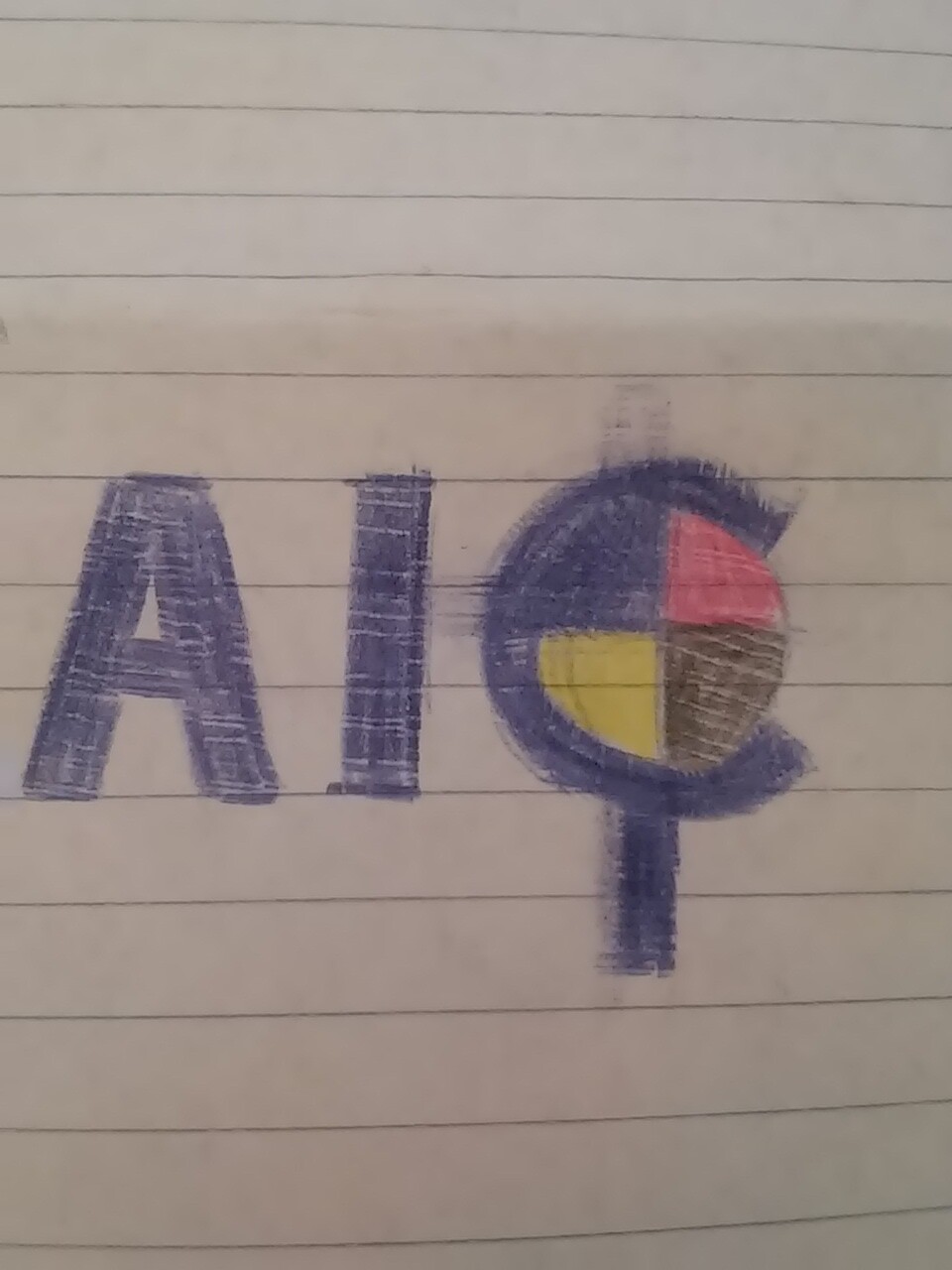
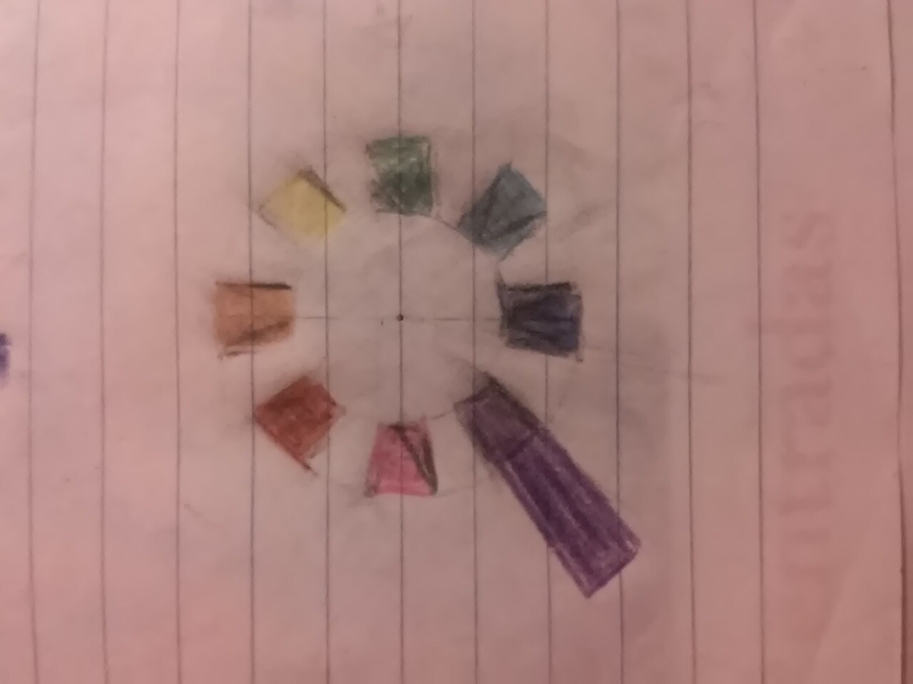
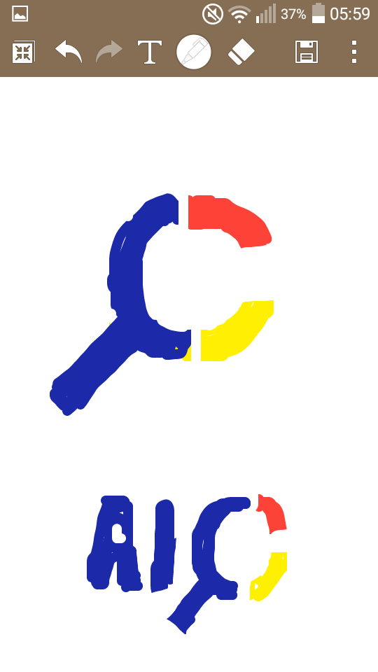
As to the design itself, if I am being honest, I find all a bit cliché and uninspiring. Your initial description of what you have come up with sounds like you read a book on colour theory and basic design principles and this is something that ticks all boxes. Fair play, at least you read the book, which is more than can be said for many posting work for critiques here.

However, what this does not do, is tell me anything about the personality of the company and doesn’t really speak to their audience. It feels like it is trying to be all things to all people. From what you have said, the intended audience is visually literate, educated demographic and will understand, in a heartbeat, the massively obvious visual cues you have employed and feel more than a little patronised. That would certainly put me off. It all feels a little like local ads for painter/decorators that use the cartoon man with paintbrush in hand. You need to dig deeper. You stopped at the first idea.

Now that I have completely shot you down in flames – apologies, not intended to be quite so brutal – what I would suggest is do a lot more research into the business sector and the target audience. Employ what it appears the company does, and learn some psychology.

All that said, any company that entrusts their visual identity to a competition site (especially, given their area of operation – you’d think they’d know better) to a crowd-source competition site, doesn’t deserve the kind of attention to detail required to communicate what they do effectively.

My advice; ditch the competition and focus your efforts on getting yourself educated at a decent university. You have obviously gone beyond the ‘design as pretty’ stage and are thinking about what you do. Learn more, learn properly and ditch the crowd-source sites, or you will resign yourself to bottom-feeding with the molluscs for your working life.

Hope this helps, rather than disheartens. It may be brutal, but it’s intended to be brutally honest. Good luck.

2 Likes

:sweat_smile:But i alredy went to decent university and did even the master but realy they dont sem to care much about the psycology of things or dig to deep.
But i do want to participate in competition for the only porpoise to make my CV better.
I dont have no experience in my area and i am looking for voluntary work in my country but with the pandemic it becomes bit harder than the usual.

So i am desperate enough to grab every oportunity that comes my way sence i have nothin to lose.

Participating in logo design contests - on sites such as 99 Designs - is not going o take you anywhere.

Instead, try Dribbble, Upwork and Useme:

https://dribbble.com
https://www.upwork.com
https://useme.com

Before you start, take this dirt-cheap course:

It’s about Upwork, but you can use the same principles to get hired on any freelancing site.

Apologies; I just assumed you hadn’t. Then I revert back to my other advice: dig deeper.

You do. If someone came to me for a job and their portfolio was full competition logos, they would have to fight doubly hard to get the job. They would already be on the back foot.

By feeding on the bottom, you consign yourself to playing in that league. If you need work for your portfolio, you are supposed to be a creative. Be creative. Put work in there that shows the best of what you can do, not pseudo-professional crowd-source logos.

I didnt take contests in any of those sites btw.