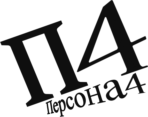
I made this russian Persona 4 logo, but for some reason I can’t put my finger on the logo does not look that good. Can anyone give me feed back as to why this is?
Original Logo

The Russian logo I made

I made this russian Persona 4 logo, but for some reason I can’t put my finger on the logo does not look that good. Can anyone give me feed back as to why this is?
Original Logo

The Russian logo I made

Your perspective lines are off. Check your vanishing point.
I think some letters have a stroke on them too.
I don’t speak Russian - so it’s the 'N e p c o H" - seem to have a feint stroke for no reason.
I accentually miscolored the stroke. I will fix that
Let’s see if anyone else agrees me . . .
My question is. what are you doing with this work? Does this work generate any kind of income for you?
This forum is by professionals for professionals who rely on our advice to make a living. It is mot a sandbox for amateurs.
He says he’s recreating these game logos for fun. Why that’s fun, I don’t know, but to each his own.
As for amateurs who visit the site, we wouldn’t have much to talk about if they weren’t here to ask questions that prompt most of the discussions.
disclaimer: am not russian, do not speak/write the language, no idea what the glyphs are called.
the upside-down U that is apparently equivalent to P in the english alphabet does not appear to be perspective distorted as the P is in the original logo. It’s rotated to match, but it needs the distortion.
More like a 3-D composition with three different perspectives.