For body text I agree never to distress it. For headline a small distress isn’t noticeable if done correctly and paying attention to the work.
It can work. But I just wanted to see what it looked like as I lay in bed at 5.30 this morning. To fill the whole top half of the cover with the type and it might add some personality to it and not a pedestrian look.
Doing it correctly is the catch because correcting the distortions would require redrawing the letters. You probably already know that vertical strokes are usually thicker than horizontal ones. This compensates for the optical illusion of horizontal elements appearing heavier than verticals.
Scaling the typography in a vertical direction increases the width of the horizontal strokes without changing the verticals. Bringing the horizontal widths back into balance pretty much means redrawing the letters.
One of the huge advantages of variable fonts is that the font designer can design the glyphs to do exactly as you suggested with no distortions. I do agree, though, that a bit of scaling on a non-variable is sometimes not noticeable. Still, if it’s not enough to notice, there’s usually not a sufficient reason to do it.
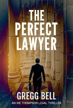
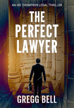
For what it’s worth — again, a matter of opinion — I think the existing type fits the space nicely. The kerning isn’t quite there yet, and if it were me, I’d try moving the title down a little, then placing the bottom “An Ike Thompson Legal…” line of type at the top, above the title. Then again, if it were me, I’d likely forgo finding the perfect typeface and draw the letters myself.
I think we’ve reached a similar spot that students run into during their final couple of semesters in design school. The work is good enough that the critiques devolve into matters of legitimate differences of opinion between students and instructors. The students finally conclude the instructors won’t be happy with the work until it looks exactly like the instructors would have done it themselves.
Thanks very much, guys, but I must admit that lacking your knowledge and keen sensibilities I am still processing all this. That said, I do like the looks of Just-B’s suggestion of dropping the title down and shifting the subtitle to the top. It gives the cover a nice balance. (I also switched the font color from Ivory (#fffff1) to White (#ffffff). Any thoughts on that?)
You say that your intent is to clearly communicate that the genre is legal thriller? I think you’ve accomplished that. I am a beginner student of graphic design, so take my advice with a grain of salt, but this cover seems conventional and competent for the genre you are aiming for. If that’s all that you want to accomplish, that’s fine. It’s just that it blends in too well with the other books in the genre. Is there something unique to this book that you can choose to highlight that will make it stand out from the others?
Thanks, NesWest, for the feedback. I hear you about using something unique to make it stand out, but in this case I just was wanting to make sure I got the genre right. And now, the cover is done, so I won’t be experimenting with it anymore.