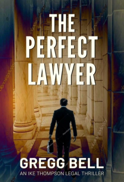
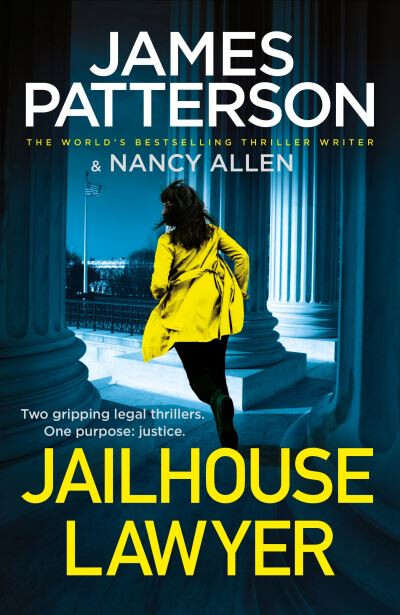
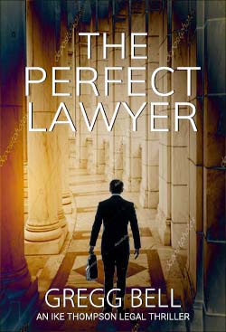
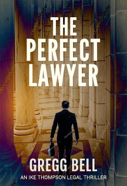
Thanks. This is a book cover. It will be an ebook and a paperback. (I don’t have the back cover done yet. I need to settle on the front cover first.) My intent is that the cover clearly say legal thriller genre. As always, thanks very much for your help.
Your book covers for this are turning up in Google searches now - the ones you’ve posted here… guess it was bound to happen.
Guess my font suggestions were ignored…
Not a fan of the typography - on all the covers posted on this so far - pretty pedesterian and uninspiring.
Looks like a lot of other legal thrillers
I have mixed feelings about your recent covers.
They’ve gotten much better. The covers look professional. If I saw them on the shelf at a bookstore, they would not jump out at me as not having been designed by someone at a big publishing company.
Depending on how you look at it, that’s either a problem or not.
You’ve studied hundreds of legal thriller covers and soaked in the formula of how a quintessential legal thriller is supposed to look. That’s where you’re aiming, and I think you’ve come close to nailing the bullseye.
In other words, you’ve hit B-grade level. The work is competent, professional, and spectacularly adequate. It’s a blend of similar covers with the same general personality. There’s no insightful spark of creativity and originality pushing it up to the A grade — nothing to make it stand apart from the other formula-driven covers.
I’m not saying this isn’t OK. There might be a good business case for sticking to a successful, established pattern. Romance novel covers have done it for years, and it seemingly sells books. I suspect the same is true of legal thrillers.
Are you familiar with Chip Kidd? He’s a well-known book jacket designer at Knopf. At first glance, his covers are pretty good but not spectacular. At second, third, and fourth glances, though, it becomes apparent he’s working at A-grade level. I don’t know if he’s designed a legal thriller jacket, but if he had, the jacket would be tailored to fit the book, not the formula. It would be the book that didn’t look like the others on the shelf, and because of that, it would be the book that got noticed.
You’ve gone for genre and ended up with generic.
I’m with Smurf, in that, it looks like every other cover in the genre. Competent, but fairly average and definitely not standing out from the crowd. The type needs attention, both practically and personality-wise.
This was all a pretty inevitable outcome. If a clichéd, stereotype approach to genre is what you wanted, you have ended up with exactly that; a stereotypical cliché that looks like a thousand other self-published ebooks.
It feels like you were given a lot of good advice a few weeks back by a number of qualified people and you’ve ignored it all because you have a fixed idea of what you think you want to achieve. That is fine, but it begs the question, why ask for advice in the first place? You’ve even, doggedly, stuck to the same typographic style when almost everyone pointed out that it is flawed.
Well, you have exactly achieved exactly that.
What you have is an advert intended to sell cars that simply says ‘car for sale’ over a stock shot of a car. You are definitely not making me want to take a test drive.
What is the point of it focussing solely on genre if no one turns the first page because it looks predictably like every other airport novel ever self-published?
As I said, it is competent and average, but who wants to spend their time reading competent, average books. You could be the next Grisham for all anyone knows, but surely you want people to find out by turning the first page?
I’d walk right past that, I’m afraid.
Good luck.
Thanks.
Yeah, I was quite surprised to see them there.
You know, maybe I should be aiming higher, but that’s what I’ve been after.
Thanks, B, for the kind words. And yet, I hear you about the cover being B-grade level. I’m going to keep after this cover and see if I can create some magic somehow.
A long time ago I saw Chip Kidd’s TED talk. A phenomenal talent. I also looked at his portfolio online today. Great stuff.
Thanks, sprout.
Please refresh my memory as to this:
How have I repeated the same flawed typographic style error in this version?
It is the same font as your very first version on the other thread, with only a slight variation in layout.
I am not a huge fan of the fonts you’ve used and, in addition, the visual alignment and kerning needs playing with a bit. Just all tightening up.
It just all adds to a sense of it being more than competent but a little mediocre. If you are happy with it all, so be it. I’ve seen worse – a lot worse. This is more than OK. I just think, in your own words, you should be aiming higher.
On the upside, the fact that we keep responding means we all think it has merit. With the no-hopers that keep flogging a dead horse, we’d have all bailed ages ago. I am only this harshly critical as I think the horse is definitely still running, but in danger of falling at the last hurdle.
Again, as I say, if you are happy and this is what you want to say about your book – and after all is said and done, it’s your book – then what you have is a long way from poor. I just think you’ve slightly missed the point of what a cover should be doing.
As with the last post, I am simply repeating myself now, so I shall stop here. I don’t think any of us can say the same thing in may other ways, so the decision is yours.
Good luck with it all.
1 Like
Thanks a lot, sprout. I appreciate you hanging with me.
I am not unhappy with it, but I am always looking to improve it.
I’m not either, but I’ve experimented, and they were the best I could come up with. (Title: League Gothic, Name: Barlow Bold, Subtitle: Roboto Light) I am doing this on my own, so I don’t have access to a lot of fonts, but I could use anything in Google Fonts if you have any suggestions.
In the previous cover (the one with the gavel over the desultory documents) I had in the Crit Pit, CraigB mentioned tightening the spaces between the “A” and “W” in “LAWYER.” I can do that, but I’m afraid of throwing off the symmetry of all the other letters in the word. And wouldn’t all the other letters need to be adjusted as well? (I’ve never worked with kerning before.) So if you have any suggestion about that I’d be happy to try it.
I realize that in the company I’m in here in the forum I’m over my head, but you guys have helped me a lot and I really appreciate it. (I know the easy reply would be: “Get a cover designer!”)
That said, I realize I may be asking too much for how the forum basically works.
@tag Kerning can be difficult even for professionals and there may even be some degree of disagreement on whether an item is kerned properly.
I still feel that the kerning between the A and W in lawyer needs to be tighter. The kerning between ER in Perfect and EC in perfect also could use a little nudging.
Unfortunately there is no hard and fast rule. It really comes down to visual balance and balancing out the negative space between the letters. Once again, even two season designers may present two slightly different versions of the above text being kerned, but I would believe that those differences would be relatively minor.
I will say that the kerning at the moment is not “jarringly bad”, and most people wouldn’t notice, but much in the same way if you were shopping for something you might subconsciously notice when something just seems a little off and therefore you may perceive it as being a little cheaper or shoddier.
I guess what I’m saying is it’s not bad, but with a little bit of time and effort fixing those minor kerning issues would be impactful.
1 Like
I avoided writing anything about the typography because it’s good enough that it’s moved into the realm of subjective opinions rather than wrong or right.
But I might as well toss out a few of my judgments. As for the kerning, I agree with @Craig — the pairs he mentioned are just a little off. Then again, the word LAWYER is difficult to kern. Getting the WY pair right is nearly impossible due to the gap between them. Uppercase is difficult to kern anyway — a few of the letterforms don’t play well with the others.
A second observation is the choice of typeface. This choice is also subjectively awkward to critque since the face you’ve used isn’t bad, and it works about as well as the faces used on books from big publishing companies.
Still, in my opinion, the type is a little too generic for the title of a book. It’s a great typeface for when a generic look is needed, but I think it needs a little more personality — not much, but just enough to give it a little life and flavor.
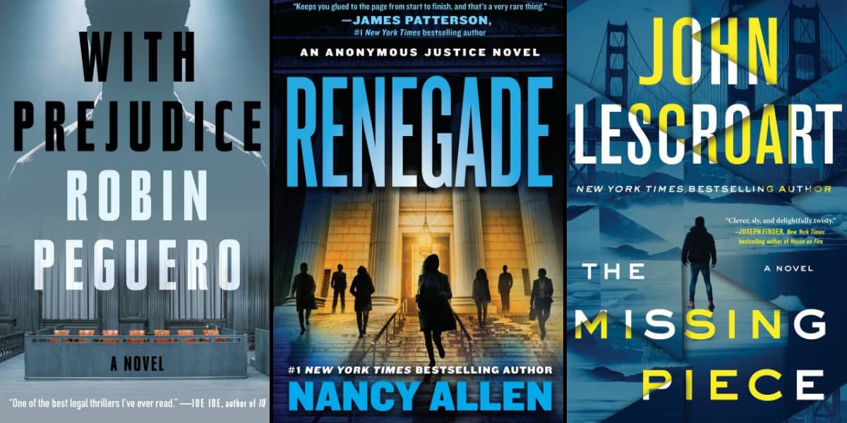
For example, using three of @Smurf’s examples below…
The typography on the two right books is generic. The designer chose a nice typeface that fits, then ran it as big as possible.
The design components in the book on the left, however, are a bit better integrated. The typeface has a little more style, and the letters are tracked a bit more, which conveys a more refined, relaxed, and classy quality rather than packed together like a supermarket can of sardines. This quality matches the illustration behind it in a way that makes the typography appear as an integral component of the illustration instead of something simply superimposed on everything else. In other words, there’s synergy between the type and the illustration which creates a unified cover with a consistent personality.
I’m absolutely not suggesting that you use the same typeface and track out the letters the same way. I’m just saying that great use of typography requires being aware of these kinds of details that contribute or detract from the layout and the desired personality and emotional flavor of the layout.
2 Likes
@CraigB Thanks so much for tracking this down and giving me your feedback. Yes, to my untrained eye the typography looks fine, but when you pointed out the gap between the A and W (esp. compared to the close gap between L and A) I was astounded.
I will attempt all your suggestions. Thanks again.
@Just-B Thanks B. Great explanation of how font can have a huge impact on a book. And I agree that my cover’s fonts could use a little more personality.
My story is about a lawyer who used to be called The Perfect Lawyer by colleagues but after a stunning defeat he lost his confidence and gave up practicing criminal defense law. Now he’s approached and asked to defend a sensational murder case where the defendant has an incompetent public defender and no funds to hire a private defense attorney. Moved by what he believes to be the defendant’s innocence and her uncalled for prosecution by the D.A., he takes the case.
Although a legal thriller, it’s not a slam bang John Grisham international high concept thriller. My protagonist has totally backed off big-city high-profile cases and just wants to live out the rest of his days in peace doing small-time real estate closings in the sleepy suburbs. This of course all changes when he takes the case.
I will search desperately for a thriller font with more personality. (I’ve already tried Bebas Neue and given up on it.) Seems League Gothic is the easy default choice for thrillers.
Friends have suggested tilting the T in PERFECT since my lawyer is a very imperfect lawyer. But I thought that was kind of cheesy. Others have said use a cracked texturing in the the text for PERFECT. I thought that was equally cheesy.
To be continued. I’m getting back to work on it.
Thanks again.
You are wise in disagreeing with your friends. ![]()
There are times when unusual typographic experiments work out great, but doing so requires a keen sensitivity to what works and what’s “cheesy.”
In addition, the tilted letter would come across as a distracting one-of-a-kind afterthought — a little bit of cleverness tossed into the mix that doesn’t quite work with the rest of the composition. If done right, it could work, but not as an afterthought. Instead, the intimation would probably need to form the central idea behind the design.
2 Likes
On a separate note, if you are looking for fonts, you may also want to look at font squirrel. It is a site with curated collection of free fonts available for personal and commercial use. It has been a while since I have poked around their site, os no recommendations come to mind, but you may find a suitable font there.
1 Like
@Just-B Thanks B. It’s good to get confirmation on the cheesiness. And especially since I’m planning a sequel I would like to make the cover for that easier to brand with this one. (That’s the same reason I’m avoiding gradients in the title. Of course gradients can be excellent, but I think for a sequel plain old white will be safer.) I gave the fonts a do-over (except for the subtitle). Thanks for the encouragement to do so. I have not had a chance to experiment with the kerning yet but I will.
@CraigB Thanks for the font squirrel site. Great looking site. I bookmarked it. Will definitely use it in the future.
I did a new cover with new fonts. I did not do anything with the kerning (I see the same problem exists with the new fonts–I was hoping for a miracle!) but I will once I settle on the fonts.
Sorry - it’s a swing and a miss again.
But if you like it. Then go for it.
Picking a font and hoping for a miracle is just not going to work. You might get lucky.
Take a trip to a book store today and take a look at the top 10 selling novels on the shelf. Take a picture of them. Or buy one or two you like and study them. Try to recreate them yourself - and explore different options.
I’m not saying to copy the same style/font from these book covers - but experiment with them.
See if you can reach the conclusion why those covers were designed ‘that’ way.
2 Likes
Please tighten the kerning between A and W on LAWYER. I could park an 18 Wheeler in there ![]()
I know others mentioned it with the older version, with this new font it’s even worse.
For me personally, I preferred the thicker font. This one seems a bit on the wimpy side.
As also mentioned we are only batting around opinions on personal preference now. I think you need to decide what you like and be done with it.
Everyone has given you great advice to clean up your design elements. You have done pretty well overall. But, every time you change a little something you are going to keep getting opinions ![]()
… Just my take on things.
1 Like
Placing thin, light type over a light-colored, busy background interferes with legibility.
1 Like
@Smurf2 Thanks Smurf2.
I agree. Especially since I think I went overboard in abandoning the thriller font for the title. Anyway, I put it back.
Oh, and I wasn’t hoping for a miracle to find a font but to choose a font that didn’t need any kerning. But any kind of miracles are always welcome!
@RedKittieKat Thanks Kat. Yeah, that is quite a gap between A and W. I will take on that task after I figure out which fonts I want to use.
^ Agree entirely.
It’s just the fonts that are holding me up. I’m satisfied with the image.
^ Yeah, I can see that now. Hopefully, the type on one of these two new versions work. Thanks.
Version A:
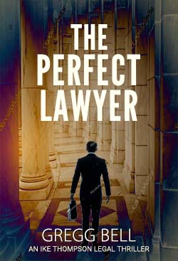
Version B:
Make THE smaller by about 25 percent.
Then increase the entire thing to cover out as far as you can.
Then add about 25 percent vertical scaling to the perfect lawyer but not so much that you don’t cover the image of the bloke.
*edit ‘horziontal’ to ‘vertical’
And the kerning… Fix it
Top one for me
Sorry, but I have to disagree with that bit, I’m afraid. It would be far better to find a font that is designed as ultra condensed. As soon on you add vertical and horizontal scaling to any font, you destroy it. You stretch all the curves and stresses and it never ends well.
Personally, I don’t think I’d go much more condensed than this anyway. Increase it a bit, if you want, but more condensed beyond this and you risk legibility issues.
There are so many fonts out there these days, it can’t be hard to find one. Even if you have to buy one. You’ll end up with a much better product. The font you have now, although better than the thin one, is not the prettiest of condensed fonts as it is. If you start stretching it, things are going to get messy. The R would end up almost criminally indictable.
Go to Myfonts.com. You can even put in the weight and the width of font you are looking for and it will give you suggestions. There are so many beautifully designed fonts that would fit the bill better. DIN next springs to mind, though I am not sure it will be condensed enough. Far nicer font though. There are so many…