

1 Like
Hi Alian
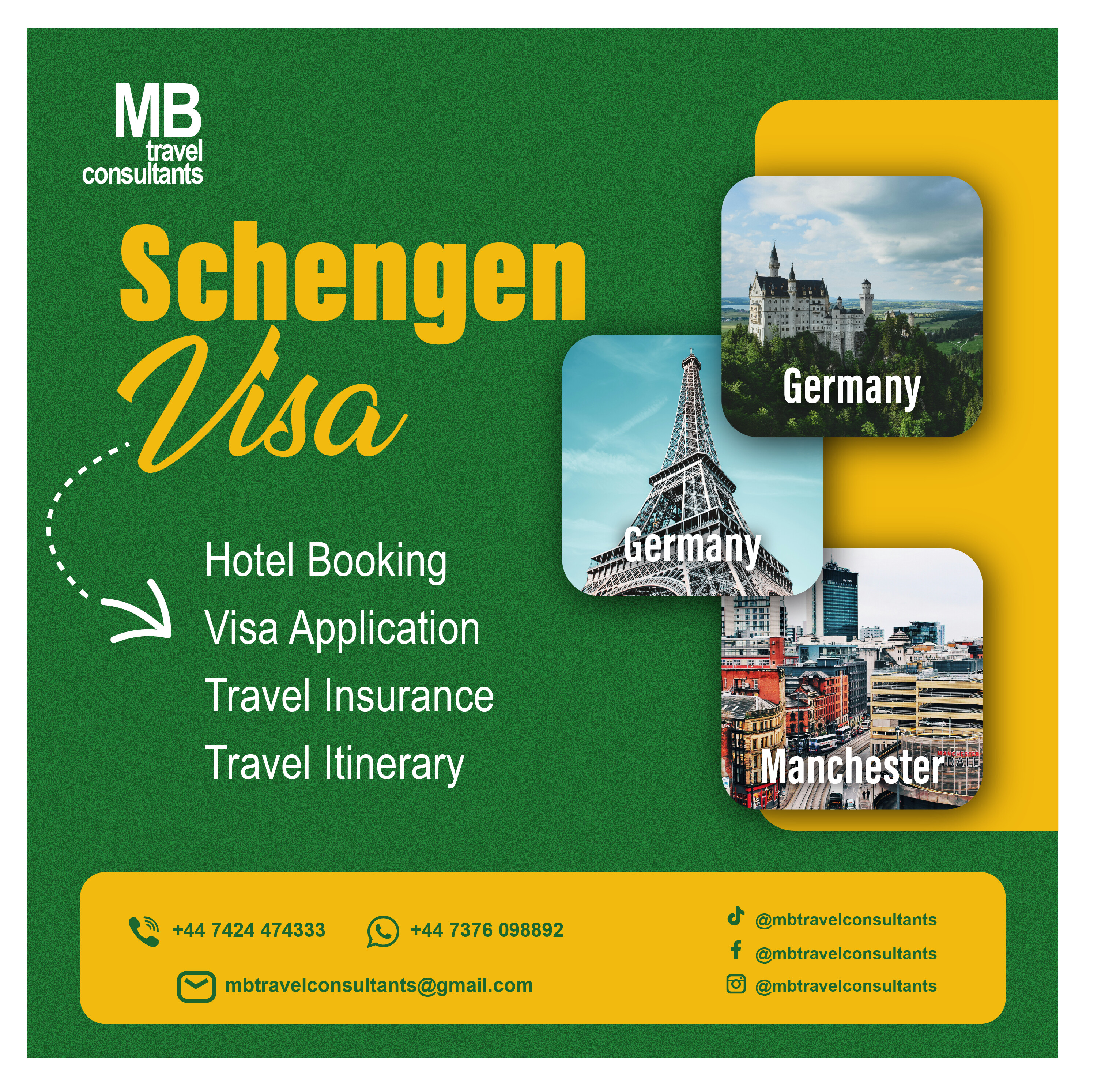
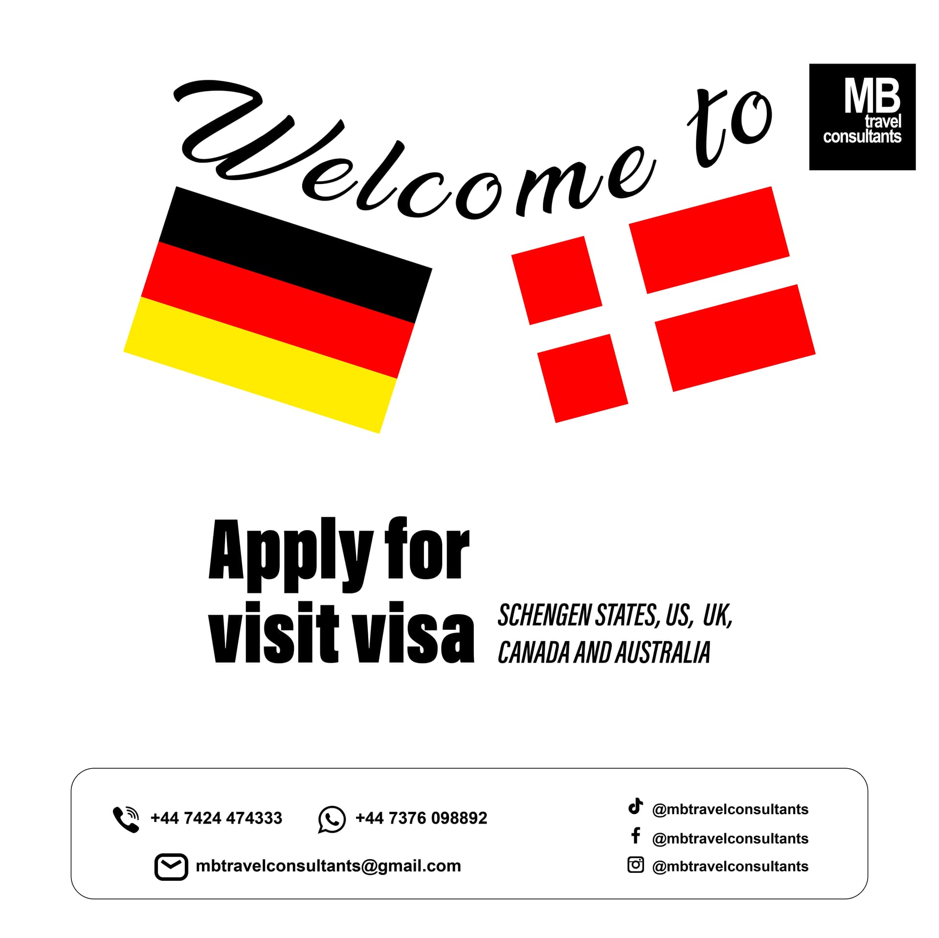
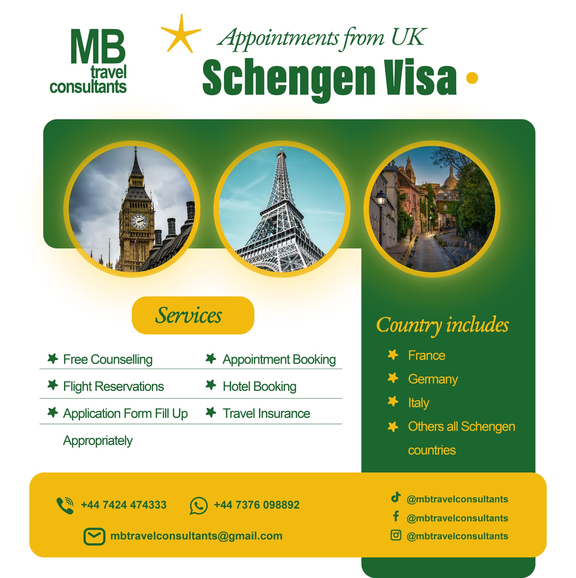
About the Schengen Visa, i think the colors are ok but as this is European Union and UK, the green or yellow (just a suggestion) should be changed for the colors of European Union and UK (Blue, White and Red) or for EU would be Yellow and Blue. About the font of the contact you should make them bigger, they are small should be big (see the size of the country and compare them with the contact letters). For example I like the last design, this is ideal but I would change the colors (for example this is UK) I would change green and yellow and instead i will use red, white and blue.
Usa?? Uk??
1 Like
Of course there we have The United States of Manchester, aka Manchester United.
1 Like
They look OK, but there are multiple issues with the information, grammar, geography, and phrasing.
1 Like
I welcome your feedback. It really helped me to think about my mistakes and avoid them in future.
1 Like
Thanks alot
1 Like
I assume this is your company and you are attempting to create your own ads? Canva? It certainly looks that way. If I am wrong, I apologise. Either way, the following still stands.
I am afraid, I am going to be a little less generous than others. I agree with all they have said, but, going a little further, I find them all a bit predictable and, at times, cliché. I am not trying to be scathing for its own sake here. You need them to do a job. At the moment, they look like every other low-budget home-made travel ad out there, which means, they are likely to get scrolled past as visual noise.
Ideas and emotion sell. Why should someone come to you? If there was ever any sector that should be emotive and dream-selling, it’s travel – even at its most practical and administrative.
You need to stand out from the crowd and speak in your tone of voice, not some, generic, derivative lowest common denominator.
Typographically, they are pretty weak. You need to use it to guide people to the pertinent information and ultimately the CTA. Arial, is just about the laziest choice you could make and screams a PowerPoint aesthetic. If you need to use an arrow to tell people where to look next, your hierarchy isn’t working.
My advice; find a good designer and invest in your business. There is little point in any business having invested everything else into its growth, if all potential customers scroll right on by.
Finally never u/lc UK. It should always be capitalised. It’s an acronym, not a word.
Finally, finally; I can’t believe it’s called a Visit Visa. As far as I knew they are just called Schengen Visas? Perhaps even Schengen Travel Visa? Visit Visa sounds incredibly juvenile. Again, if I’m wrong, I’ll pull my head in, but it feels incredibly toe-curling, to my mind.
Hope this helps rather than deflates.
1 Like
I designed these images for a client. This is not my company. You gave me a detailed feedback. Thanks alot. God bless you.
This topic was automatically closed 365 days after the last reply. New replies are no longer allowed.