Hello everyone, I’m doing a logo for myself.
I’m a motion designer / video editor and I’m not really good in logo design but, after long long different tries, I kinda did this logo thing here…
I like the “wasabi studio” font cause it’s like, written with wasabi sauce, it’s rounded, it’s creamy and it represents well the “wasabi” material.
I like the ninja - wasabi - shittylike thing up the text too, it’s funny, but serious in the same time.
I’m not sure about proportions…
someone can help?
Thank you guys.

A few comments. I’m not a fan of the font. You’ve spelled out the reasons you like it, so go for it. Watch your kerning. The icon looks like a green poop emoji. Chances are, if I see it that way, others will , too.
2 Likes
Without knowing how this works brandingwise, just the visual works okay for me, except I don’t get ‘ninja’, I get ‘demonic turd wasabi studio’. I think if you want ninja it’s gonna need more work. Wasabi AND ninja AND turd may be muddying the branding.
1 Like
Yeah… I know…it seems a green poop…but it’s evil, funny and I like it ![]()
Here is an animation of the wasabi poop
https://www.instagram.com/p/BpSywxtA55k/?utm_source=ig_web_button_share_sheet
I wish someone could explain to me the popularity of a shit emoji.
I personally find it repulsive and if anyone put it on anything to do with food I would steer clear.
I’ll be glad when the “omg poop is funny” craze is over ** rolling eyes**
1 Like
Glyphs like that really ought to be hand-drawn by you, the logo designer. At the very least, you ought to redraw one of the a’s to make it different from the other one.
Like those ahead of me, I too will suggest rethinking the soft-serve poo.
1 Like
Weird but poop wasn’t the first thing I thought of seeing this.
(being a fan of guac, myself.)
But it wasn’t even guac first.
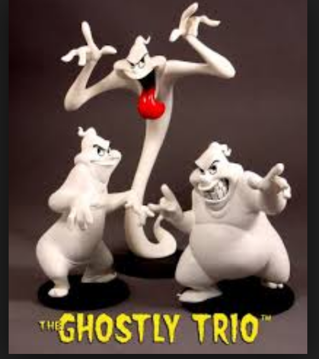
It was these guys
I wish that’s what came to mind for me too! LOL
Social media is having a love affair with the poop emoji. So much so they are making stuffed poops for kids to snuggle up to.
ACK!!
And people laughed at folks who wanted a pet rock. ![]()
On the funnier side though … some older folks have used it thinking it’s scoops of chocolate Ice cream ![]() … now that’s kinda funny … kinda
… now that’s kinda funny … kinda ![]()
![]()
As a logo this design can be ideal for studio. Though design is not very complex but it looks well, but font choosing of the logo is excellent.
One for the plus side of not being on social media I guess.
1 Like
Yeah that’s like the mood I had in mind. The animation of the “thing” will be cartoon like, as I did in the short animation, so the rounded shape and ghostly face like that don’t bother me.
Thanks!
Actually It is meant for a motion graphic studio. I’m ok if the font is not super professional, elegant, corporate like, cause I’d like to do a cartoonish animation with it.
I like the rounding of it all, but maybe I’m little afraid that the font is actually too childish.
Should I see other font alternatives maybe? Maybe a little less rounded and fat?
I wouldn’t want anything that looks like or could be mistaken for poop to be associated with my brand. You may like it but you have to think of how it will be perceived to your audience. You don’t want to be remembered as the company with the baby poop in its logo. Just saying…
You could try contrasting the handwritten font with a sanserif such as Helvetica Extended or something.
1 Like