Thanks Smurf2. Good point. I blew the text up as big as I could and couldn’t read it.
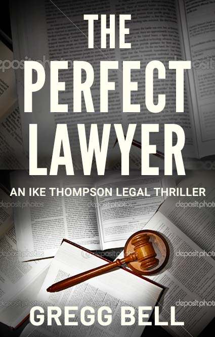
@Steve_O Thanks. Yes, I wrote the book. And yes, the gavel says judge more than lawyer. I went with it though just to nail down the genre.
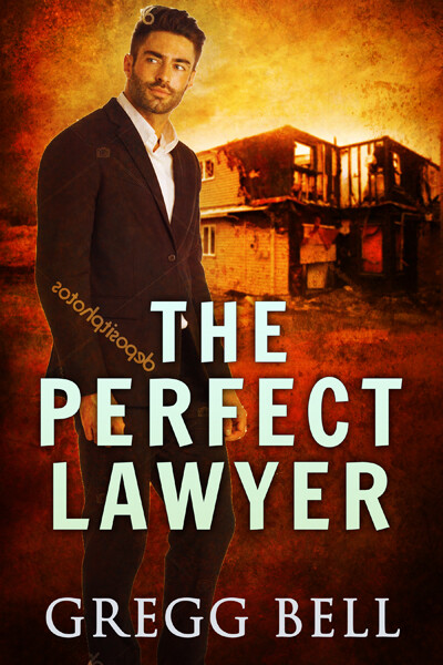
@HotButton Thanks. Actually did some covers (well, the cover designer and I did them) with guys on them. (Thing is The Perfect Lawyer is ironic in that the lawyer is far from perfect.) Here’s the cover I liked the most but it was deemed too much like possibly a romance cover.
@PrintDriver Yes, there are a lot of words. And yes, that image break line is bad, and the scaling, because I did them in a rush.
Considering it.
@CraigB Thanks for the feedback. All good points. One question. The “AW” pairing. I see what you’re saying but that’s the font (League Gothic). Do I really want to pull the “A” away from the “L” and bring the “A” closer to the “W”? And I tried and was unable to (in Photoshop Elements 19). LAWYER looks fine to me. I only notice the kerning issue when you point it out. Won’t adjusting it look odd?
@Just-B Thanks B.
Good memory.
I considered something like that but don’t know if I have the skill to pull it off. (Especially because it looks like my cover designer and I will soon be parting ways.)
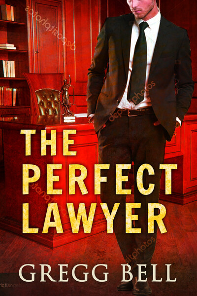
Yes and yes. Was just rushing to get it done as a mockup. I did not refine it because I didn’t see this cover working for the series.
^ I definitely need help with this. Not with using the typography to unify the covers, but with backgrounds and images that definitively say “legal thriller.” We did some covers trying to demonstrate the story more. (A mother is accused of starting the fire that burned her three small children to death.) But they didn’t say “legal thriller.” Eg.
And I didn’t see anyway of connecting that sort of cover, save the typography, to the next book.
I’ve seen legal thrillers series connected with various legal backgrounds. Eg.
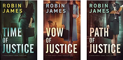
But I would want something to say legal thriller more. Again, especially for the first book.
My apologies, others evidently have better memories than I do. You are the author, so you get the plot!
I think the last example you showed, from an image point of view, gets closer to an expected genre styling, in that, there is some narrative intrigue. That would more likely make me want to read the book, than a more generic cover would.
However, back to my original point – but repurposed. Naturally, you know what the story is about. Has your cover designer read the book?
To my mind, you seem to be focussing on it stating the genre too much. This last one, like the Robin James ones, are not a million miles off the mark if you want an expected, almost cliché genre styling. The name of your book, ‘The Perfect Lawyer’, pretty much gives you the genre all on its own. Beyond that, I’d let the image and styling give specifics and tenor. This is down to your designer to interpret both what the story is about and your style as an author.
The other thing to consider, hopefully to alleviate your fears regarding genre, is physical placement. In either a real-life, or an online selling space, the book won’t be seen in isolation. It will be sold next to others in the same category. Of course, you need it to look as though it is part of that set, but more importantly, it needs to stand out and tell your story – literally.
So, there’s the million dollar question. What will make it stand out? What makes it unique? As with any other book / author. It is them; their story, their style. Again, this is down to your designer to interpret and distill this ‘feel’ into a visual narrative.
I’d say, don’t worry too much about slavishly following type, in the same way, I imagine, you didn’t set out to copy John Grisham’s style when you wrote your book. Of course, you start with a general sense of the genre, but I imagine that you wrote your story in your voice. That, for me, is where the design should be headed, not copying Mr Grisham’s (et al) style, but rather characterising the tone of voice of the book. The visual and writing narrative styles should be the same, or readers will be left confused.
For example – and, of course, I cannot know whether either of these examples are the case, or not – if the personality of the main protagonist is whimsical and sarcastic, that would demand an entirely different visual cover style to that of a dark, brooding narrative. They could both sit within the legal thriller genre, but their covers should be quite different, as they need to give a sense of this narrative approach.
Hence my original question, has the person designing the cover, read the book? Without doing so, to my mind, it is impossible to say what the best approach is. Story and narrative style should always be the guide.
Good luck.
1 Like
I much prefer your imagery in these.
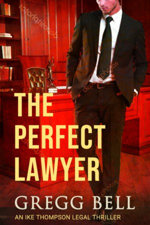
I don’t mind having the Ike Thompson Legal Thriller on it - I don’t know who Ike Thompson is but if you’re into legal thrillers you likely will.
It’s something I think it needs to be on it - just like Robin James has done.
There is a very good reason to choose this one instead of the one with full face. The partial face says “Intrigue/Mystery, etc.” It is well known among artists/designers that a partial reveal of an object stirs up wonder and mystery among the image viewer—the psychology being that humans are intrigued and will want to “finish” the image in their own minds..
@sprout Thanks very much for the reasoned and very helpful reply. I suppose I’m focusing so much on genre for fear of missing it. This cover in particular has several feedback people saying it looks like a romance. (Perhaps having “Perfect” in the title adds to that, ala “the perfect date” etc.)
And no, the cover designer did not read the book. (And we’ve parted ways over this cover anyway. So I’m on my own.)
But does it really need to stand out? Aren’t people just looking for genre? Sure, if it stands out it’s a plus, but standing out and missing genre is a problem.
I’m concerned that first cover
may miss the boat for being considered non-fiction or if considered fiction it will be considered a wordy, stuff courtroom story focusing on documents.
The protagonist (the perfect lawyer) is a guy who was at the top of the legal world who got knocked off his perch (he’s been called “the poison lawyer” too) and after several years down there he has an opportunity to make a comeback.
@smurf2 Thanks for the feedback. I think though that you get into the ‘do we really need to see the lawyer if “lawyer” is in the title’ sort of thing.
@PopsD Thanks for the feedback. Agree that the partial face is best. Another side benefit is that readers will be less likely to say "that guy on the cover doesn’t look like the protagonist!’
Do we need to see Harry Potter on the cover of the Harry Potter books
If you’re doing a series having the same figure that’s recognisable isn’t a bad thing.
1 Like
Not for the sake of it, but yes, in terms of setting the scene and getting people to want to read it, of course it needs to stand out, as a visual representation of your story.
Anyway, I’ve outlined my thoughts on the matter. I would only end up repeating myself if I continue.
1 Like