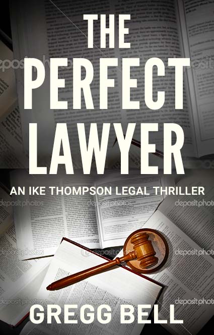
Hi everybody. I did this cover. I thought it was just what I wanted for the first cover in a legal thriller series. But I can’t see the next books in the series working with it. The gavel looks natural lying on top of the documents, but I can’t see any other legal images (scales, courtroom pillars, Blind Lady Justice) working lying there. So I’m back to square one. My goal was to make the covers scream Legal Thriller genre. (I’ve made covers that missed genre by a country mile and am resolved not to do it again.) I’m planning on using template type font placement and the same fonts etc. But any suggestions for the theme? And again, stressing legal thriller genre. Thanks.
Try being led by the actual story, rather than generic clichés. Have you read the book? If not, I’d suggest doing that.
This should always be your first port of call when designing a book cover. Your job is to capture the flavour of what the story (or subject) is about, well enough, so as to make people want to open the book and read further (without giving the game away, of course).
With your cover, I know the genre, but nothing of the individual story to make me want to open it. It’s evidently about lawyers (or auctioneers ![]() ), but so are a thousand others. This story is unique (I assume). What makes me want to open it? Is there tactical, legal intrigue? Is there murder? Is there a protagonist with a particular personality trait, etc, etc? Currently, it is OK (depending on the market), but all a bit, generic mass market and remaindered. It’s just not all that ‘thrilling’.
), but so are a thousand others. This story is unique (I assume). What makes me want to open it? Is there tactical, legal intrigue? Is there murder? Is there a protagonist with a particular personality trait, etc, etc? Currently, it is OK (depending on the market), but all a bit, generic mass market and remaindered. It’s just not all that ‘thrilling’.
With regards creating a series style, you should be able to do this with typographic, photographic and general visual styling. If it is a specific series, with a specific hero, or heroine, then even a series logo(type) my be appropriate. Think 007 – though this usually comes later, once you gave an established series / character.
I think this needs to tell more of a story. Then you need to establish its market. Is it trade fiction, mass market, online, ebook, self-published, or have you been commissioned by a publisher? All of these things will affect how it is designed, but start with an idea and start with the story itself.
Good luck.
3 Likes
You also need to be careful about the legibility of the text in the books on the cover. Can they be read? Will a lawyer know what these legal texts are - are they pertaining to the book?
For example, the text in the books on the cover could pertain to taxation laws, and the book is about anything else not related to taxation.
(I’m only saying this because this happened to me before. I did something similar and didn’t realise the text wasn’t relevant to what it was all about.)
2 Likes
I believe Tag is the author of the book.
1 Like
I think @sprout’s comments are right on. Come up with something unique rather than a cliche stock image. Also, the gavel says “judge” to me more than “lawyer.”
Then I guess, knowing the salient points of the plot won’t be too much of an issue!
1 Like
A few things I’d consider:
A bit on-the-nose, maybe, but the title subject is a person. That’s what I’d put on the cover; something to bolster the readers’ mental image of the protagonist—perhaps just some “perfect” part of him (assuming it’s a male character)—with a little dramatic lighting, maybe along the lines of this quick-and-dirty suggestion:
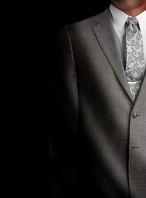
Photo credit: JoS.A.Bank Reserve Collection
The other thing is getting the word “thriller” off the cover. While I get the reasons for having it there, to me it’s a bit like putting the word “brochure” on the cover of a brochure. Plus, it’s up to the reader to decide whether there are thrills to be had; not the author.
2 Likes
James Paterson often has ‘Worlds Best Thriller Author’ or something like that on his covers.
Having the word thriller on it is not an issue, in my opinion.
There’s no need to be so direct with the images.
1 Like
Too many words.
The imagery of the books is far too busy. The title does not read over them.
Having all that text begs the buyer to look at it and try to read it. It could be frustrating if blurred, or annoying if not story-appropriate. And the image break line is also annoying since you also decided to change scale there too.
in the words of my college GD professor, “Do Over.”
1 Like
A google image search reveals some overall designs in the genre that your design generally lacks.
- Higher Contrast
- Dramatic Lighting
- To some degree saturated and monochromatic color schemes or at the least a vibrant focal point of color
This is not to say that you need to 100% duplicate or follow what this Google search seems to indicate is something of the norm. But I do think it is important to be aware of it. Also, quite a few of the covers play with tighter crops that are off center (to create some visual interest/suspense), or more wide shots (usually the wide shots are with silhouettes of people).
Your typography is also pretty average. Nothing wrong per se, but the hierarchy is off (an ike thompson legal thriller for example is a little too large IMO) as is giving it all a little breathing room from the edge of the page. Even if it is a digital cover, the text (once again IMO) comes too close to the top, bottom and sides of the image.
Line spacing is off on the header. The amount of space between “the” and “perfect” is different than “perfect” and “lawyer”. The kerning needs overall attention, but specially on the “aw” pairing in lawyer
Lastly it looks like you have composited two photos together, while that in itself isn’t bad, they don’t really mesh well, especially since it causes two vastly different sized books being used making it look unnatural.
Most of the books in the google search through the contrast, through the obscured or silhouetted faces and people cause some intrigue, some tension. IMO that is what you need to work more towards.
1 Like
Yeah I know, and I’ve advised him to ditch it too. It’s tacky, and soon enough tacky will fall back out of fashion.
But thanks anyway for critiquing my critique. Here we go again.
Sorry, I didn’t mean to offend.
No meaningful offense taken; just my self-flattering inability to swallow the discourtesy of a post that appears to be dedicated to the direct repudiation of mine, immediately preceding.
Terrible etiquette for a forum…
I held off my response because I wanted first to read what others said. I expected diversity in the responses.
I think the cover is OK but could be improved — especially since you intend it as a template of sorts for future book covers in a series.
The cover is much better than those I remember you posting a few months back. If I remember right, you’re the author. The cover is good enough that criticisms tend to focus on details and personal preferences rather than fundamental flaws.
So here’s my opinion that I’ll toss in with the others.
I like the grayscale treatment, which enables you to use color to focus on something you want to stand out — in this case, the gavel. However, the gavel looks a bit lonely and anemic. As you mentioned, you’ll have trouble finding additional solutions in the series using the same formula. A possible way around this would be to make the gavel larger and treat it as a separate, superimposed object that doesn’t exist on the same visual plane as the background books and isn’t part of the same photo (difficult to explain). This approach might better enable you to add scales, robes, or whatever else into similar positions on future covers.
The books at the top of the cover are larger than those at the bottom. It’s apparent where you spliced a couple of images together.
Even if you solve these problems for this cover, I think you’re boxing yourself into a visual corner. You’ll constantly find yourself looking for just the right photo that fits within the preordained formula for future covers in the series.
A better way, in my opinion, might be to use similar-looking images with a similar visual flavor (not necessarily similar subject matter) as backgrounds and concentrate on the typography to unify the book covers’ personalities as part of a series. Sprout alluded to something similar in his critique.
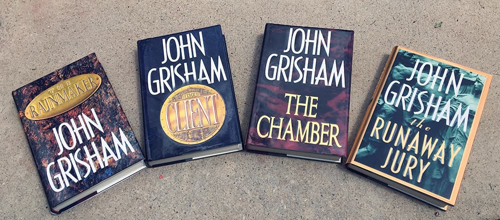
Since we’re discussing legal thrillers, here’s how four John Grisham book jackets dealt with the problem in a similar way. These books aren’t part of a series, but the designer, Whitney Cookman, made an effort to visually brand the books with a John Grisham look using typography and similar ill-defined and unresolved images as backgrounds to create a certain amount of desirable tension for a legal thriller.
I’m not saying this is the only solution — hundreds of other equally viable or better solutions exist. Instead, I’m primarily pointing out a few things that I see as problems and suggesting there are ways around them that might better lend themselves to future covers in the series.
1 Like
Removed
You have some really good advice so far! Kudos to my peers! I agree that the cover does not communicate “Thriller” me.
I do like the photo of the man in tie and coat, but perhaps with a small splash of blood on the shirt. But even saying that, it sounds like a cliché. I’m sure you can come up with something more creative than that.
One more thing, I don’t think the John Grisham cover style would work for an unknown writer. He is so well known by now that he only needs his name to sell books.
1 Like
Just to clarify, I wasn’t suggesting the author run his name huge (at least until he sells as many books as John Grisham). That would probably be a bad idea. (Although Tommy HIlfiger did exactly that with his line of clothing to make himself famous.)
What I’m suggesting is that consistent typography combined with visual imagery that shares a similar personality and flavor can connect a series. The subject matter in the photos across a series can be wildly different as long as their visual personalities are similar and each matches the gist of the novel’s story.
Just-B — Agreed
Thanks sprout. I’ve written the book. Now I’m just trying to settle on a cover for it. I hear you about telling more of the story, but really, with this cover I was just after getting the genre right. Agree that it’s not much thrilling.