A logo for a tech startup. Dropup data is the company name and dropup is the product that eables users to upload exel data to SAP with one click
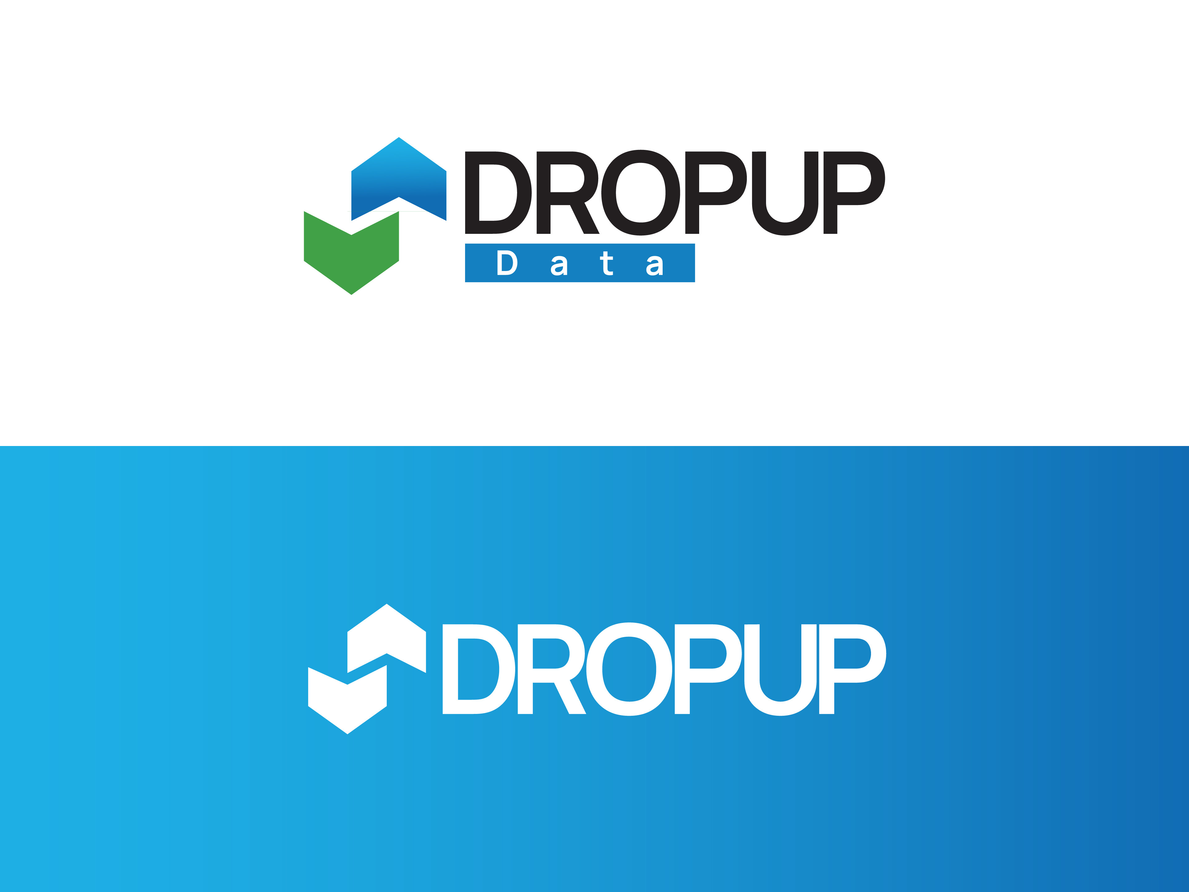
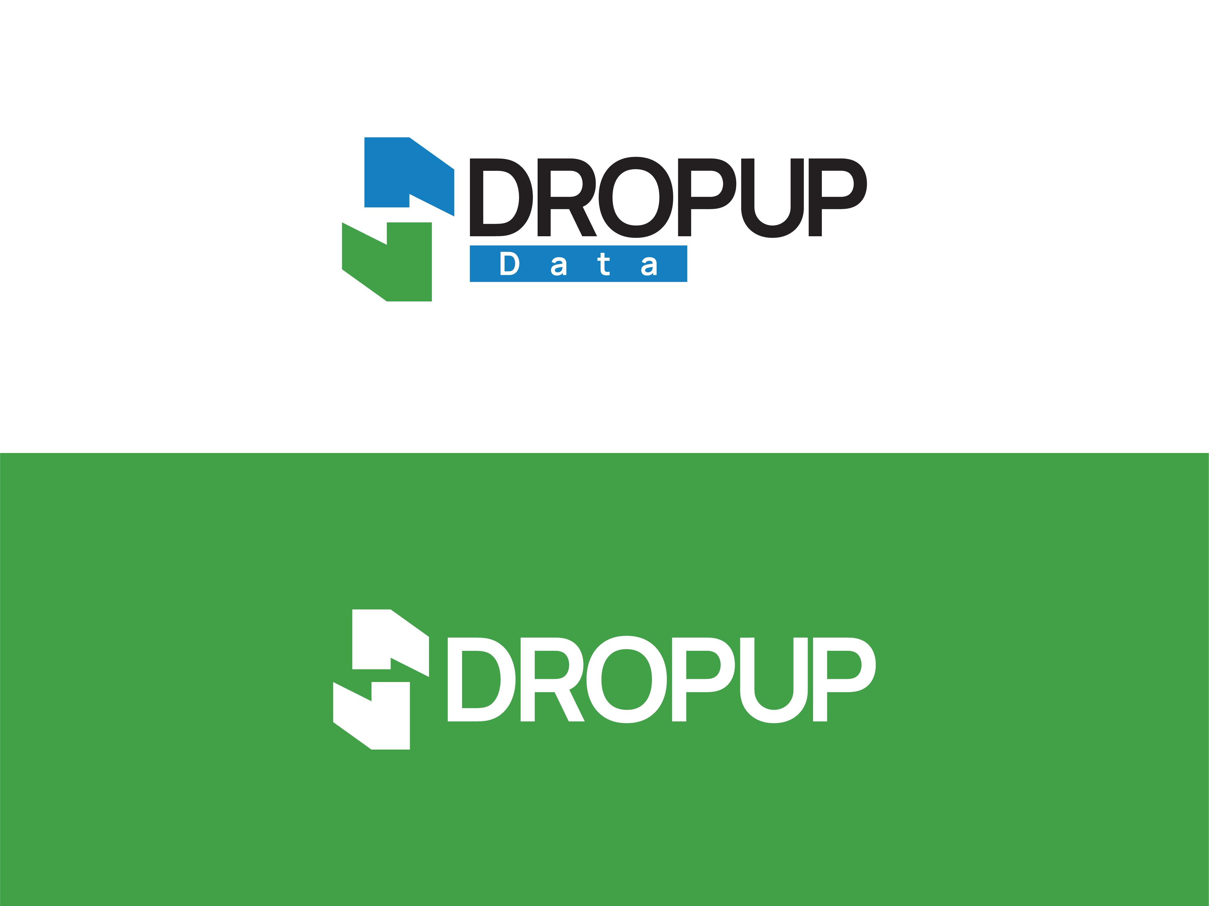
I like the blue one and green one, but checking with AI tool, it seems that blue goes more for tech stuff.
I like the logo in the top two because it implies both drop and up in the most minimal way possible. Good job.
The way you’ve used the word Data is a bit clumsy, though. Is it necessary? If so, I’d probably spell it out in the same typeface (but not necessarily the same weight) and point size as the word Dropup.
1 Like
Not so sure about others, but to my eyes “PUP” hit me first.
Not your fault of course.
Baseline shift ‘UP’ for the up effect and sepearates DRO-PUP so it seperates the word.
Oh what fun people will have deciding if the the DROP is lower or the UP is higher…