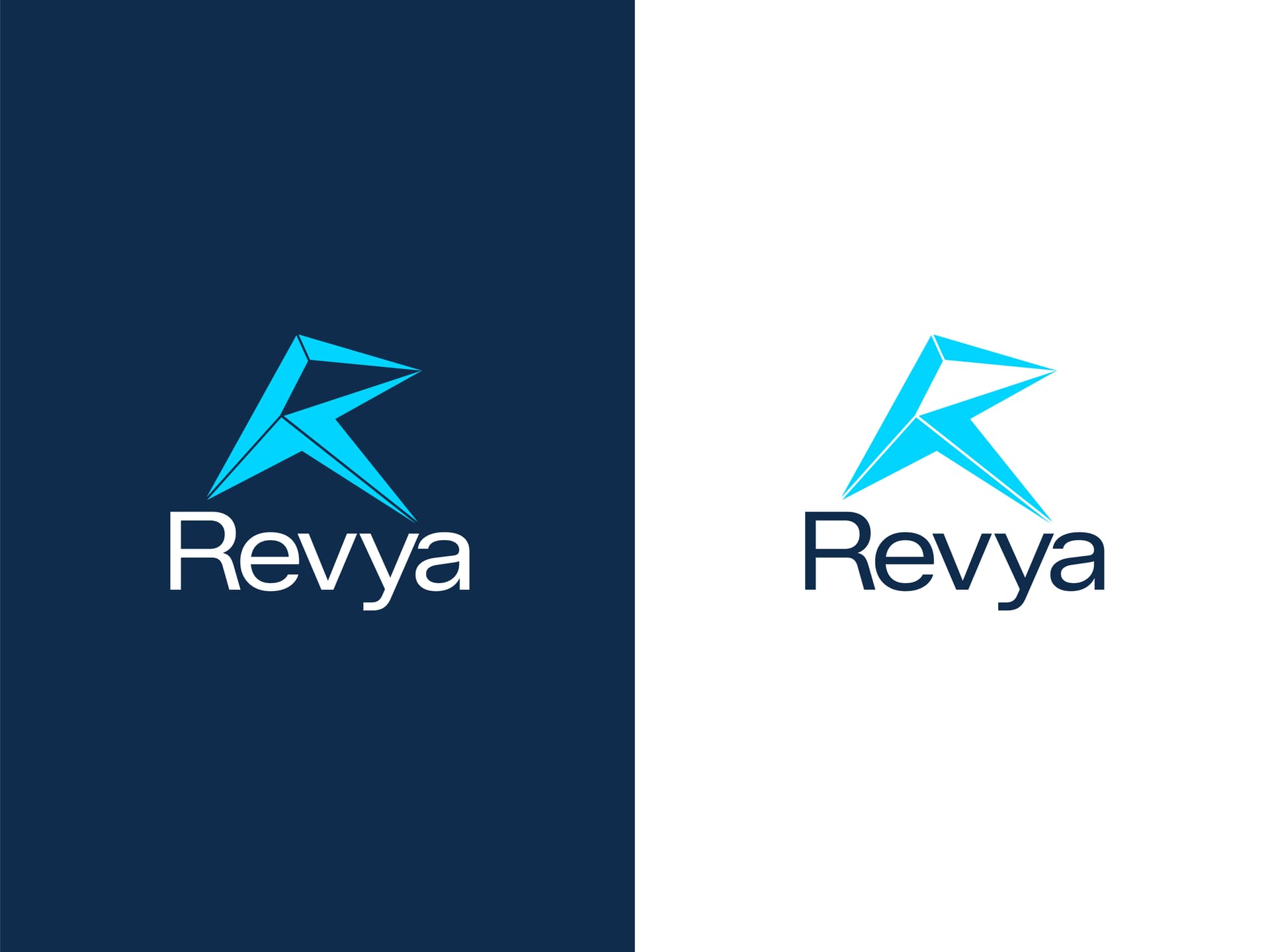
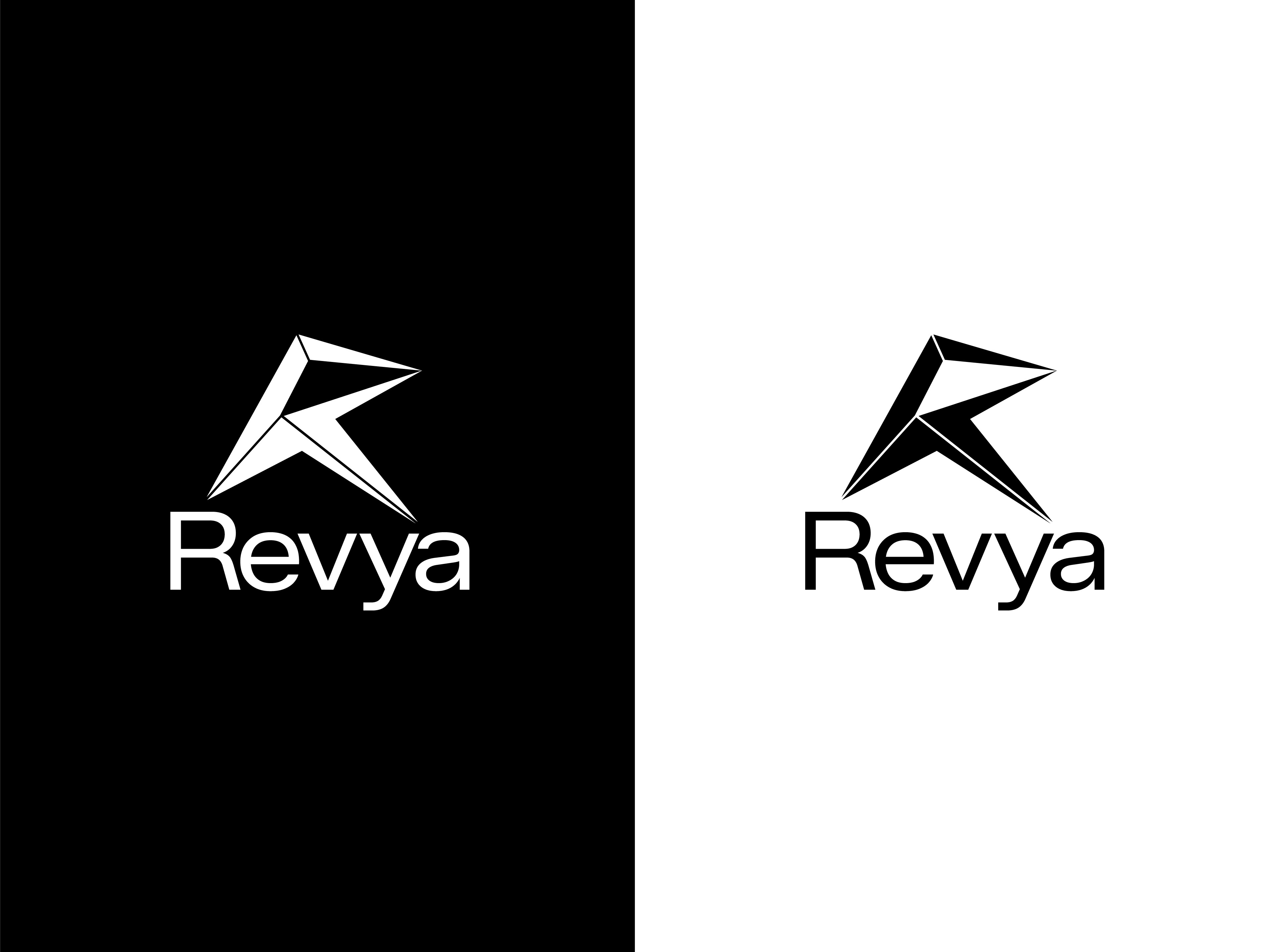
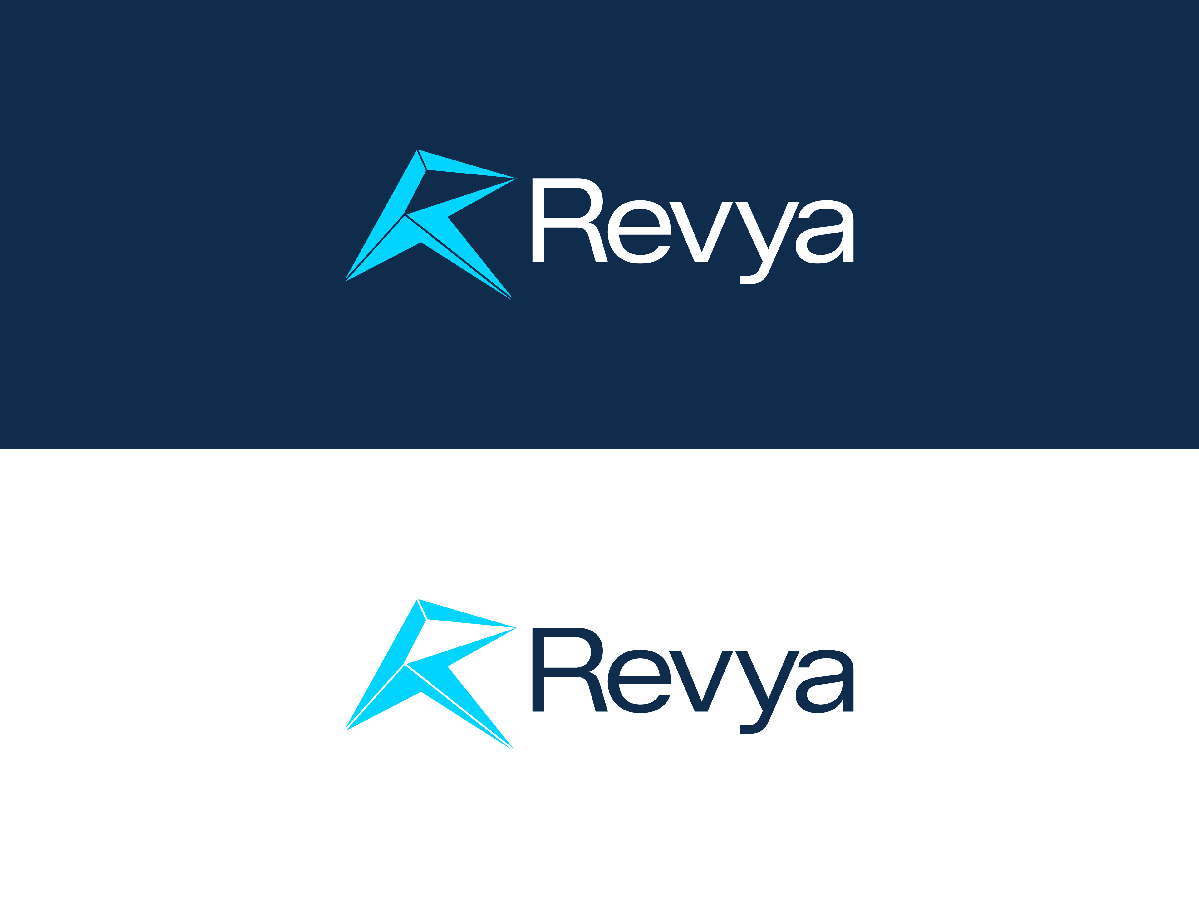
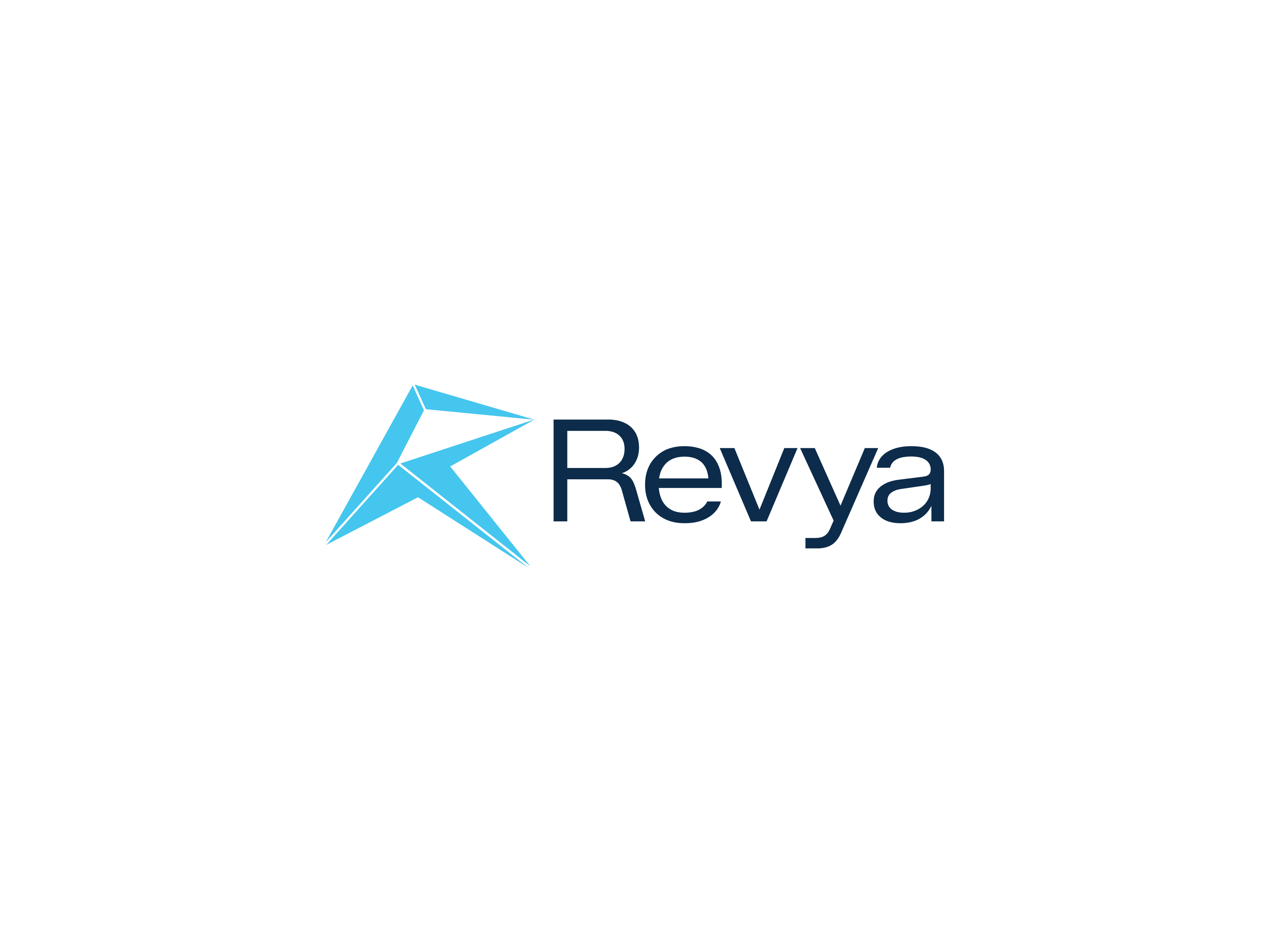
Company Overview Revya is a B2B digital marketing agency dedicated to the hospitality industry. We help hotels increase their revenue through data-driven strategies and modern technology. Our target audience consists of Hotel Owners, General Managers, and luxury hospitality professionals.
The Vision & Design Concept We are looking for a modern, geometric, and professional logo that balances “Corporate Trust” with “Digital Velocity.”
We have a specific direction in mind: We want a symbol based on the letter “R” that subtly incorporates the concept of growth/ascent.
The Symbol: A stylized “R” that integrates an upward arrow or a rising bar chart. The negative space or the legs of the “R” should suggest movement upwards (right/up).
The Vibe: It should look solid and architectural (like a hotel) but also fast and dynamic (like digital data).
I like the logo, but those fine lines separating the different sections will cause problems at smaller sizes. In addition,
I’m not a fan of the typeface you’ve chosen. A geometric sans is fine, but the one you picked isn’t well-designed and isn’t up for the job. In addition, the large space between the v and y is problematic, as it would be using almost any typeface. For that reason alone, I’d probably use caps.
I’m just a student, still learning so I hope I’m not saying anything stupid.
But the “R” symbol reminds me of italics style and just makes me feel … uncomfortable. Maybe if it could be straightened and the bottom part of the R less wide, it would still show upward arrows, just a little narrower.
I mean this for the ones with the R before the word “Revya”, not above.
Well, I think you’ve nailed it as far as the desired properties described in the briefing are concerned. I thought it was architectural before I read it.
As for the thin spacing between the elements in the R and the font, I agree with Just-B.