I’m relatively new to design.
I’m mostly self taught but going to start school for fall semester.
Doing commissions already, but I stated my own apparel designs as well.
I have 2 designs that I’d like some thoughts on:

Thank you in advance.
I’m relatively new to design.
I’m mostly self taught but going to start school for fall semester.
Doing commissions already, but I stated my own apparel designs as well.
I have 2 designs that I’d like some thoughts on:
Thank you in advance.
Yeah, that’s a good way of explaining your work. You have some artistic inclinations, but get ready to have them ripped apart and reorganized once you start school this coming semester.
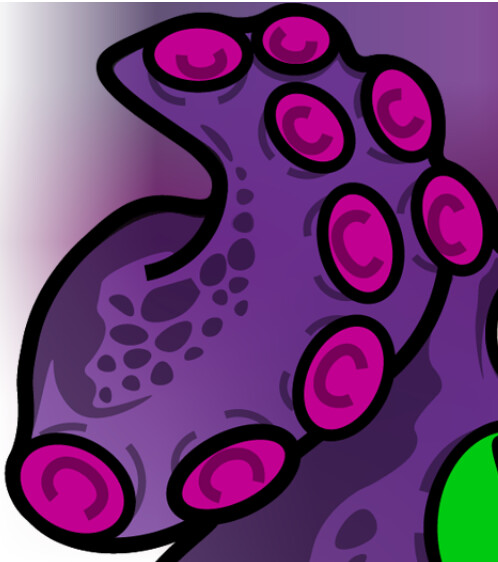
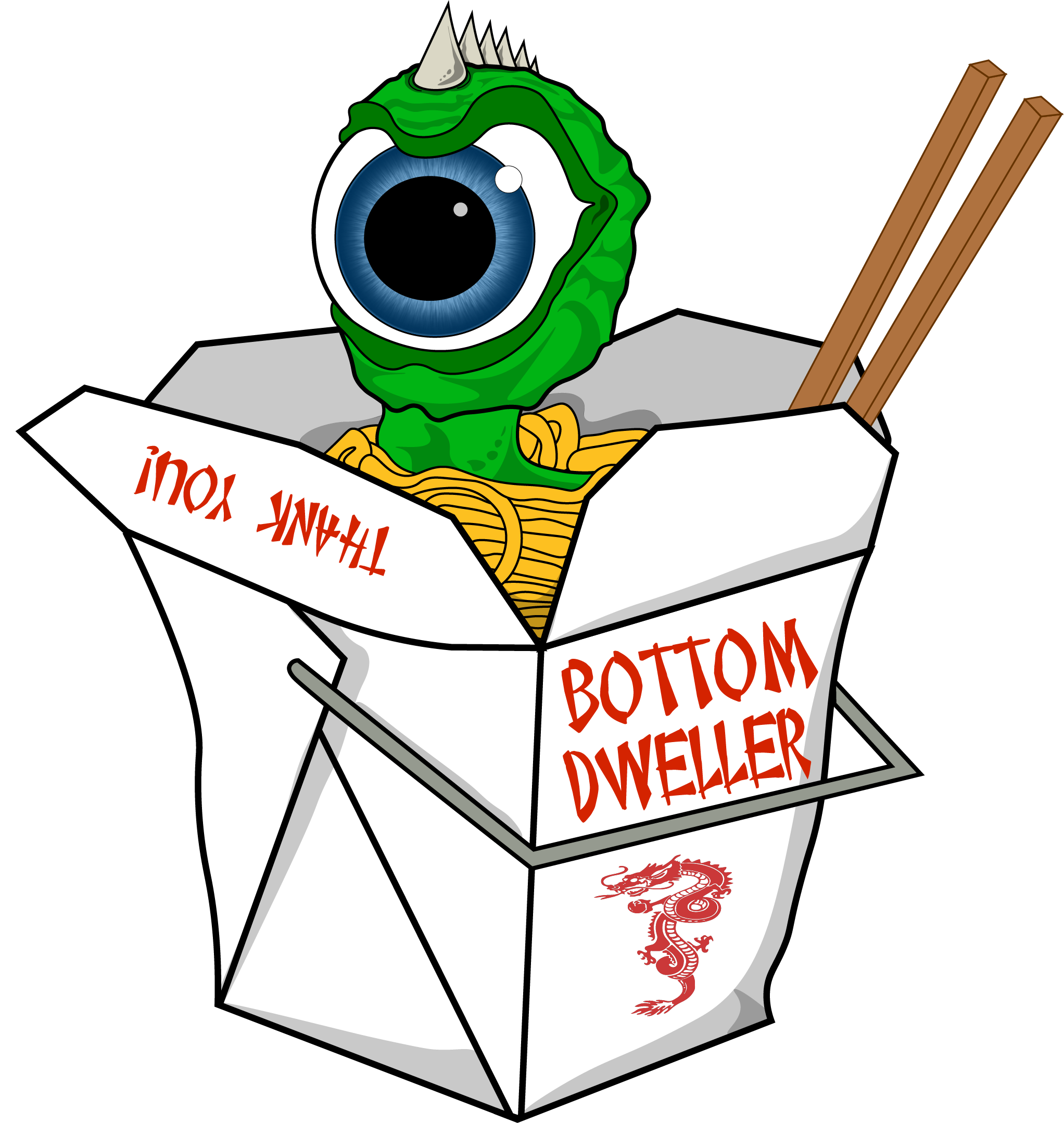
Giant eyeballs with horns or octopus arms in an ice cream cup will likely be ripped to shreds in your upcoming school critiques. Look up Big Daddy Ed Roth’s artwork for examples of what not to do. Then again, he became famous doing this kind of thing.
It’s the kind of artwork that appeals mostly to adolescent boys, but doesn’t extend much beyond that. As I mentioned, be prepared to have your artistic preferences challenged.
I really dig the work of the kustom kulture guys: Roth, Dutch, Willians, others. This makes me want to go pull my Rat Fink short out of the dirty clothes and put it on.
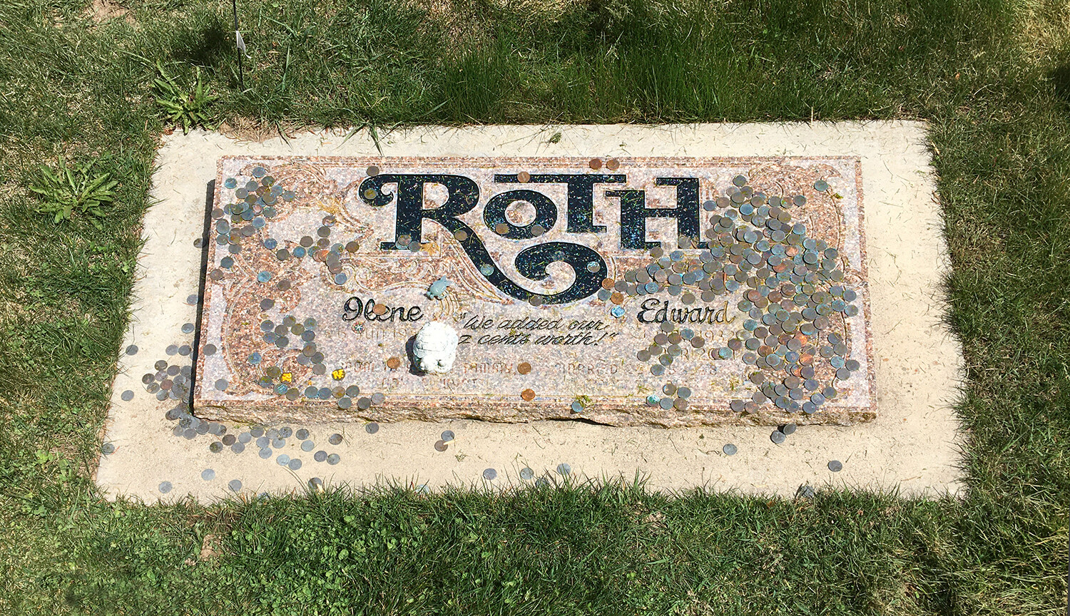
Ed Roth married someone in my little hometown of 2,000 people. He lived the last several years of his life there while driving around in an old horseless carriage sort of contraption and wearing a top hat.
His widow holds an annual Rat Fink Festival at their house each year in June, which attracts several hundred people from all over the world. I keep thinking I should attend, but I never have.
He’s buried a couple of hundred feet from my parents’ grave. I snapped the following photo of his gravestone a year or two ago.
As for the original post, I’d classify these as illustrations rather than graphic design. Sorry, I’m not particularly digging either one of these, and I would not wear a shirt with this art.
That said, you are just now beginning your journey. Why the rush to launch your own apparel line before you’ve even had formal training? You have a lot to learn and will learn a lot from a formal education. These are fine for self-directed learning exercises, but I think you’ll look back on these illustrations some day and wish you’d waited to launch an apparel company until you had some more experience under your belt.
Just my two cents.
Those are illustrations (not very good ones I might add). What has design to do with them?
Dammit, you beat me to it by mere seconds.

Funny. Very funny.
I needed that.
Thanks for the input.
I should have said I’m playing around with apparel type designs under the name “Bottom Dweller.”
I didn’t expect to hit home runs right out of the gate, not even get on base for that matter so what you said about my art not even being good isn’t going to be a bother. After all, look at an artist like Monet ![]()
I am a young kid following the foot steps of artists such as Jimbo Phillips and Roth so I can totally see why that was a mention.
I neglected to mention that since I’m enrolling in school I’d like to see all of your opinions to even see if there is potential. This is how far I’ve gotten without formal training.
Thanks again,
Please don’t take our criticisms as condemnations. At one time or another, we were all beginners. I wouldn’t have bothered to respond if I didn’t see some talent. When I was in high school, I’d try copying illustrations out of Mad Magazine (with varying degrees of success). There’s nothing wrong with what you’re doing at your point in life. It’s fine and shows promise. On the other hand, your design program will challenge you to do things differently. Keep an open mind about it and soak in everything.
Are you sure you know what graphic design is? Eriskay asked what your illustrations had to do with graphic design. You referred to Monet. Graphic design is about visual communication — typically in the service of clients or employers trying to influence target audiences in various ways. It’s not about art, nor is it about illustration. Yes, graphic design can be artsy, and it can incorporate illustration, but it’s different from either. It’s definitely not about self-expression or making cool things, even though it can be, when appropriate, cool and satisfying.
Yes I realize that this is a graphic design forum and I do know the difference between illustration and graphic design. But because I didn’t have a whole graphic design gig to present, I showed what I’ve been playing with.
Your input was by far the most helpful. I literally didn’t know how to strike a line in AI 6 months ago, this is just the beginning.
Once I get a more refined craft, I will bridge the gap between illustration and graphic design I’m sure.
Maybe this was the wrong place to put feelers out for what I thought was the beginning of something much, much better.
I draw on surfboards and work in a construction union for 70 hours a week so far, that’s it. Not trying to taint the graphic design community just yet lol.
Don’t worry about it. You’re doing fine.
You posted something in a graphic design forum where the first three people to respond probably have well over a hundred years of combined experience. We sort of tend to see things through that bias and judge everything accordingly. You also posted in the critique part of the forum rather than the student part, which invited a critical analysis.
You wouldn’t have any reason to attend school if your work was already flawless. Seriously, though, get used to the critiques because you’ll get plenty of them in school Learn to accept them as other people trying to help instead of criticize. That way, you’ll learn from them rather than getting discouraged.
I’m going to say something good now: your first illustration show an inherent understanding of foreshortening and perspective. You didn’t learn those things in a construction union — from drawing on surfboards, maybe. But my point is you’ve shown the ability to do something that many art students and professional designers have difficulty with. I’m specifically referring to this…
Very cool illustrations. And they show you have a firm grasp of linework, shading and color, not something we see here too often from a beginner. I suspect you are used to drawing though and only are a beginner at using Illustrator as an art tool.
I don’t know if it’s a stylistic thing, but maybe next on the list to learn in Illustrator is the variable stroke width tool and not ending strokes in square ends.
Also be careful if you are using stock images in your pieces, even for stylistic tracing (not saying you are but the ice cream cone and Chinese dragon jump out as stylistically different enough to ask questions.) Always be aware of your stock sources and pay attention to the copyright requirements of using them. Even Creative Commons stuff often cannot be used for money-making ventures, even if they are “personal” projects.
Other than that, good illustrating (it helps that I’m also a fan of Roth’s Rat Fink art.)
Thanks for the review! This was on point with what I needed to hear. I understand there is a ton of room for improvement, trust me. From an artistic background I thought I had an ok grasp on certain things though, so that’s really good to hear.
The waffle cone was an actual picture of a waffle cone that I image traced in 3 color option and then traced it with black outline.The dragon wasn’t mine at all but it claimed to be “royalty free.” I planned on doing my own little design there, just haven’t had the time. Everything else was custom work.
My squared lines are definitely not exactly what I want. I have yet to take the time and look up how to round those lines off? Anytime I’ve needed to do that I’ve just used curvature tool which is a pain.
After certain comments I started doing logo prompts. Hoping to practice more graphic design instead of illustration.
Here’s examples:
In your Illustrator Window> Stroke palette, there is a generic option for rounding your stroke ends. But the variable width tool in the tool palette can be your friend too.
You’ll eventually find that looking at logos with no context in which they were conceived is only gonna get you a “that’s nice” type of critique. A logo isn’t a pretty picture. It’s part and parcel with an entire branding concept developed for a company’s public facing identity. There are also logo mechanics that have to be taken into account. I’m a sign guy and I hate skinny fonts and skinny line art, especially when being asked to laser cut acrylic or even cut sign vinyl. You also have to consider how it might be made into a 3-dimensional sign on a lobby wall or embroidered on a hat. On the printing side, the more colors there are, the more expensive it can get. I’m happy you didn’t fall into the gradient trap on the rocket one. But some of your interacting spaces, particularly where the fin meets the crescent, need to be given some thought. Either do it, or don’t, but don’t make it so close it appears indecisive.
Very good advice. My tattoo artist always says to just commit/lay it down with conviction.
Thanks for the awesome tips!
One last bit of advice when it comes to logos and signage, consider your signblank.
Think about your negative space as if you were going to have to put the logo on a board hanging from chains in the wind. What would the shape of that board be? A lot of times it’ll be a shape in white that isn’t seen until the logo goes on a color other than white (which is also a consideration to keep in mind.)
Can’t tell you how many Fortune 500 company logos don’t consider the signboard until we’re making lollipops to hang their TM symbol off some other element of their logo…because “it’s gotta be there.” Unattactive.