Please I need your comments on the designs below which I created for an imaginary company which offers flight services. It isn’t a real project but need your comments on them. I believe it would help me to move in the right direction as a young designer.Uploading: SF.jpg…
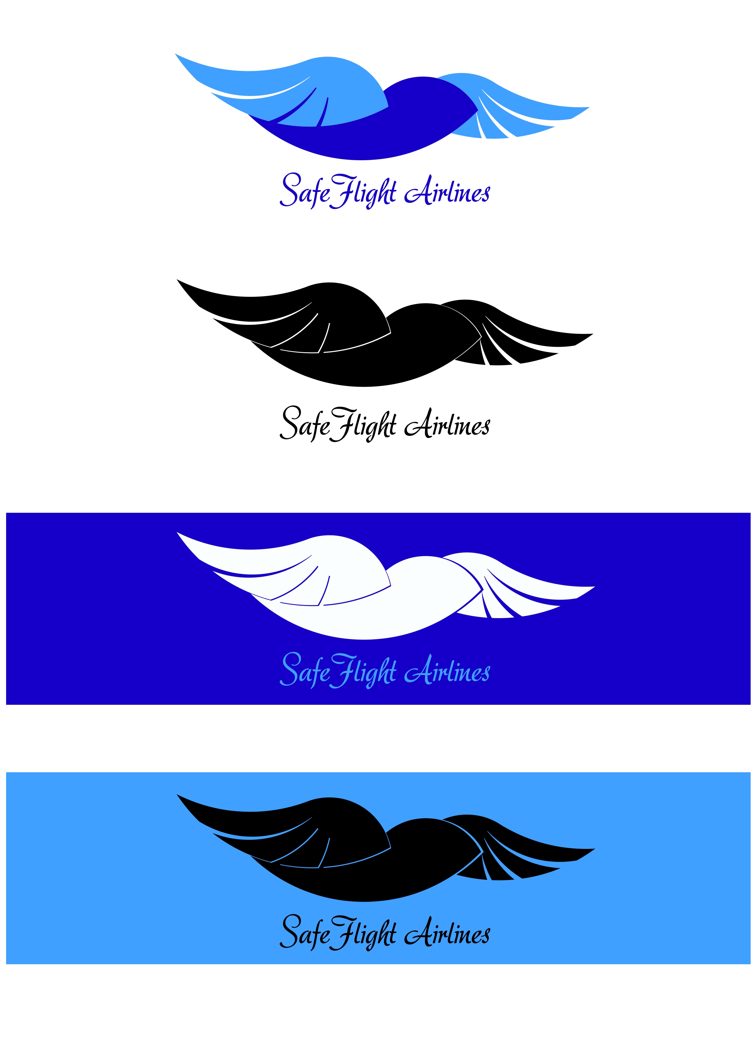
This is the logo and some variations I created. The primary logo is the first one in blue.
Safe Flight Airlines is an imaginary airlines company which offers flight services to both short and long destinations.
The logo is designed in the form of a bird soaring up into the air with its wings spread out at a very high speed. I decided to create a logo which depicts a bird flying through the air instead of a plane which is about to take off or flying through the air because I did not want the logo to look ordinary. And also birds are animals that can always be seen in the skies 24/7. Which means the company operates every day.
The idea behind the creation of the this company’s identity mark are as follow. We know that birds are animals with feathers that fly through the air. The mark depicts this attribute of a huge bird flying at a very high speed towards a destination. This signifies how greatly the company values time, and, thus, sees to it that people who travel by their company reach their destination on time irrespective of the distance.
The strong and widely opened wings do not only represent speed, but also depict safety too. Birds use their wings to protect, shield and guard young ones. This signifies that traveling with this company is safe as the name suggests.
The color “blue” is chosen based on its cool nature. It denotes that the company’s operation in flight services offers nothing but only the best experience and comfort.
I quite like it. The only things that I might tweak a bit are the fine lines in the bird. They will disappear when scaled down.
Also… love the Adore font … but, it might come off as a bit feminine. (think flower shop or bridal boutique) I would probably try a sturdier font to see how it looked as well.
I like the bird, but the thin lines won’t work. As RKK already mentioned, they’ll fill in at smaller sizes and probably don’t look quite right at any size.
And again, I agree with RKK about the script type. It’s nice, but probably not appropriate for an airline. If it were me, I’d pick something more legible and with less of a feminine personality. I don’t remember seeing an airline using a script face before, so it would stand out (which is good), but I’d still change it to something else.
I’ll give you an A for effort and commend you for putting your work out there for public scrutiny, but I don’t think this is ready for prime time.
Unfortunately, the color blue plus a graphic bird makes me think of Twitter. I hate that they own that, but I can’t help but think “Twitter” when I look at this. Also, on the bird, it looks like a sparrow. When I think about sparrows, I think of small birds that are darting here and there and constantly changing altitude. Compare that to a hawk or eagle that steadily and majestically soars. Which is a better symbol for an airline?
As others have said, the script face is probably not the ideal choice for an airline.You also need to really watch the type when developing branding – or corporate identity as us old farts used to call it.
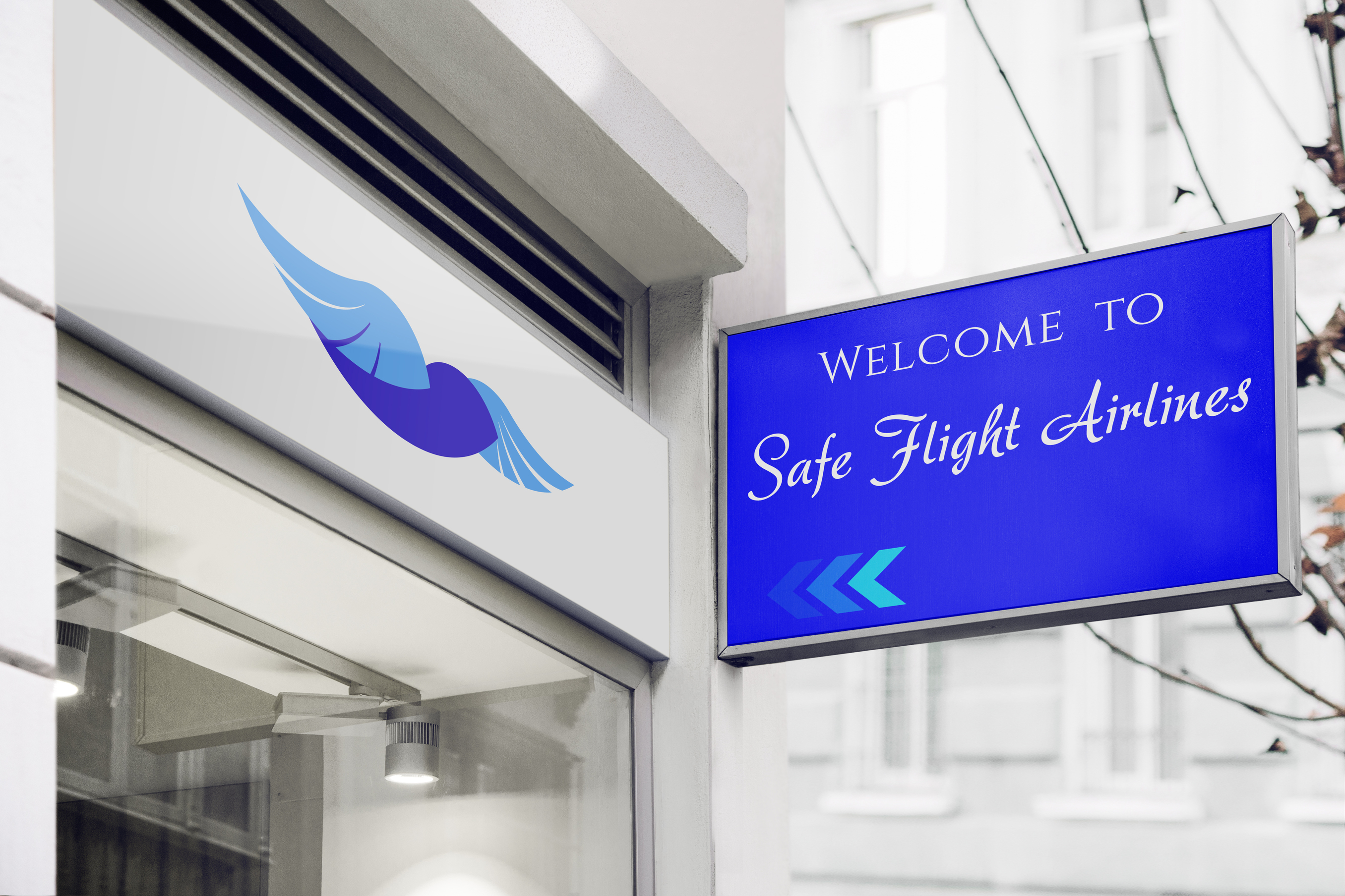
Take a look at the sign mockup. See how much space you have between “Safe” and “Flight”? Now look at how much word spacing there is between these words on the image with the four logo variations. The words are really tight. The type should have consistent kerning and word spacing at all times. On the example with the four logo variants, you end up with a funky space between “Flight” and “Airlines.”
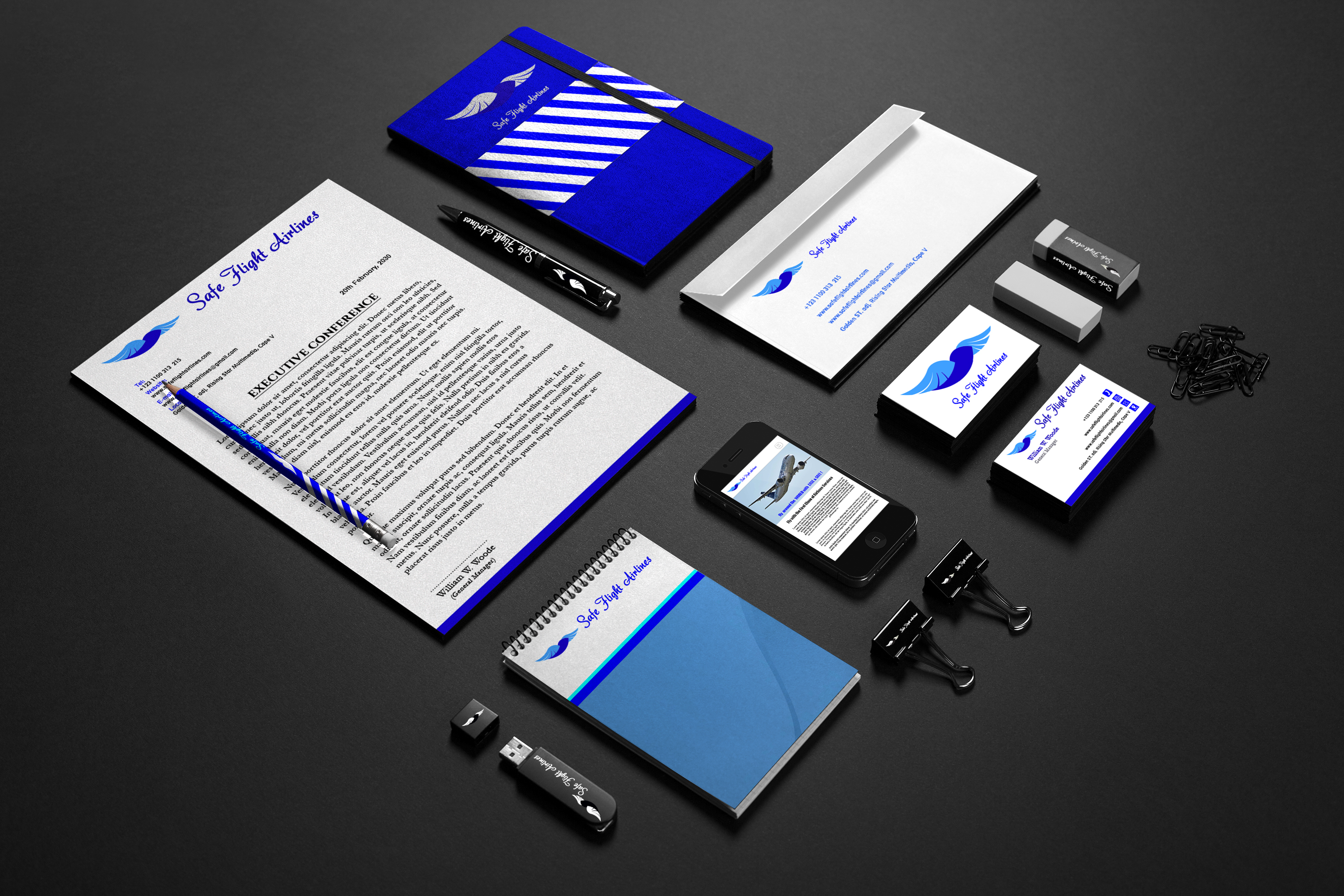
When looking at the stationery mockup, it looks like you need to work on your balance and composition.
In general, I’d recommend you stay away from these type of Photoshop mockups until you have a rock-solid logo. It’s a little too easy to become enamored with a logo when you see it in a slick mockup.
To close this on the positive side, I like that you’re thinking about what the logo will look like in color as well as black and white and with different shades of blue as a background color.
maybe make airline the script type and SAFE FLIGHT a san serif, (no curves) and protrude the bird to a plane and clouds underneath with a circle.
but do not despair, I have to create some mock logos for a comic strip one of these days, and know how fragile the attempt can be.
I like a lot here! I am a student new to design but the one criticism I may have is that it might be a tad too complex. People have mentioned the fine lines being an issue, I also think they complicate a little. Logos that shine the most almost always seem to be the simplest.