Hi there , i’m designing this poster for my portfolio i hope you guys give me some feedback.
Hi there ![]()
I’m not very good in giving critical feedback, but whatever.. ![]()
I like it tho, only thing I’m wondering is, why did you choose to get her a pink taint?
It’s a nice looking poster, but it seems to serve no particular function. Nobody commissions a poster about nothing. Graphic design is almost always about visual communication aimed at a target audience with the purpose of helping to solve a problem or achieve an objective for a client.
Graphic design is not just about making things look nice. There needs to be a purpose behind it or it drifts into being more like fine art than design. Again, your poster looks great, but what is it supposed to accomplish and for whom?
1 Like
To Just-B’s point, I’d say this is more “fine art” than “applied art” (aka graphic design). No client, you did it for yourself, you have a personal meaning or message you want to convey, so you did some art to convey that message. Maybe that sound you hear is a can opener on a can of worms. At times there can be a fine line between fine art and applied art. Sometimes one can become the other.
Is it a reverse inspirational poster?
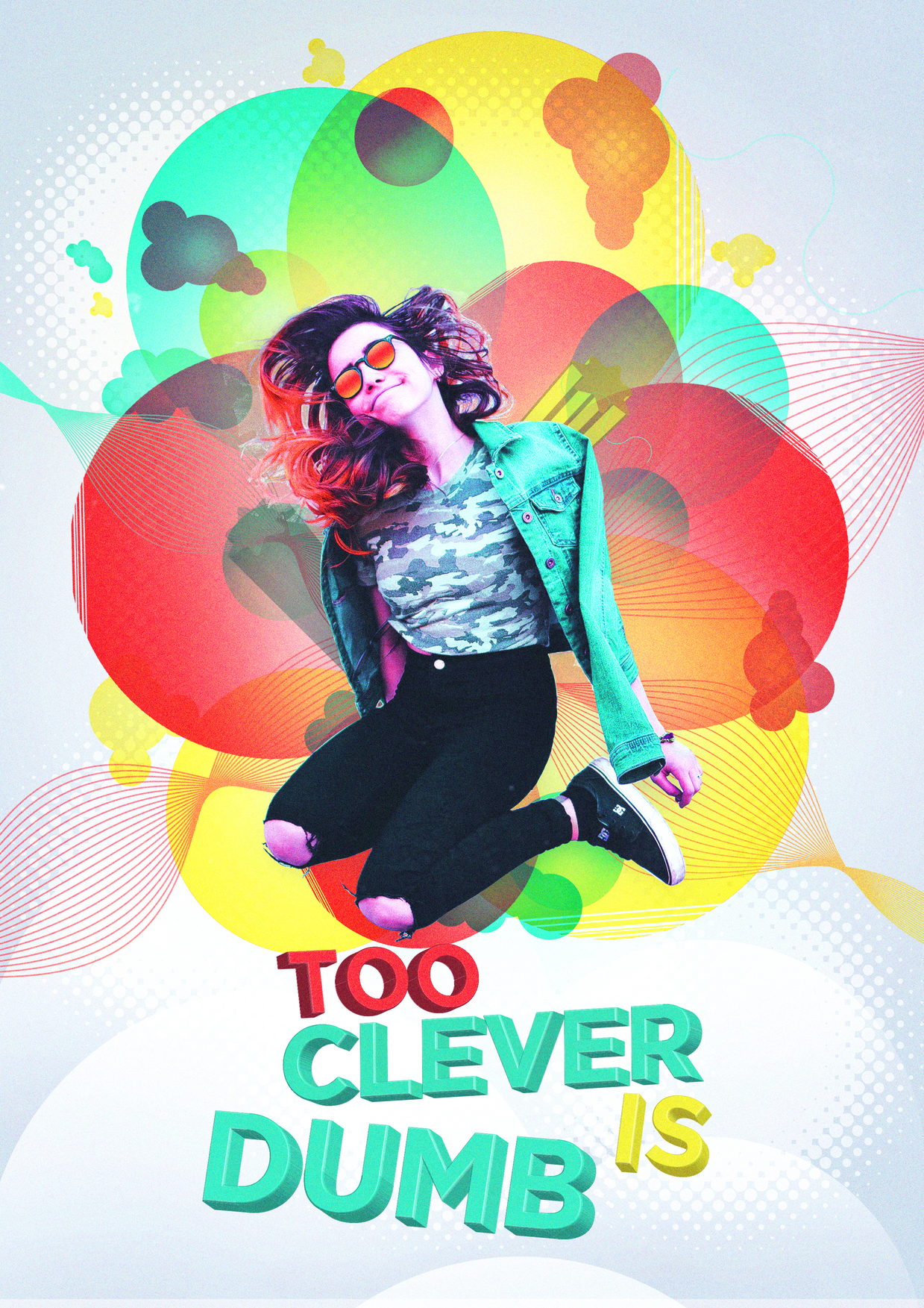
What I see in this:
- recent trend halftone dots
- recent trend spirograph loops
- recent trend grunge filter on the background
- Transparency overlaps that may be difficult to print without turning to mud (red over green is usually bad news)
- A gray background that may approach the lower ink limit stop on K ink, and if printed digitally will want to shift green.
- Light source on the “TOO” and the “IS” is different from “CLEVER” and “DUMB”
- Stitch lines and color facets in the lettering especially on the bowls.
- A hint of Mickey Mouse Ears in the lazily copied small multi-bubble shape.
- Some things that look like cyan hairs top left in the gray and off the girl’s left shoulder (viewer’s right)
- Some bad masking in the interior cutout jacket arm and bum area. Same for the thigh on the other side
- The extruded 7pt yellow star is lost in the mix. The gray one (which may be green) is not working. Neither works with all the color intersects going on in those areas. Simplify.
1 Like
Wow thank’s a lot for your feedback!
In this point i really don’t have any client yet to work with so i made my designs based on imaginary brief.
You’re correct sir.
Hey looks good. Maybe you can add more details like small bubbles or circles to mimic the other circles you got there. I like the half tone dots havent seen them being used a lot recently.
That’s good for practicing your artistic skills, but unless you come up with realistic briefs, you’re not actually practicing for realistic situations.
The hardest part about graphic design is not the part that involves aesthetics — instead, it’s coming up with and implementing workable ideas that solve the problems that clients bring to you.
When you’re working in an agency as a beginning designer, most of these ideas will come from others with more experience — creative/art directors, copywriters, account executives, senior designers, etc. As a freelancer, though, you need to be proficient in all those roles.
1 Like