Hi guys,
I’m new here! I’m redesigning the contents page for a magazine and need honest feedback. Pls tell me why you like and don’t like each layout and your top choice. Thanks for your help! ![]()
Hi guys,
I’m new here! I’m redesigning the contents page for a magazine and need honest feedback. Pls tell me why you like and don’t like each layout and your top choice. Thanks for your help! ![]()
Is this a school assignment or a project for a client? Knowing that will influence my critique.
On the surface, you have some decent options, but they all need work to tighten up and clean up. As @Just-B said, more background information would be helpful.
This is for a nonprofit-owned magazine targeting older readers. The magazine currently has two contents pages, but I’m thinking of dropping one.
Hi Steve, this is for a nonprofit-owned magazine targeting older readers. The magazine currently has two contents pages, but I’m thinking of dropping one. They’re rough layouts, any feedback would greatly appreciated.
I really like the dynamic layouts. I like how you’ve added some visual tension by strategically breaking free of the grid in places. In other words, at first glance, what you’ve done appears to work nicely.
However, when diving into the details, things begin to fall apart. Perhaps this is because these are just mock-ups or comps. Even so, the sheer number coming up short is a big problem. I’ll list just a few, but the problems are throughout. As the idiom goes, “God is in the details.”
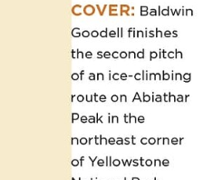
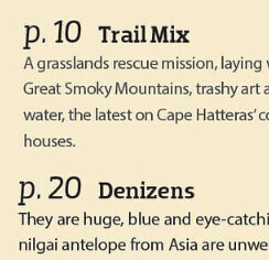
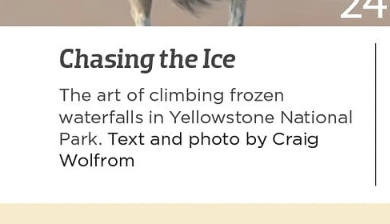
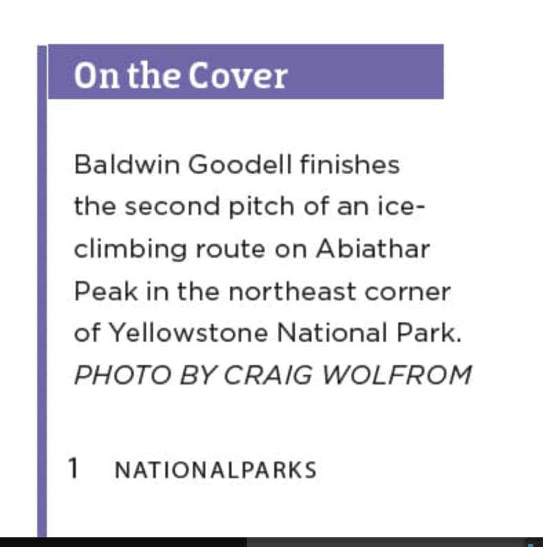
^ Contents is the headline for the page, but you’ve treated it like a minor detail.
^ I have no idea what this is or why it says “Photo Finish.”
^ Why are there no page numbers, which is sort of the point of having a table of contents.
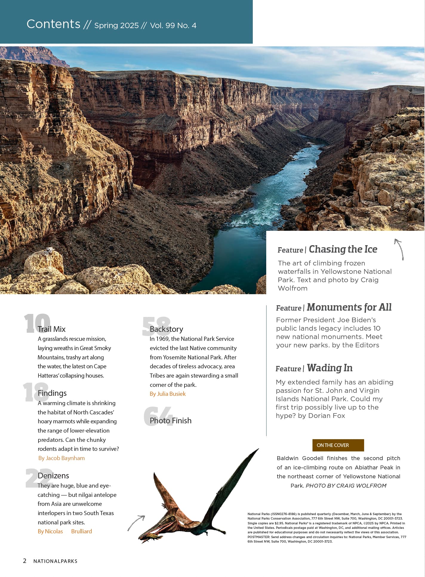
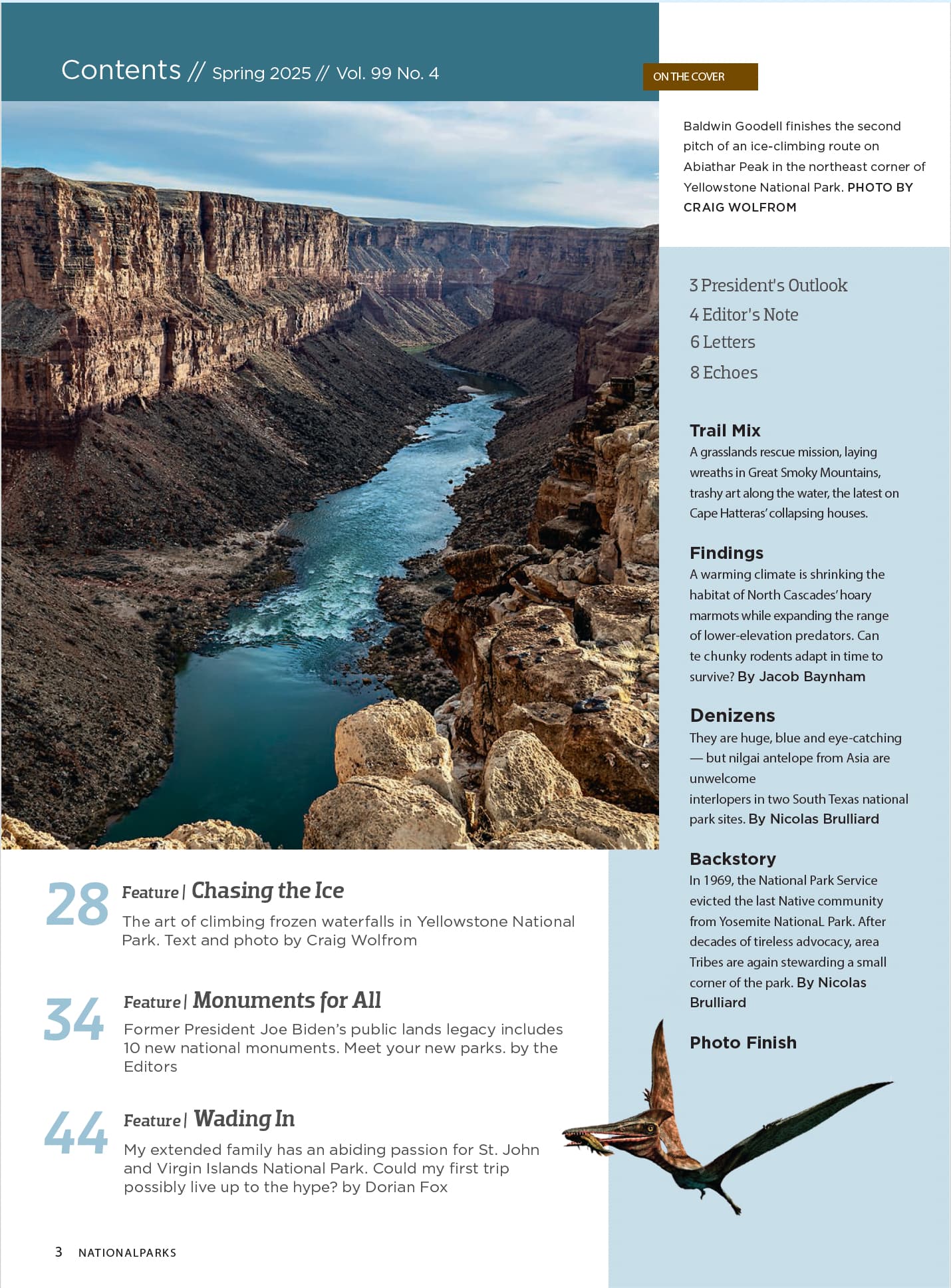
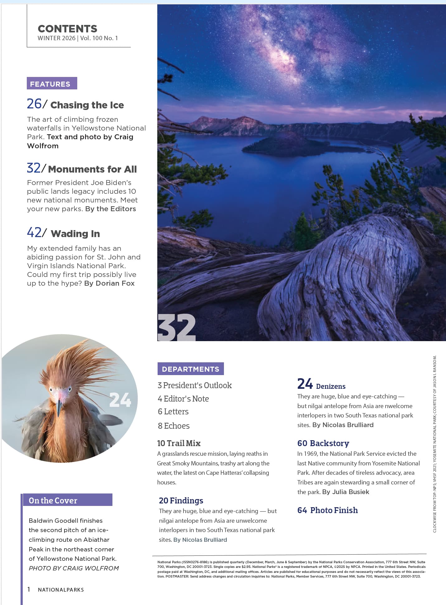
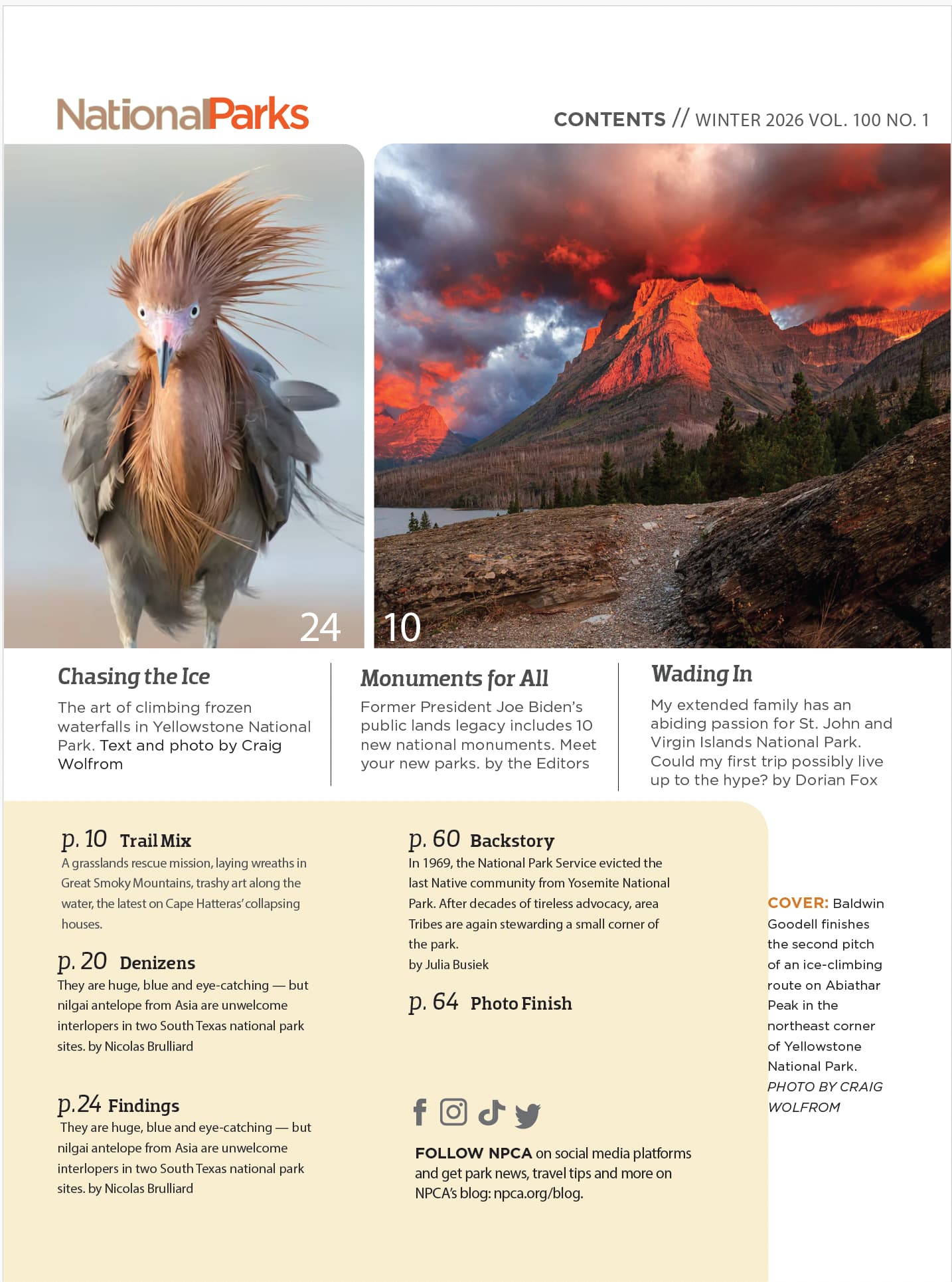
^What’s going on with the large photos you’re using? They don’t appear to have anything to do with any of the articles, nor are there cutlines saying anything about them.
^ I’m not a fan of text being smashed up against the yellow.
^ I suppose there’s a place for writing p.10 or p.20, but the table of contents probably isn’t it.
^ If it were me, I wouldn’t include the byline in the same paragraph as the teaser.
I’ll stop here because I’m convinced that you intentionally weren’t paying attention to the details because the layouts are just mockups. That being the case, never mind, since much of what I wrote isn’t relevant.
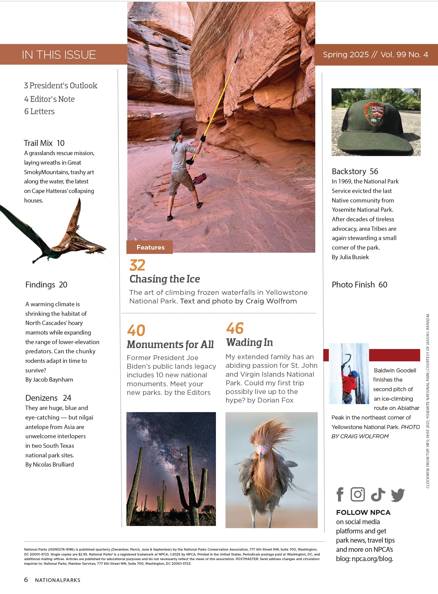
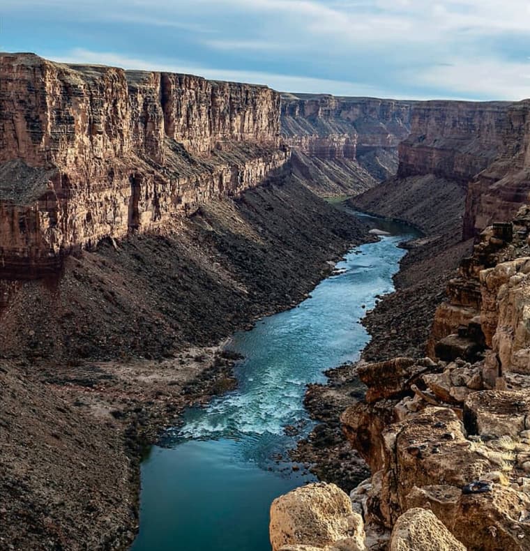
As for which one I like best, it’s a toss-up, but I think I’d choose the one with the guy scrubbing the wall of the slot canyon.
Thank you all for your valuable feedback! I’ll take a close look into these options and make adjustments. What a great community! ![]()
Out of these options, I like the look of 1, 3, and 4; and I’d say 3 and 4 are a toss up for my favorite out of those three. As others have pointed out, there is a lot of refinement that needs to happen with any of these.
Yup! 3 is also my favorite. I’m going to close the threads and circle back later with a more refined vesion of the winner. Thank you!