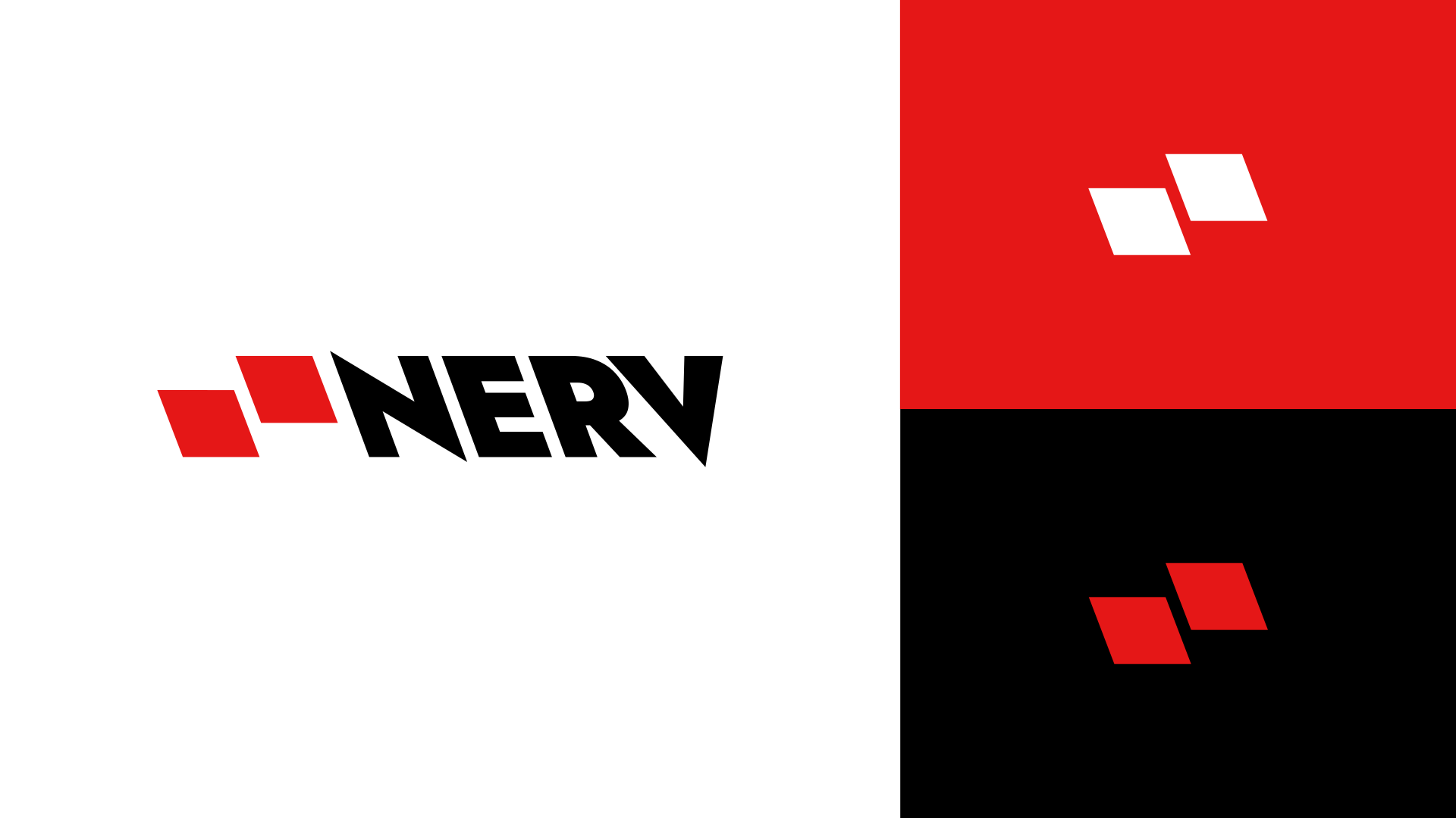
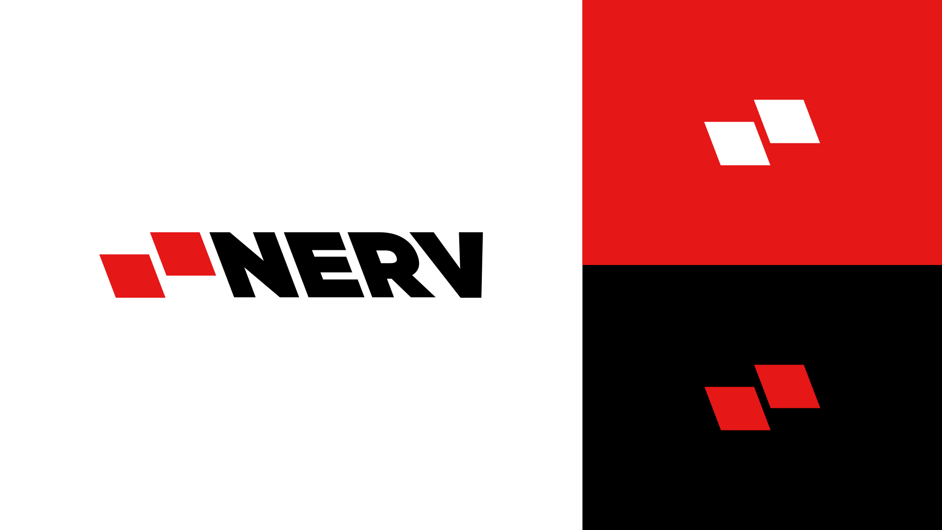
I preferred the first one, if kerned correctly and with overshoots left on.
Rather than changing fonts, I’d suggest that the solution might come from editing the glyphs a little to get all the spacing correct for this specific requirement. Many times, logos that appear to be a particular font, are often bespoke, amended versions, tailored to suit the solution.
However, in order to do that, you have to be able to see the problems in the first place. That takes time and experience (usually decades of it), so good on you for posting it here. You’ve had some great advice from very experienced people.
I think the bare bones of what you have done is good – far, far better than a lot of the over-complicated attempts we see posted here. Typography on logos, however, needs to be exacting, not just OK. It needs to be perfect, otherwise the lack of attention to the tiniest of details reflects on the company.
Your take-away from this should be to really study the nuances and subtleties of typography. You obviously have some understanding. Unfortunately, the last 10% of knowledge takes 90% of the time to understand fully.
When designing all the glyphs in a font, each must pair reasonably well with all the others. When designing a logotype, the glyphs only need to pair well with whatever glyphs are next to them.
As a result, when typing a sequence of letters directly from a font for use as a logotype — even using a typeface as exquisitely designed as Gotham — it’s rare for each glyph in the logotype to be a perfect match for the glyphs adjacent to it. Almost always, it’s beneficial to adjust the glyphs themselves to create the best possible fit and overall color for the logotype.
You’ve received some great feedback on the type, no need for me to add anything there.
Generally speaking, I like where you’re going with this, and I can’t say that about too many logos posted here. That said, there is some visual tension between the mark and the type. Maybe it’s because you have the mark set to the same height as the text. Or maybe it’s because the diagonal angle of the mark does not match the angle of the downstroke of the N. For the latter, you end of with negative space between the mark and the type that does not match the negative space in the N. Anyway, I’d suggest you spend some more time exploring the relationship between the mark and the type.
There’s overshoot for visual compensation, then there’s this…! It’s not just the type that’s going backwards now, I’m afraid. These are not a progression. I am definitely not a fan of the whole backward slanting type thing.
Agreed. Distorting a font is usually a bad idea. I’ve been following along, the icon is the place to get creative. The word mark is a place to choose wisely and let the font do nearly all of the work with perhaps a small unique tweak. Those letters have already been designed.