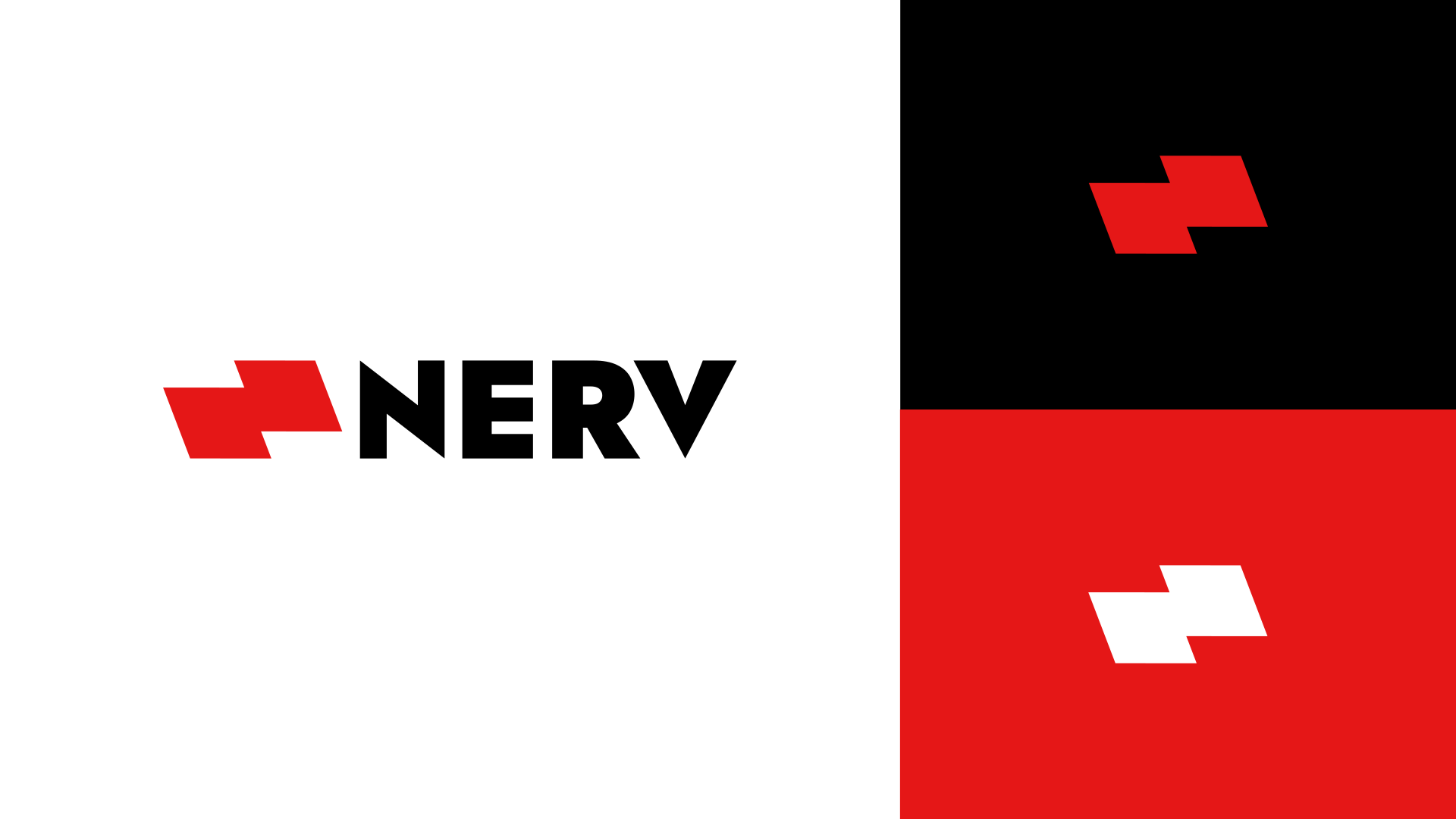
This is for a computer keyboard design.

I like it, but…
The space between the R and the V is way too wide.
In addition, it’s such a simple logo that I’d be concerned that someone else had done something very similar at some time or another. Have you performed Goggle and TinEye searches to help ensure that’s not the case?
1 Like
Nothing similar on Google. TinEye keeps tellin’ me the logo image is not detailed enough.
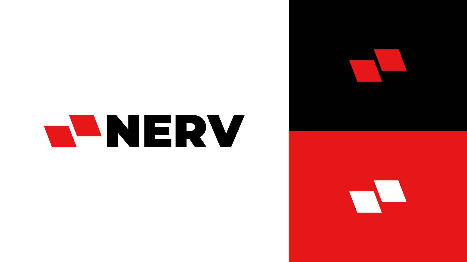
Much better. However, no matter how you space it, the RV combination in this particular typeface will be awkward. I like the distinctive pointiness of the letters, but have you tried a different typeface with a similarly heavy weight that doesn’t come with that RV issue built in? Alternatively, you could letter space NER a bit more to help the spacing match.
1 Like
What’s wrong exactly about the RV issue?

The total amount of negative space between the RV is much greater than the negative space between either the NE or the ER. In addition, the consistent spacing of the NER letters really accentuates the unavoidable extra spacing between the R and the V. Consistent uppercase kerning can be difficult, if not impossible, when so few letters are involved.
I haven’t tried, them, but you might want to consider the heaviest weights of Gotham, Monsterrat, Futura, Poxima Nova, or similar.
Then again, this whole letter-spacing thing is just my feedback. Others might disagree. ![]()
1 Like
Your “N” seems to be of a lighter weight than the rest.
I agree. Visual spacing IS important.
You’ve got a good eye. I hadn’t noticed that, so I measured them. You’re right the vertical strokes are thicker on both the E and the R than on the N.
In addition, if you stick with the pointy letters, the points need to extend a bit above the cap height and below the baseline (the overshoots).
1 Like
I’m pushing up against the forum rules, but sometimes the best way to explain a visual thing is with visuals. Capitol V’s and A’s always create awkward pairings. Also notice the overshoots I added. Sometimes, it’s necessary to redraw the letters a bit to get the various pairings to fit together comfortably.

1 Like
The first font (Jost) actually had overshoots. It’s me who made all letters have the same height.
![]()
Why did you do that? They’re supposed to be there to offset the optical illusion of letters only touching the cap height and baselines being smaller than the letters with a good, solid flat surface resting against them.
1 Like
How’s the line spacing here? I used Gotham Ultra. @Just-B

Close, but I’d space the NER just a bit. In addition, in my example (bottom), I carved back the crossbar in the E a little and shortened the width of the bowl on the R to enable the V to move a little closer in.
Kerning is very subjective. Everyone sees things a little differently.

1 Like
Reminds me slightly of the lawsuit between these two
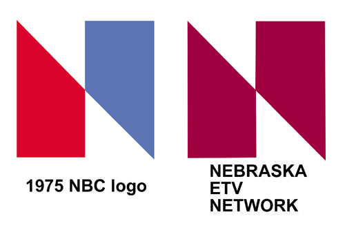
Nebraska TV won and it was judged that NBC logo was too similar (copy).
2 Likes