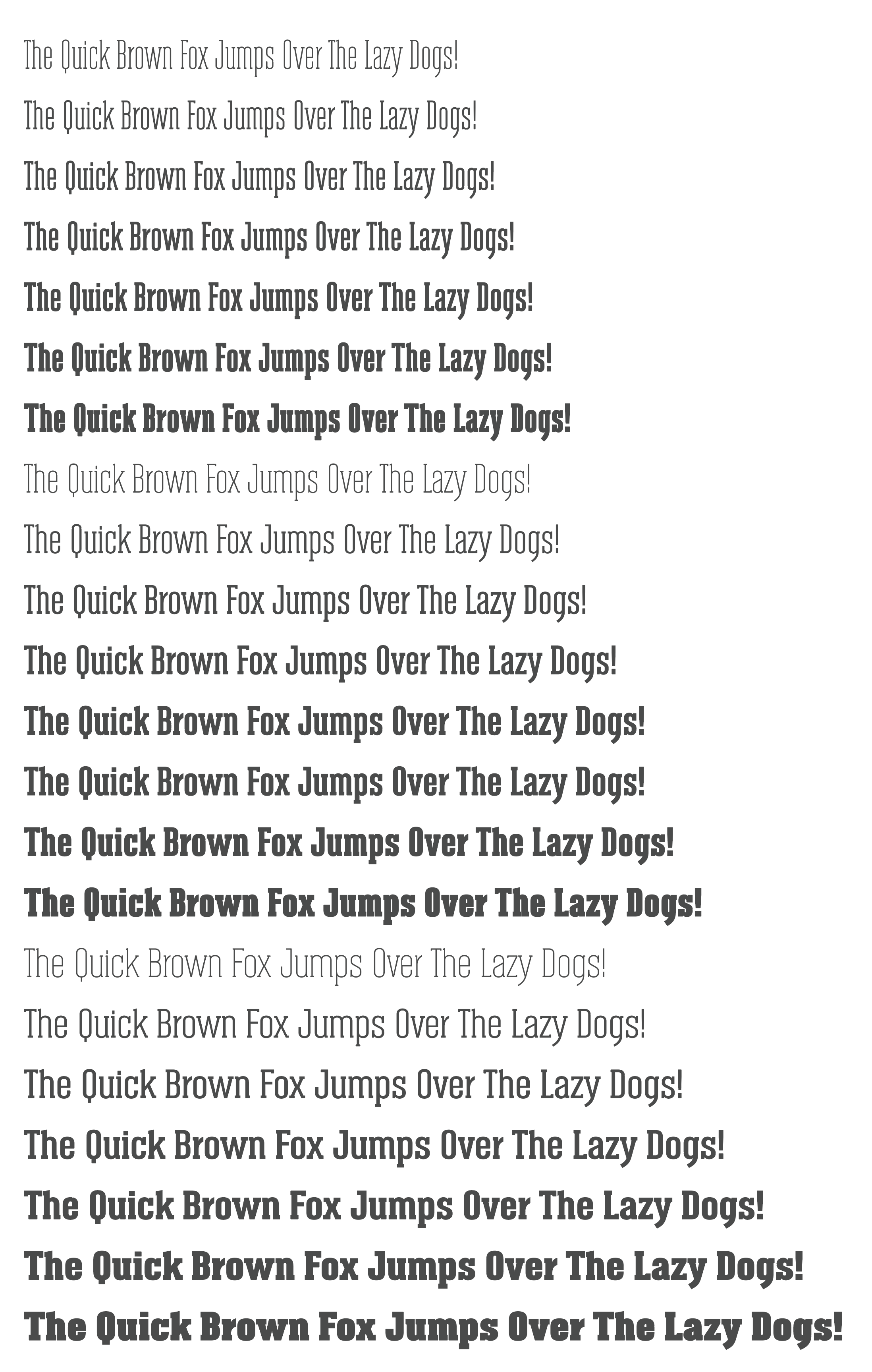
Can some of you please share your thoughts on this big condensed type family I’m designing? I’m calling Albireo Slab. Good, bad, okay, do this, do that, wouldn’t use it in a million years, anything at all. I’m just looking for feedback of any kind.
I’ve been working on it for several weeks now. The upright Roman glyphs are finished (except for hinting, tweaks and some kerning pair adjustments (haven’t started on the italics yet). It’s gotten to the point where I’ve lost some objectivity about it.
It’s basically the slab serif version of a sans-serif type family I completed late last summer called Albireo, which is on FontSpring and MyFonts if you’d like to compare. (Not trying to advertise — just providing background for a critique)
I have some reservations about the slab serif version, but I’d rather hear your critiques first.
I’m not much of an expert with the technical specs on fonts. I just know what I like when I see it and I like this very much. I could see this as a frequent “go to” font for me.
I don’t know that I’d reach for it over and over, but I do love condensed type, and this one has more personality than many, while maintaining a worthy stoutness and unsacrificed readability. I’d buy it for the mid-weights alone. Embrace the slabs; the x and the s really move. And conversely, that k really stops!
I’m wishing there was a fatter, wider version of it, but it’s difficult to morph the straight vertical strokes that form a big part of the typeface’s personality into the more rounded curves needed for a wider version — at least without fundamentally changing the look of the typeface. I’m just not sure there’s much need for a condensed slab face that doesn’t also come in a non-condensed version.
There are also a few problem letters, like the lowercase x and s. I can think of ways to treat them differently and make them better, but then I’d need to alter some of the other glyphs to make them match.
I think it looks good overall. I’m no type designer, but the only thing that stuck out to me as being “off” was the lowercase r, the arm of it seems a little “stubby” and too abruptly cut off.
Yeah, maybe so. Thank you. I’ll need to play around with that some. I was struggling with just how long that arm ought to be, and it’s one of the places where I think my objectivity started to suffer after staring at it so long.
The lowercase r is always a problem since there’s that big blank area of empty space beneath the arm that interferes with the overall color of whatever word its in.
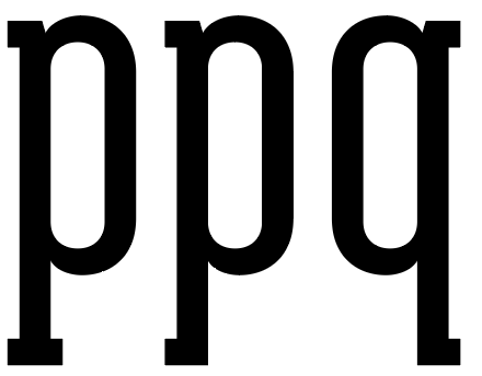
I really like the cap Q. I was going to say some of the metrics and kerning needs playing with, then I read your full post and saw you had yet to do this. Now your fun begins!!
I agree with CraigB, the l/c r is a little truncated. The only other two comments I would make are that there is a slight disconnect between the Des Enders on the l/c g and y. Visually they appear a little different. Also the serifon the lower case p in all weights cou,d do with saving slightly seems a shade to heart and drags the glyph downwards a bit.
I’ll need to play around that that. They need to be a little different since they emerge for their respective letters at different angles. I think there are also some optical illusions that I might need to address.
Something like the middle p in the following — more or less a flopped q? That sturdy-bottomed, double-serifed descender is a bit of an anomaly. I wanted to make it something other than a flopped lower-case q, but I think you’re right?
Yeah, I’m finding that to be a challenge in this family — not so much in the lighter weights, but the heavier ones have such a disparity between their heavy, thick parts and their more open areas, that it makes an even color in the spacing difficult. Checking with other heavy slab serifs of various sorts, metrics seem to be a problem with most of them for much the same reason.
The light and mid-weights are really well done, because they are so well done I can imagine how hard it must be to translate those fonts into a bolder weight especially since its a condensed face. In terms of kerning, it appears pretty close to perfect.
I can see myself utilizing this family in any weight. The boldest option falls a bit short for me. Although as condensed type at this weight id expect to see it in western movie posters.
The bold s may benefit from having its foot mimic what the z is doing in the right upper-most corner. the z’s foot looks like it glides into the form and has good negative space when next to the y. I’d be curious to see what it would look like if the bolder S does something similar.
I prefer the way you had the serif on the p previously. I meant try just taking a tiny bit off it’s height, so it just has slightly less visual weight. Doesn’t need much.
I’m not quite following what you mean about what’s happening in the z possibly being useful for the s, but I am curious about it. It’s probably difficult to describe. I do agree that the lowercase s isn’t looking quite right — the serifs seem a bit bulky.
Almost all newly created typefaces with lots of weights and widths (like this one) are composed of interpolated glyphs. For example, the heaviest and lightest weights are drawn, then the font creation software interpolates the intermediate fonts. This saves tons of time, but it also means that anything done to the boldest weight will gradually morph across the interpolated glyphs. This interpolation is also how the new variable fonts are produced (see below).
In other words, I can’t do anything to the boldest z (or any other glyph) without it affecting all the interpolated z’s. This generally isn’t a problem, but it does force some compromises here and there when a detail of some sort works at one weight but not another.
Below is an example of the non-slab, variable version of the font. All the weights and widths were produced in Illustrator with a single variable font using Illustrator’s variable font control panel sliders.
I didnt know about font interpolation. I suppose the only work around would be something manual.
Maybe if you shorten the glyph on the S similar to how the Z is in the lighter and bolder weights that would yield the result im describing? the lower case S has a long glyph on its foot.
what Im proposing may look weird because then the top glyph on the S maybe lose balance and be too top heavy.
Ahhh, I think we’re stumbling over each other’s terminology. You’re referring to the bottom serif on the s. The glyph is the letter itself. In any case, yeah, I think I agree with your observation. Thanks!
Nice work. I prefer the slab version of this font, but not so much the lighter weights - especially the upper case A and lower case f. I did not know about font interpolation. Would that also interpolate the tracking? If so, and manual adjustments are made within different weights, would tracking also require manual adjustments?
All the outlines and metrics are interpolated from the masters — sidebearings (the built-in space to the side of each glyph), the kerning pairs and whatever manual hinting (the code that tweaks the outlines of the fonts at small sizes for legibility) is applied.
So, yeah, when the interpolated weights and widths are created from the masters, any refinements that only apply to those interpolated fonts need to be made individually. That tweaking of the intermediate fonts isn’t possible, of course, in a variable font where the interpolation occurs as the font is being used on a website, in Illustrator or whatever other software might support variable fonts.
For what it’s worth, interpolation doesn’t just apply to weights; it can also apply to widths, italics, serif to sans-serif and most any other kind of morphing between one font and the next. All of these “axes” can exist within any given variable font or rendered out individually as stand-alone fonts.