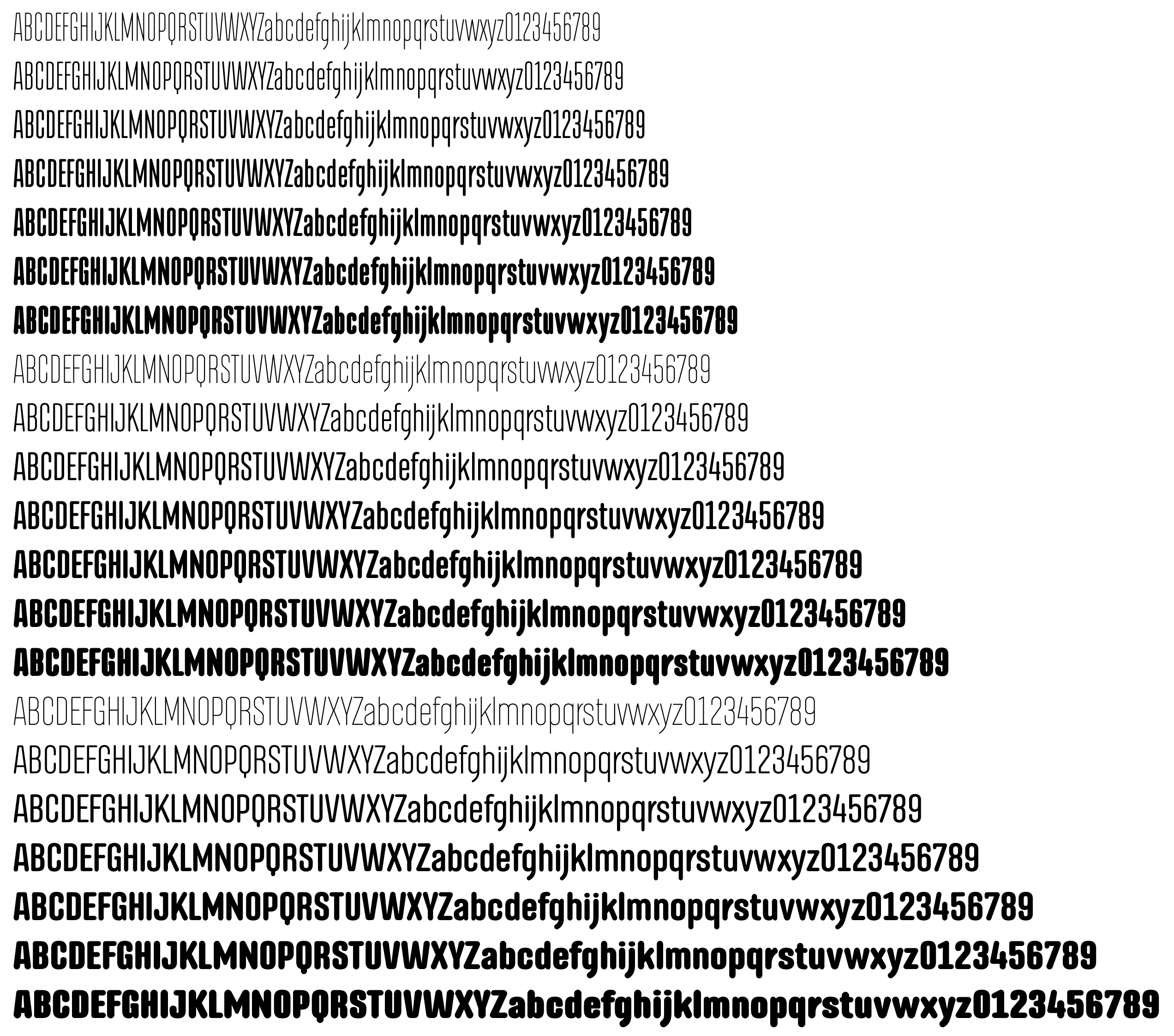
I’m getting close to being done with this typeface. It’s a rounded version of a typeface I released last year titled Albireo. This one is Albireo Soft.
Sorry about the size. It’s a large variable type family, and these are only fraction of the glyphs. You’ll need to enlarge it to see if halfway clearly. Any comments, criticisms, etc. I’d rather catch them now than later.
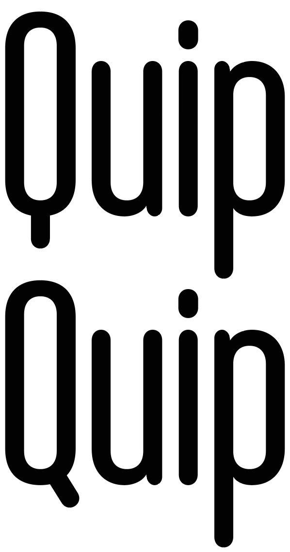
Yeah, the Q is something of an outlier. I like it straight down since the face is so skinny, but it does draw attention to itself, which maybe isn’t good. I’ve really gone back and forth on it.
I was hoping someone would notice the A. It and the Q are the two oddball glyphs that I’ve been wondering about. I just might end up doing alternate glyphs for both.
Maybe not, but it helps fill the space since the numerals are monospaced to line up when stacked in columns. That’s another where an alternate would be good.
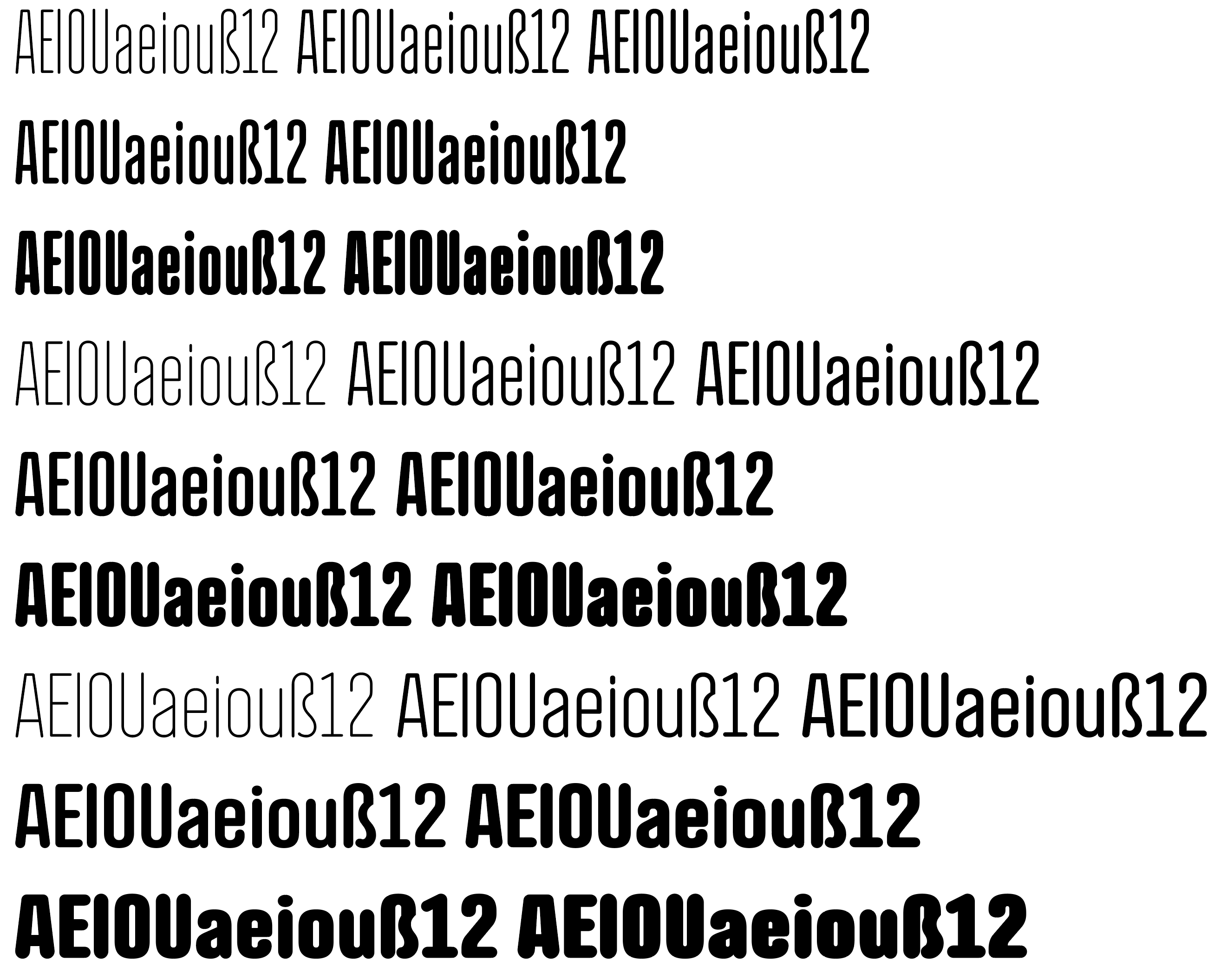
Yes, that’s an eszette. There’s even an uppercase eszette. The fonts include all the European Roman glyphs and diacritics, from Icelandic thorns and eths to Polish ogoneks to Spanish ordinals and all the usual diacritics, fractions, math symbols and punctuation marks.
It’s just the 0 and 1 are close together, and maybe because of the foot being centred between the 2 characters. If the foot was gone, the flag could be used to centre it, and it wouldn’t be so close to the left character.
I just have a couple of really nit picky comments which apply to the two narrowest and boldest incarnations. The counters look like they could do with opening up a the tiniest amount. They are right on the verge of disappearing. The most expanded if the three is fine. It’s just the heaviest weights on the first two.
In addition the central section of the Eszett suffers a little too. It is noticeable, though less so, on h, n, m, etc
Other than that, there are two glyphs which stand out fir me; the l/c r (and to a lesser extent the bottom of the l/c v) look a little heavy. Almost like they need a small ink trap, or just narrowing down a bit.
Sorry if that sounds over-critical, but you know what it’s like, it’s all about obsessing the details!
Makes me want to get my backside in gear and continue with mine. Always seems to end up at the back of the queue.
What software do you use, by the way? I jumped the fontlab ship a while back (used to use fontograoher when if first dipped my toes in) onto Glyphs. I much prefer it. Feels more intuitive to me.
As I say, overall, a really nice job. You’ve definitely nailed the even colour thing.
Thanks Sprout. It’s always good having a fresh pair of eyes look at things.
The lightest and heaviest fonts are the most problematic, I agree. In addition to all the weights, there’s a variable version of the typeface, where the intermediate widths and weights need to be interpolated from both extremes. This places some constraints on the individual adjustments of the extremes since those adjustments will be interpolated across the entire family.
I think there are some areas where ink traps would help — especially when I see them small. The inside apex of the A possibly being one of them.
I started out using Fontographer back in the early '90s, then moved on to FontLab. Over the past couple of years, I’ve been using Glyphs. It doesn’t have all the bells and whistles of FontLab, but it’s a little easier and friendlier to use. I suspect you’ve found the same to be true.
I had exactly the same problem with one of mine. It would be nice if you could tweak elements of the extreme interpolations somehow. In the end I solved it by dropping the maximum weight down a tiny bit. It was just pushing the interpolation a bit too far.
I nearly mentioned that too, but didn’t want to appear as though I was pulling it to pieces.
I have never played with fontlab. When I wanted to replace fontograoher, I evaluated fontlab and glyphs. Glad I jumped the way if did. At the time, Fontlab just felt all a little too scientific spreadsheet, whereas glyphs felt like they had actually had a type designer involved in the process. Also, at the time, glyphs was considerably cheaper. When I was looking at them, fontlab was pushing $700, if I remember rightly. They’ve dropped their price considerably since then, to compete with the young turk!
The only thing that caught my eye as odd was the top of the A. The Q didn’t register as off considering the overall look.
I’m not a typography expert though.
I saw the A but determined its function of acting like an A was more important as you increased weight.
To me, the Q was the only one that really stood out. I think I prefer the latter example. It just looks friendlier.
Now that i look at the A again i see the top being flat and that reminds me of russian characters.
Just-B — I agree with billyjean. Everything looks fantastic to me, from a non-type designer’s perspective. I do agree that the straight down Q doesn’t look right, but you are the designer. I do like the O with the slanted extender, or maybe you might consider something like this.
Unfortunately, placing the tail inside the counter won’t work for the heavier weights — there’s just not enough room. Based on yours and others’ suggestions, I’m going to add the tail in the more standard, diagonal way, then include the straight-up-and down tail as an alternate.