New digital flyer, so I thought id let it be critiqued. The client is happy.
It was technically tricky to make aesthetically pleasing, I went through a few variations.
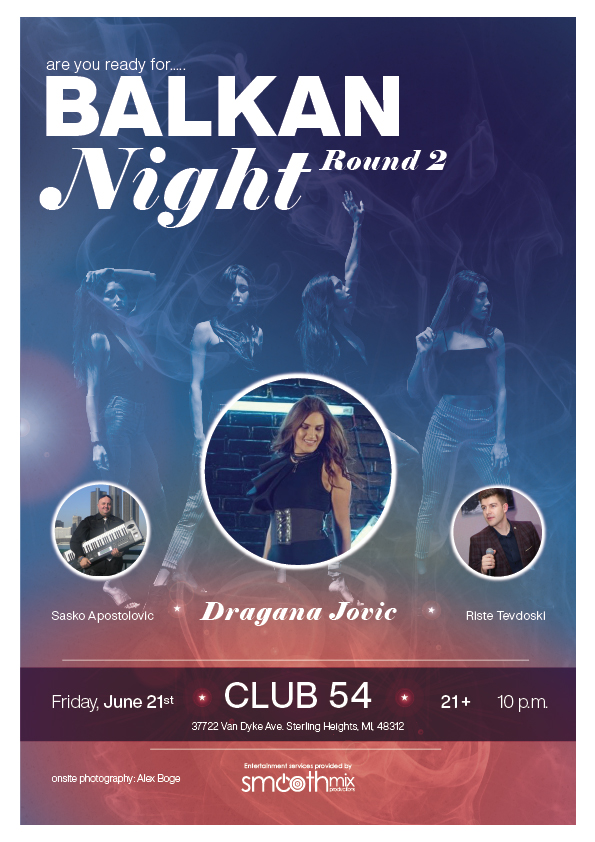
The typography was tricky.
Helvetica Now (xthin, light, medium, black) and Elephant (reg + italic) were used.
The personal goal for myself for this project was to use Helvetica Now, and use a model for photography. The smoke and sand grain (super faint to see) are stock images, the people bubbles are client provided photos.
Looks good. I like the colors and the overall personality, which seems appropriate for the subject matter and the target audience.
I’m still not quite sure how a “digital flyer” is used, though. Is this something distributed via email and social media?
They like to post it to instagram, snapchat, facebook. Slightly odd size because I went with A4. They also have a motion grahpic that fits 108 x 1080.
Both the typography and layout are rather awkward, nighter being aesthetically pleasing or easy to read.
I suggest looking at the type as just shapes, and arrange them in a visually pleasing way, while also trying to enhance readability and whatever general impression you’re trying to convey.
Since it will be use to social media sites, which mostly accessed using mobile phones, I think the fonts should be a little bit bolder and large. Specially the important information such as address, date, and time.