Hello everyone, I’ve posted a few posts about flyer critique and gotten good advice. This is the most recent flyer I’ve created that we are using. Please let me know your thoughts, it is appreciated.
Working the cross into the layout as you’ve done is interesting.
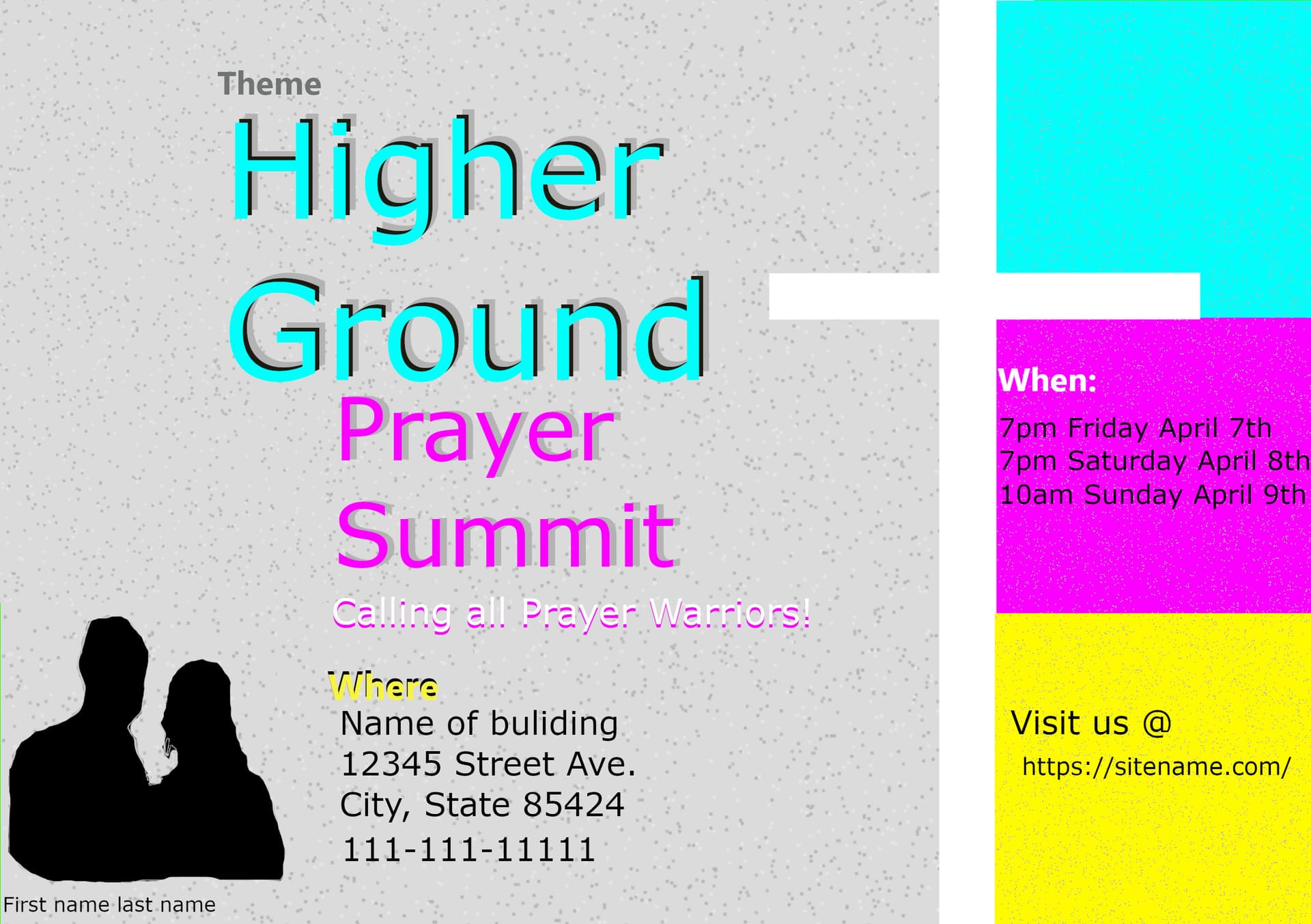
Your typography is a bit gimmicky, with too many colors and drop shadows. The purpose of type is to communicate information as efficiently and effectively as possible. Adding gimmickry to type as a decorative device generally works against legibility.
There’s not enough space (leading) between “Ground” and “Prayer.” There’s too much leading between “Higher” and “Ground.” The same is true with “Prayer” and “Summit.”
Yellow type is rarely a good idea on a light background. It’s tough to read.
The margins on either side of the type in the magenta box are nearly non-existent. This creates a feeling of claustrophobia.
In previous critiques, I’ve suggested that you study how to use negative space and how to line elements up to invisible grids. I’m still urging you to do that, and I’ll also suggest that you study how to use typography more effectively. You might also want to Google the Elements of Design, and really pay attention to what you learn, then consider how they might apply to your work.
2 Likes
In the other thread you said your church gave you examples of what they wanted the flyers to look like. How close are your designs to those samples? If you have shared these with them, what were their comments?
I did a google image search for prayer summit flyers, and there were thousands of results with very distinctive characteristics. Cutouts of speakers, gradients, fades, clouds, lens flare… It could be its own genre. Your image above showed up in the search return too because you posted it here, and it doesn’t look like anything that anyone else is doing for prayer summits. What are your thoughts on that?
So pretty much every to-be-avoided-at-all-costs design cliché going then!
There was a time back in the late 90’s early 2000’s where people would send you textures or backgrounds they wanted done with render clouds and embossed in photoshop.
Design trends, huh!
Good idea doing a google search for prayer summit. I didn’t even think to google the theme of the flyer before starting anything. I’ll keep that in mind for next time.
Thank you for the direct specific feedback. It is appreciated. Yes this flyer, I had actually created before I even posted those prior critiques. I didn’t want to bombard people with a ton of things at once, so I figured I’d try to spread out the posts I did. I will study up on your suggestions for using negative space and line elements up to invisible grinds and typography. I will google the Elements of Design as well.