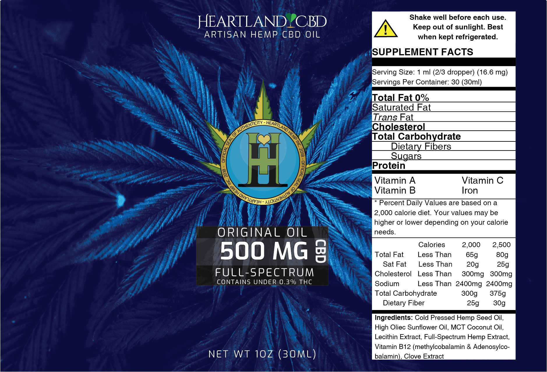
They do not, I’ll be honest, I placed them there to make them stand out, and I think I over-stood them out and I don’t actually think I need to make them stand out. It was a me thinking of the elderly reading labels.
I know Dietary Supplements aren’t exactly regulated by the FDA, but in my experience it’s good to follow the FDA regulations as close as you can. Not only does this help if these products ever had to go through regulatory approval, but it will help it look more legit to a hesitant consumer that is used to seeing labels meet these requirements for products they’ll ingest.
1 Like
Yes, I agree thank you. I am reading it carefully to make sure I can cover these bases. Thank you very much for your help 
I feel like this might be more in the right direction 
I read through the FDA guide and applied what I could to it.
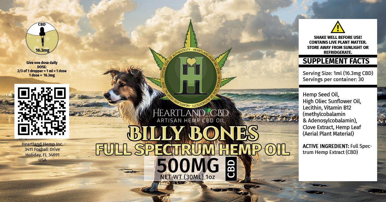
Can I ask why the dog? With a pup and the word bones on it I’m thinking it could be confused with a pet treat.
Agreed, unless this is meant for dogs, a dog shouldn’t be on the label.
You probably want to check the spelling of refrigerate (there’s no d in the word). Full spectrum, in this instance, is a compound adjective modifying the noun hemp oil. Compound adjectives are hyphenated, as in full-spectrum. There are exceptions, but this isn’t one of them.
Yes, this is meant for dogs.
Good note on the spellings, thank you very much for that!
I do indeed learn something new every day. I had no idea Hemp oil was given to dogs.
Actually, not only can dogs take CBD, but so can a lot of other animals. It turns out that anything with a nervous system, also has an endocannabinoid system, which means their bodies respond to cannabinoids.
1 Like
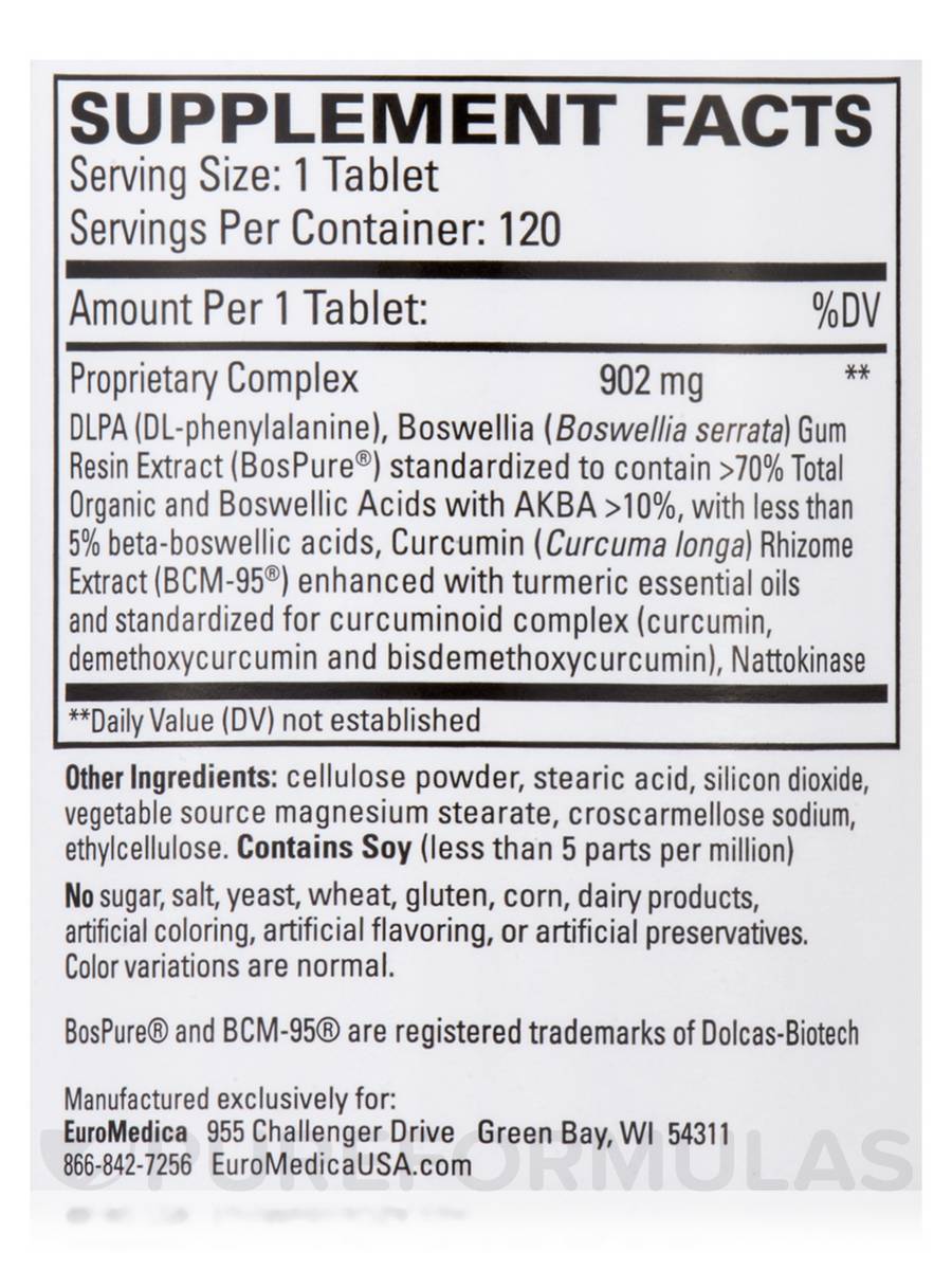
Go back to the FDA labeling PDF and look at page 35. That is what your supplement facts panel should look like.
• Match those Fonts, pt sizes, line weights, box locations, etc.
• Lines shouldn’t connect with the outside box
• Ingredients should be in the list form - assuming the company doesn’t want to expose their mg amounts for every ingredient, put everything in a proprietary blend and list the total mg for everything together.
• Make a %DV column even if there is no established DV for those ingredients
• If you wish to acknowledge the “Active Ingredient”, do so at the bottom outside of the main box, but you should still list this ingredient above with the other ingredients (either own its own Line, or within the proprietary blend if the company doesn’t want to disclose that mg)
Here is an example of a supplement facts panel with a proprietary blend.
1 Like
I think there is something up with my photoshop settings, these point measurements do not look anything like what is presented… I wonder if my document settings are messing me up?
I am using (now because of request) 6.25 x 4.25 CMYK 16 bit 300 ppi
But on my screen, when I put this together, it takes up a huge chunk of room and the pts don’t really add up either… I wonder… what is happening… to my life right now…
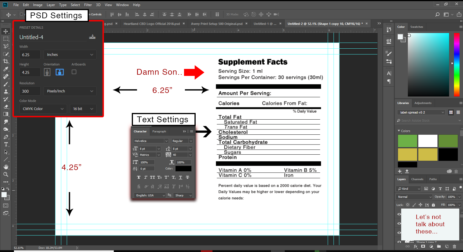
You’re building your label and adding this kind of type in Photoshop? If so, you need to rebuild it in a more appropriate layout application. Photoshop it completely wrong for this kind of thing.
1 Like
I’m all ears on suggestions. This side of things is very new to me and I am self taught. Never went to school for these things.
1 Like
You need to use Illustrator or InDesign (or their equivalents) and import/place the photo into the layout.
Photoshop is a raster application where everything is composed of pixels. You need to build it in a vector application that will export at the highest dpi settings of the output device RIP. Small typography, for example, requires a far higher output resolution than that of a photograph (which is, as the name implies, what Photoshop is made for).
Got ya, thank you so much for that clarification. I will move over immediately to Illustrator. I thought that because printing vendors would submit for both illustrator and photoshop, either format would work. I guess they do, but for regulations, not so much and not so well for labels.
Printers will take most anything you give them (to a point) since they don’t want to turn down paying jobs. A Photoshop-built layout, however, is rarely the best way to build something that will be printed. There are exceptions, but there aren’t many of them.
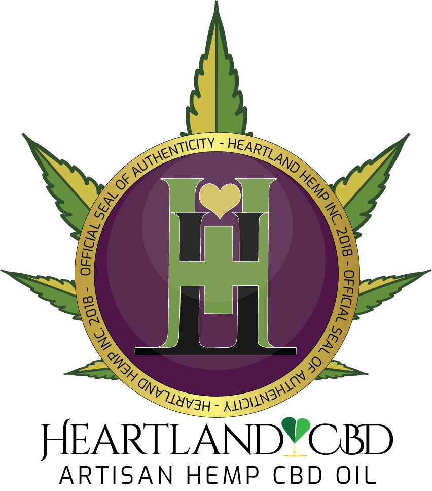
You are missing your target market, which is primarily female and under 30 I would venture to guess. The concepts are very masculine and weight lifting appealing. And a bit frightening. Is the H a logo you have use? It looks very much like marijuana even though it’s not, that is is somewhat ironic since marijuana looking artwork automatically brings munchies to mind. Look at the competition and see what they are using, then go a step beyond and make it better. It needs to look a lot friendlier. The dog doesn’t work either. Do some quick research on your competitors, other appetite suppressants, not primarily hemp oil.
1 Like
Excellent feedback, thank you very much.
I do have the solo H that we primarily use for our letter-heads for our main company.

After that, we have this for our CBD products, and our long term goals are to be providing both low thc and high thc products.