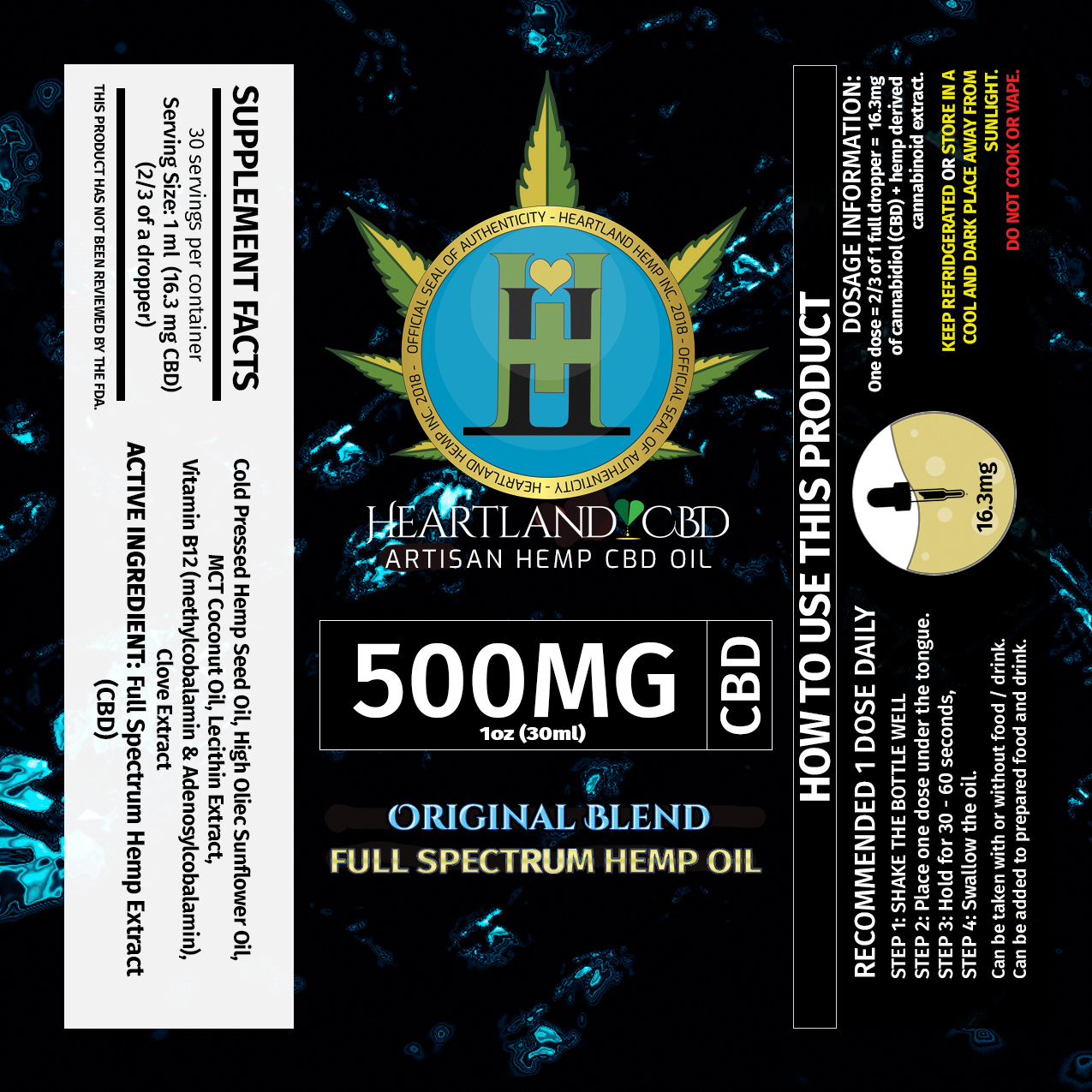
Hello everyone, so after your very valued critiques, I went and did some adjusting. I don’t have the displays done for them yet, I am waiting for the camera this time.
Let me know what you think!
Hello everyone, so after your very valued critiques, I went and did some adjusting. I don’t have the displays done for them yet, I am waiting for the camera this time.
Let me know what you think!
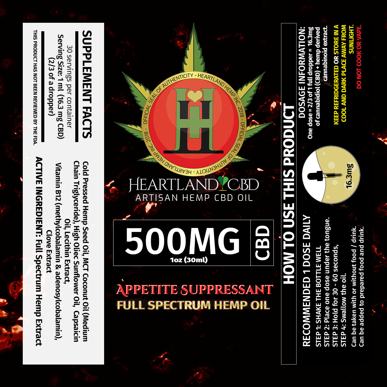
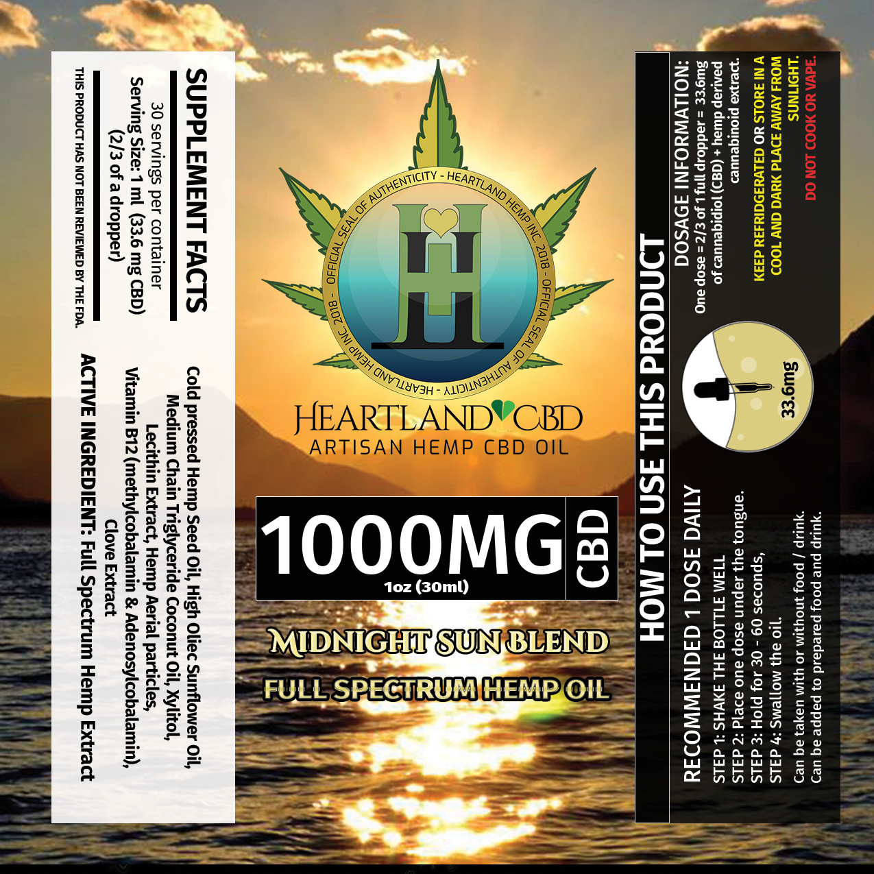
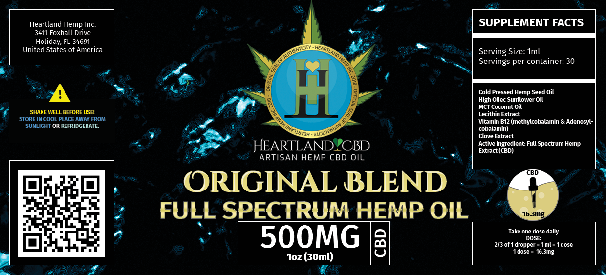
hmm.. Why is the logo a different color on each? Why is the supplement facts on white on one and black on the other? Why is the "keep refrigerated… yellow on one and blue on the other? You should be more consistent with font choices, styles, colors etc. Stick with one font style and use it in upper case for important info and lowercase for body copy.
On the front, the first thing I see is 500MG/1000MG.. is that the most important thing? I think you could tighten up the copy to make it less busy. For example eliminate the words “step 1”, “step 2…”, say USA (instead of United States of America), “Keep Refrigerated” only (cool & dark place is inside a fridge no?)
Consider downplaying the backgrounds.. maybe change them to B&W so the text and logo stand out more? That said, I’m not even sure what the background is for the 500MG.. it looks a bit Halloween-ish..?
To explain highlighting the MG.
Yes, the customer is always looking for a specific MG to work with, and then they look to see whats in it. So spotlighting that at the front eliminates the first question in their mind “how much CBD is in it?”
In terms of the copy, I can certainly clean that up.
To explain the logo part:
The backgrounds of the orb are not so important to us, as the H is in the center. The colors on the blends resemble the different blends.
Red is appetite suppressant because it contains more B12 and Capsaicin, so a more spicy oil.
The “Dark and Cool place” text is important because you don’t HAVE to refrigerate it, but it’s best when kept out of sunlight and out of 90 degree weather.
The background on the 500mg is red colored diamonds in a sort of abstract art.
My original background was less intense, and they are requesting that I do more vibrant and colorful backgrounds.
A main suggestion is that I use… beaches… I’m.. not so fond of this idea.. but idk.. what do you think?
Thank you so much for your feedback, it is very valuable to me. I understand what you are saying on the black and white differences and the text color differences between the statements.
I’m glad I came and got it reviewed by you guys, because honestly, this was made in a rush. I got told the original labels had to be re-done, and we had to have em printed by the same day. So I had to smash out 12 designs in about 3 hours to make it in time for the prints, so I am keeping note of every piece of feedback you guys provide and sharing it with my people to let them know where we stand from other designer’s stand point.
Here is an example of our original blend
And I am aware, these have the same issues as the others do.
I will be revamping this work again.
What do you think of the layout overall though? Does it work?
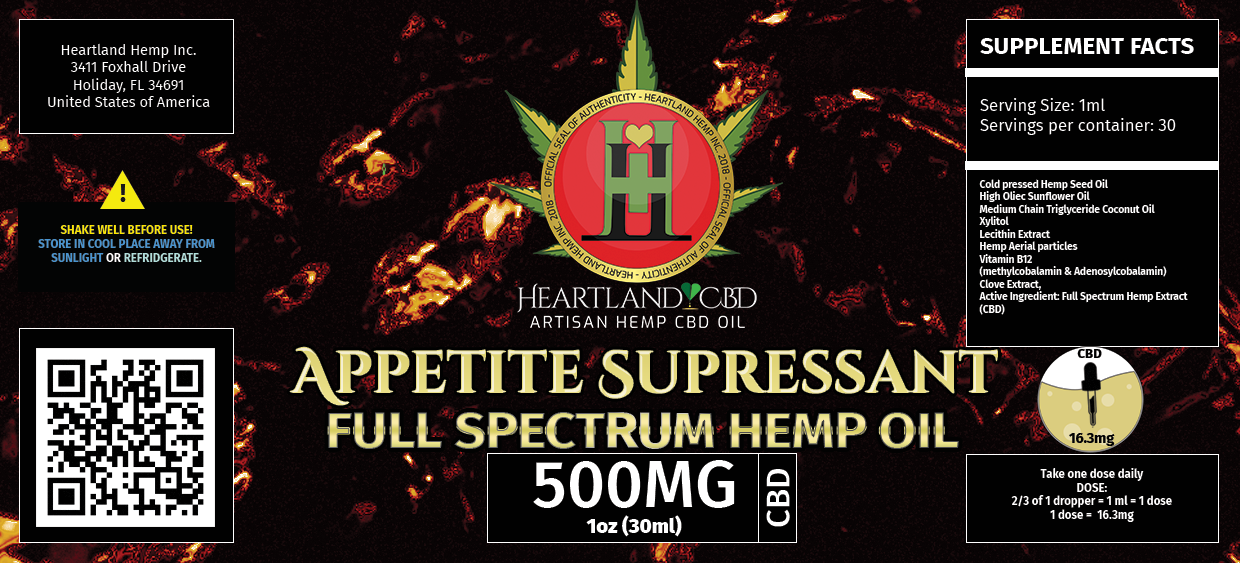
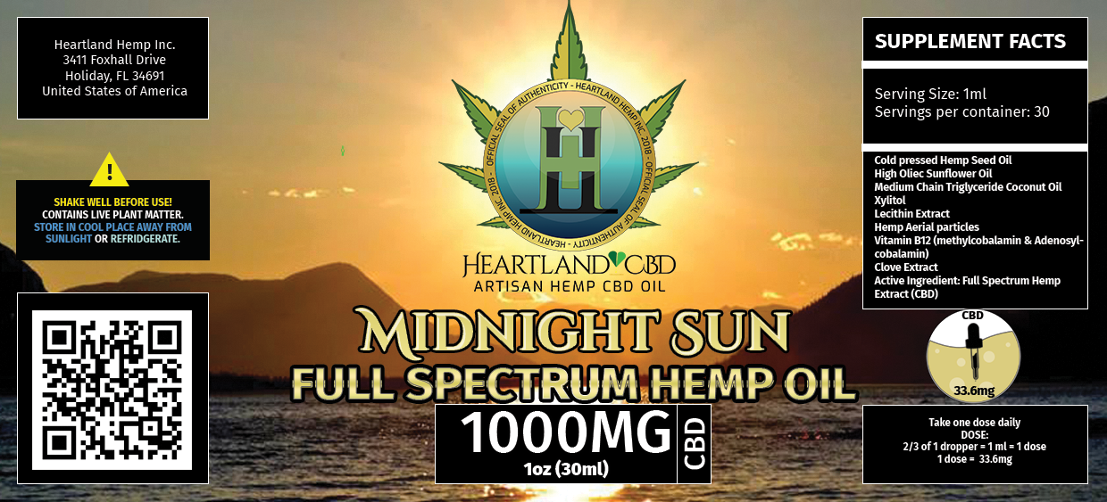
I know there’s a ton of stuff that needs to go on the sides of packaging. With that in mind, I would be inclined remove almost everything that didn’t need to be there — the white lines around the boxes, the background patterns and images, the various typefaces, the white box (why black and white boxes?), the address of the company (they can find that by following the QR code, but few people will care), the seemingly random text justification (make it all the same as much as possible).
YEP! Exactly that. The layout is too busy. There is too much going on. Simplify!!! eg. keep refrigerated OR store in a cool, dark place (the “away from sunlight” is redundant if it should be stored in a dark place)
Rather than change the logo color, I’d change the background color.. it would differentiate between the oils better (imagine them all on a store shelf) plus it keeps your branding intact as well as addressing the request for more color.
I’m not sure what diamonds or beaches have to do with Hemp oil..? Think about who is buying these. What would attract them? They’d looking at many choices, what will make them grab yours..?
You might want to google around a bit to see how others have handled this and get some inspiration.
Actually everything on the label is required to be placed there by law (in various states, we have to meet them all) for CBD products. I’m actually still missing a few small logos.
I will strongly take into consideration the background only changing.
I argued against the beach, and the diamond pattern was supposed to relay clarity and quality. Clarity of the extract and the quality standard we hold ourselves too. But that was my idea on it.
I’ll be looking at other top selling brands again for more inspiration. I don’t want to follow too close to suit there, but I do want to make sure that the message of clean quality cbd is there.. I gotta think about that more.
I hear you guys loud and clear on the text stuff, I tried to do it with less variation but I did not succeed at that. I’m glad I have you guys ![]() Thanks for all the help!
Thanks for all the help!
So do the white boxes around content have to be there?
They do not, I’ll be honest, I placed them there to make them stand out, and I think I over-stood them out and I don’t actually think I need to make them stand out. It was a me thinking of the elderly reading labels.
I know Dietary Supplements aren’t exactly regulated by the FDA, but in my experience it’s good to follow the FDA regulations as close as you can. Not only does this help if these products ever had to go through regulatory approval, but it will help it look more legit to a hesitant consumer that is used to seeing labels meet these requirements for products they’ll ingest.
Yes, I agree thank you. I am reading it carefully to make sure I can cover these bases. Thank you very much for your help ![]()
I feel like this might be more in the right direction ![]()
I read through the FDA guide and applied what I could to it.
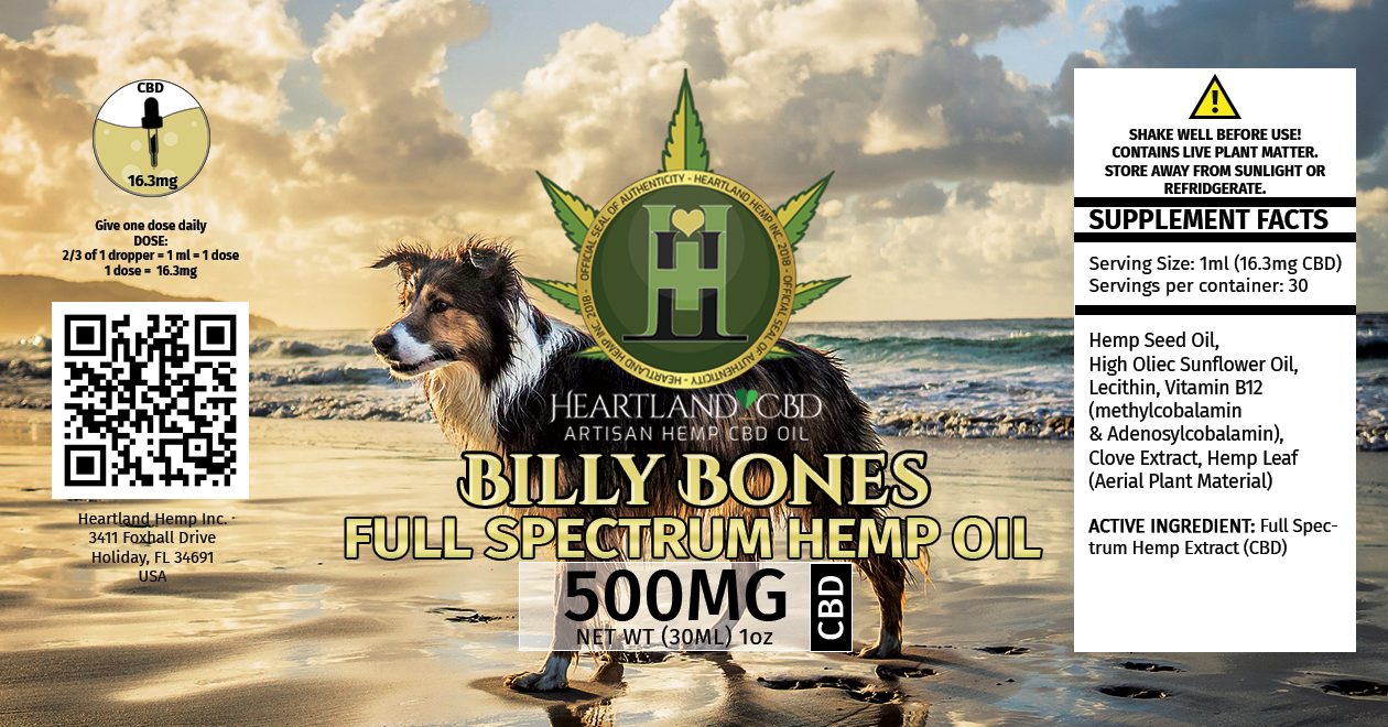
Can I ask why the dog? With a pup and the word bones on it I’m thinking it could be confused with a pet treat.
Agreed, unless this is meant for dogs, a dog shouldn’t be on the label.
You probably want to check the spelling of refrigerate (there’s no d in the word). Full spectrum, in this instance, is a compound adjective modifying the noun hemp oil. Compound adjectives are hyphenated, as in full-spectrum. There are exceptions, but this isn’t one of them.
Yes, this is meant for dogs.
Good note on the spellings, thank you very much for that!
I do indeed learn something new every day. I had no idea Hemp oil was given to dogs. ![]()
Actually, not only can dogs take CBD, but so can a lot of other animals. It turns out that anything with a nervous system, also has an endocannabinoid system, which means their bodies respond to cannabinoids.
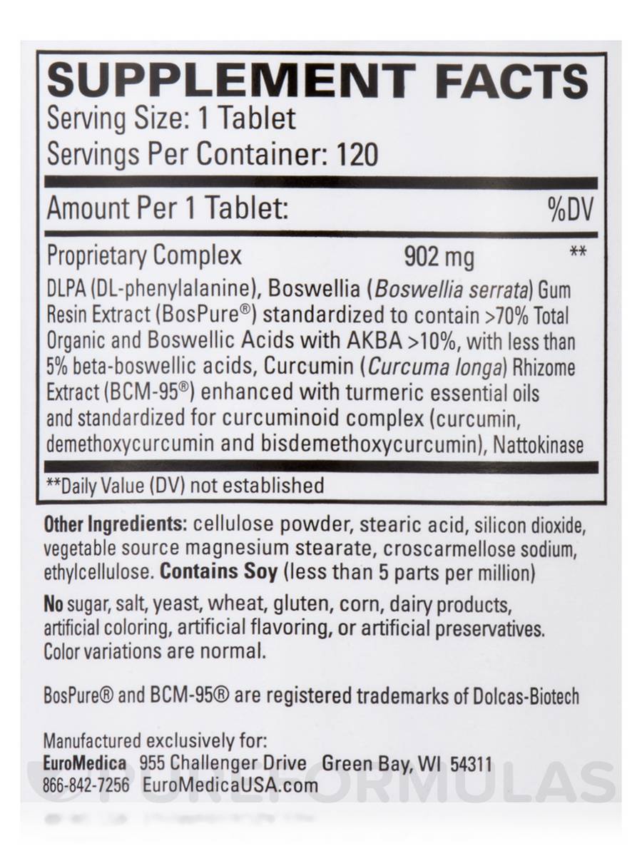
Go back to the FDA labeling PDF and look at page 35. That is what your supplement facts panel should look like.
• Match those Fonts, pt sizes, line weights, box locations, etc.
• Lines shouldn’t connect with the outside box
• Ingredients should be in the list form - assuming the company doesn’t want to expose their mg amounts for every ingredient, put everything in a proprietary blend and list the total mg for everything together.
• Make a %DV column even if there is no established DV for those ingredients
• If you wish to acknowledge the “Active Ingredient”, do so at the bottom outside of the main box, but you should still list this ingredient above with the other ingredients (either own its own Line, or within the proprietary blend if the company doesn’t want to disclose that mg)
Here is an example of a supplement facts panel with a proprietary blend.
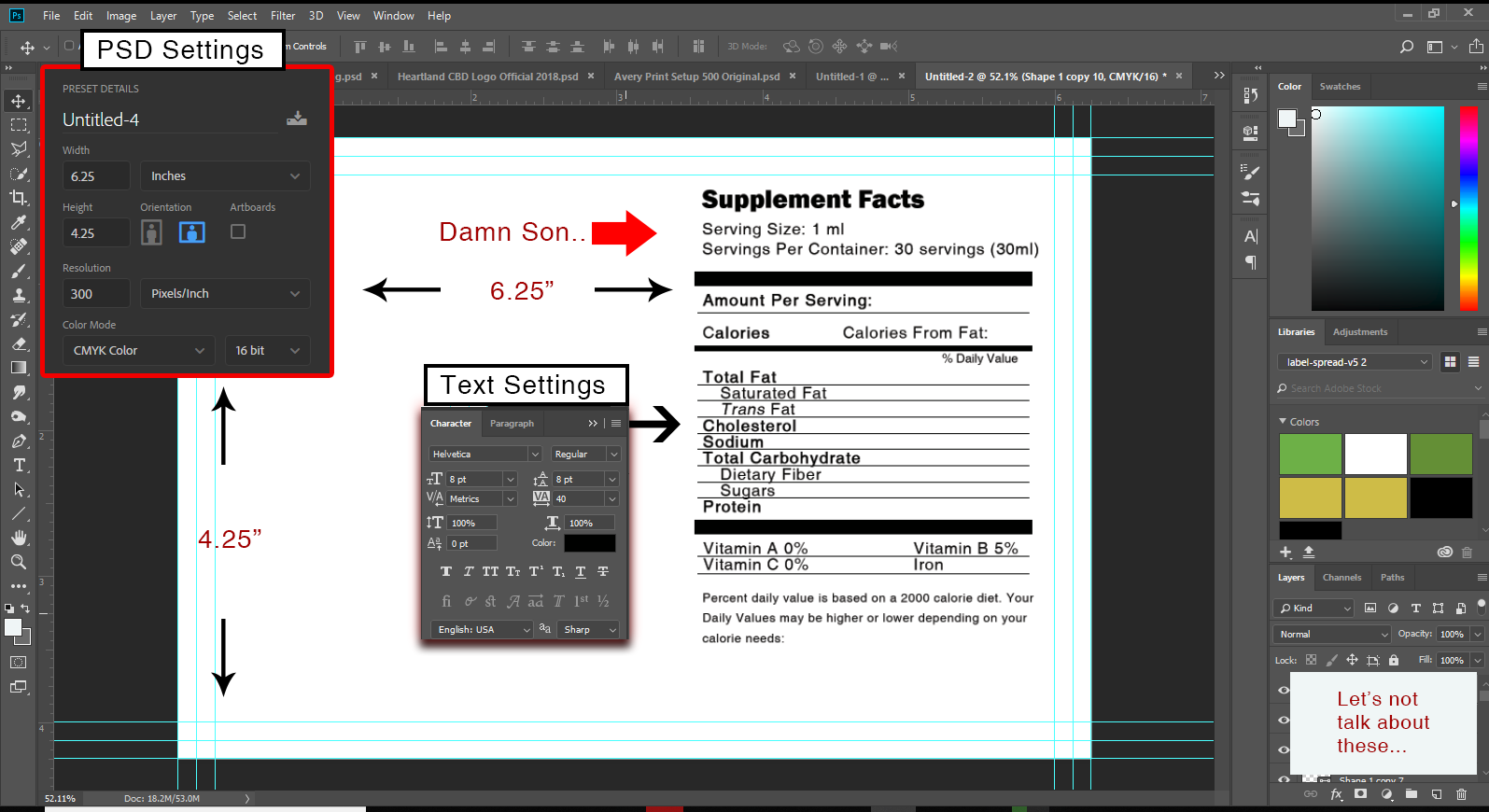
I think there is something up with my photoshop settings, these point measurements do not look anything like what is presented.. I wonder if my document settings are messing me up?
I am using (now because of request) 6.25 x 4.25 CMYK 16 bit 300 ppi
But on my screen, when I put this together, it takes up a huge chunk of room and the pts don’t really add up either… I wonder… what is happening.. to my life right now..
You’re building your label and adding this kind of type in Photoshop? If so, you need to rebuild it in a more appropriate layout application. Photoshop it completely wrong for this kind of thing.
I’m all ears on suggestions. This side of things is very new to me and I am self taught. Never went to school for these things.