You need to use Illustrator or InDesign (or their equivalents) and import/place the photo into the layout.
Photoshop is a raster application where everything is composed of pixels. You need to build it in a vector application that will export at the highest dpi settings of the output device RIP. Small typography, for example, requires a far higher output resolution than that of a photograph (which is, as the name implies, what Photoshop is made for).
Got ya, thank you so much for that clarification. I will move over immediately to Illustrator. I thought that because printing vendors would submit for both illustrator and photoshop, either format would work. I guess they do, but for regulations, not so much and not so well for labels.
Printers will take most anything you give them (to a point) since they don’t want to turn down paying jobs. A Photoshop-built layout, however, is rarely the best way to build something that will be printed. There are exceptions, but there aren’t many of them.
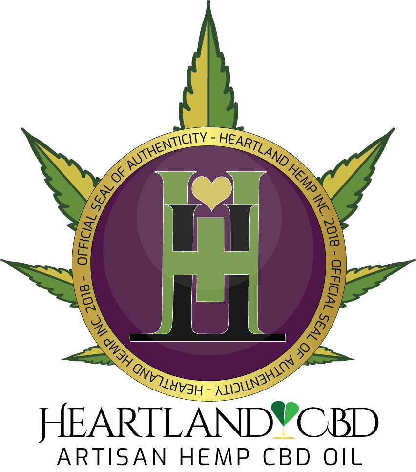
You are missing your target market, which is primarily female and under 30 I would venture to guess. The concepts are very masculine and weight lifting appealing. And a bit frightening. Is the H a logo you have use? It looks very much like marijuana even though it’s not, that is is somewhat ironic since marijuana looking artwork automatically brings munchies to mind. Look at the competition and see what they are using, then go a step beyond and make it better. It needs to look a lot friendlier. The dog doesn’t work either. Do some quick research on your competitors, other appetite suppressants, not primarily hemp oil.