Hey guys!
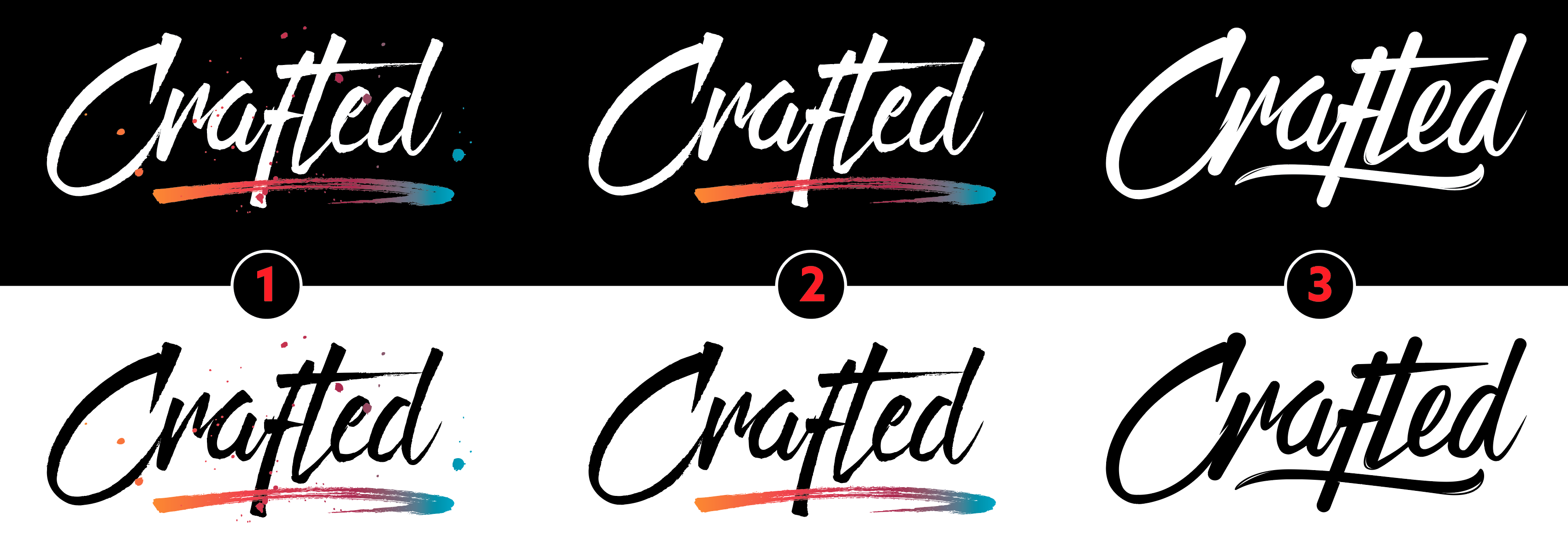
Working on a script logo for a creative agency called “Crafted Design Group”; it was created to give a personal/artistic touch to the logo to give the impression to their clients the vibe that things are designed from the ground up, or crafted if you will, hence the rough edges and the paint!
These are the final 3 here that Ive narrowed down. I’m pretty partial to number 1, as are others that I have shown this too; would be curious to know your professional opinion if anything could be changed, mixed up, added, removed, etc. Thank you!
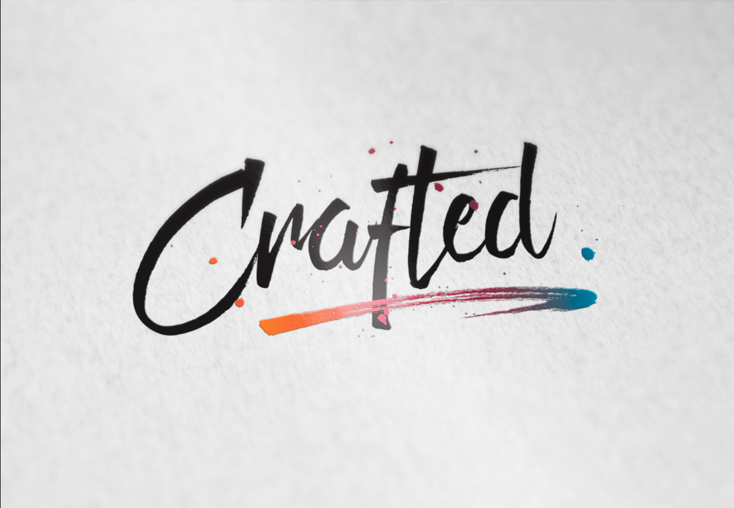
Number 1 is interesting with little splashes of paint. However, they’ll likely cause problems going forward when the logo needs to be simplified for various reasons. I’m afraid that even though I like them, they push things just one step too far, so my vote’s tentatively with number 2.
1 Like
Or use both 1 and 2
1 when printed or online, and a version of #2 should you need something without the messy spatter (random paint spatters in my industry = messy.)
The gradient and interaction of the swoosh with the lettering may be slightly problematic.
You can’t really do gradients in embroidery or silk screen (though you can direct print items with a gradient.) It’s also a 4-color logo, so you are paying for 4 screens in any conventional press process. You also may have inconsistent results in the blend areas depending on the profiling of the machine/media/inks being used to print.
The brush effect would have to be solidified if you wanted to do it in any kind of 3D process like wall signage lettering or even simple cut vinyl lettering. And if you wanted that gradient painted on the elements of the 3D swoosh, the price of your sign just doubled or more. That’s a 4-color paint job with a #1 airbrush artist.
The other thing you might want to do is see what those little tiny bits look like when the logo is 5 feet wide. Usually they are pretty messed up looking, as in all the bezier reverses become obviously apparent
1 Like
idiots like me will read that as craPed which is a good thing!
1 Like
Once words get out that a creative agency needs to hire outside help to do their own logo, what would clients think? GDF is fairly widely read, you know.
1 Like
Whoa, I just reread the OP…
As I initially said, in my part of the industry paint spatters = messy.
You might want to reconsider your “designed from the ground up, or crafted if you will, hence the rough edges and paint!”
I work high end. Everything is pretty much hand built or crafted from the ground up because we do the signage work that the people who use off-the-shelf extrusions can’t do. NOTHING has rough edges and the paint finish is automotive or woodworking perfect. No spatters, no rough edges, no chips, sometimes even no visible fasteners. The quality of a finished look is what matters. And that includes when a client wants something that is intentionally unfinished looking. We can do rough sawn or aged finished looks, but even those are built around rock-solid designs.
While I like the look of the logo, it does represent some end client challenges (as noted above) that a savvy end client is going to recognize – and might not want to deal with. Not all clients looking for design are clueless.
1 Like
Im well aware. This is for a good friend who asked me to create some ideas. It was a tag team effort for his agency, not somebody coming from a ** contest site removed ** or non-design background.