I’m currently in the process of branding my soon to be freelance design business, Point Blank Design. I am having trouble deciding which logo version I like the most and really need a new set of eyes. My heavy sweater is on so let it rip!
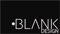
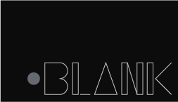
You say you’re having trouble deciding which logo version you like best. Between the two, I prefer the top option for legibility reasons. However, just by looking at the cards, I would not have come up with “point blank.” It reads “blank design” to me.
1 Like
Thank you Steve_O! And yeah I can see the problem with getting point blank from the little circle being their. I have some other versions that have the word Point in them which makes it much more understandable. I’ll throw those up on the forum as well just to see what you guys think.
Just a few ideas that might help:
Think a bit more how the logo looks like ‘‘a shape’’ and its relation with the space around it, I know it sounds vague but what I’m trying to say is to look at it as a shape rather than the words. Strong shapes are easy to remember (Puma, Nike, Apple, Mastercard, etc.)
Also did not figure out “point blank.” so probably the other version mentioned is a good shot.
Overall the first one looks nice but keeps in mind how will it look at particularly small sizes.
Nice job.
1 Like
An excellent point about being aware of the ‘shape’ of the logo.
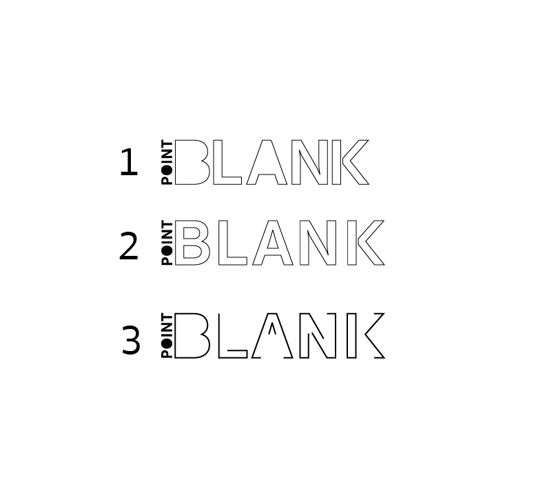
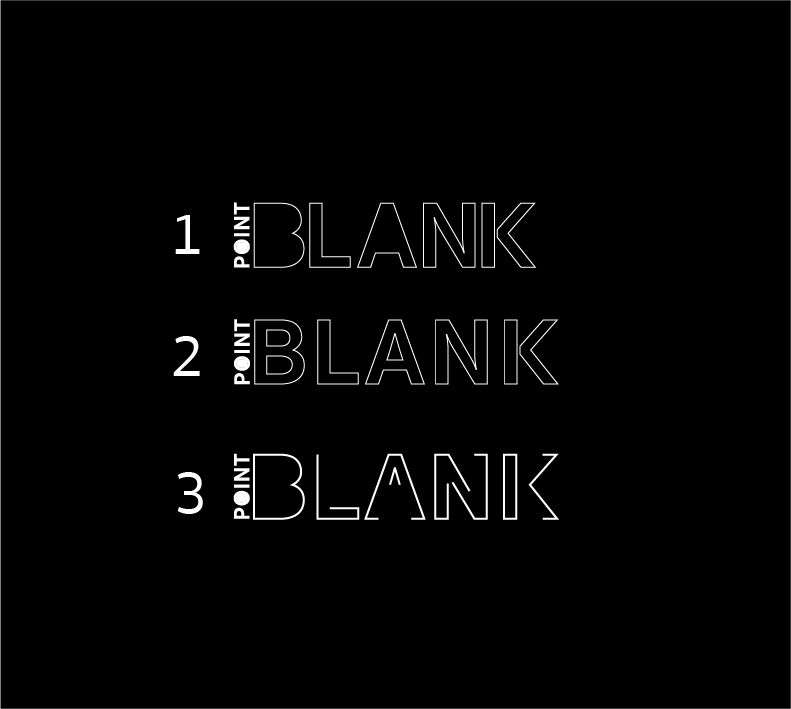
Let’s see those versions with the word “point” in them?
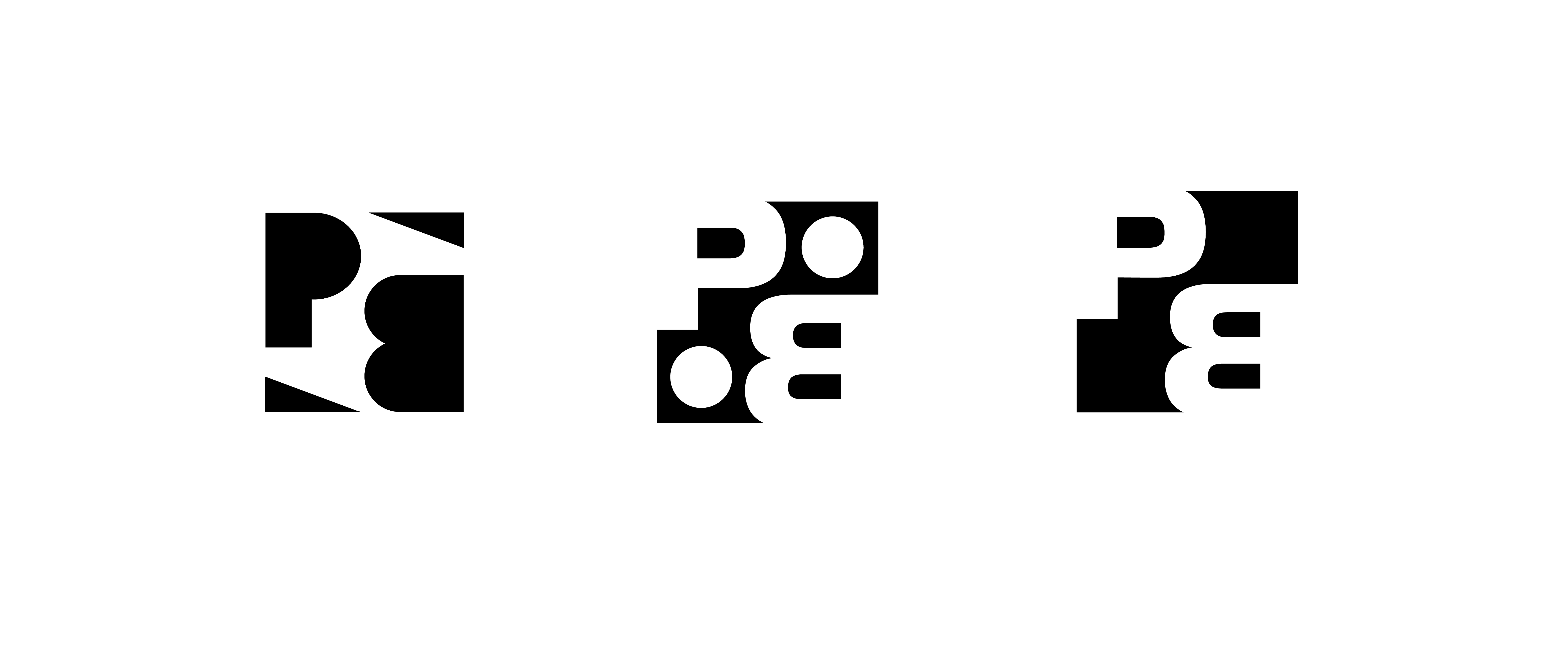
I’ve been experimenting and I have come up with all new versions both white on black and black on white. Let me know what you guys think.
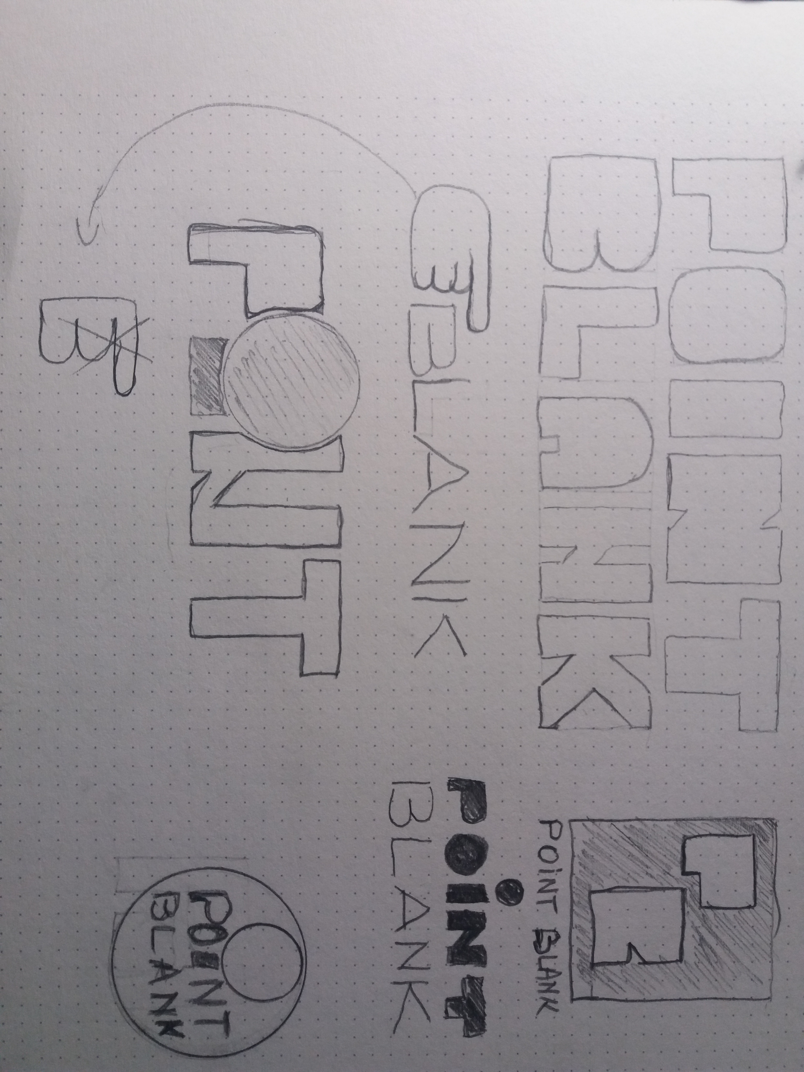
Right now you’re trying to force essentially one concept to work by fiddling on the computer, which is actually hindering the process. You need to go back to sketching and brainstorming.
No, seriously: SKETCH !
Yes, sketch !
1 Like
I agree I didn’t sketch from the beginning ![]()
Really need to get better about that it really makes the process flow better
Yup. Craig’s right. Explore some new ideas. I’ve found that good ideas don’t generally develop from less-than-good ideas no matter how much tweaking one does with them. Good ideas are usually good ideas right from the beginning. They might take some time to come up with, but broadening the search through some sketching is the best way to find them.
1 Like
I couldn’t agree more. I’m going to head back to the drawing board. I didn’t sketch from the beginning and typically when I DO sketch I don’t spend enough time doing it, I almost rush getting to the software.
maybe remove the A
so it’s
bl nk
lol. use a dot, or underscore instead of A, get creative. people tend to remember things better if they complete the design in their “minds eye”.
get inspired
Good idea Nikko. I fiddled around with the minds eye approach a little bit but I’m gonna go back and experiment with it a little more.
I went back to the drawing board and really tried to make the logo into a shape as @amdesigner suggested. Let me know what you guys think of the new versions I have come up with ![]()
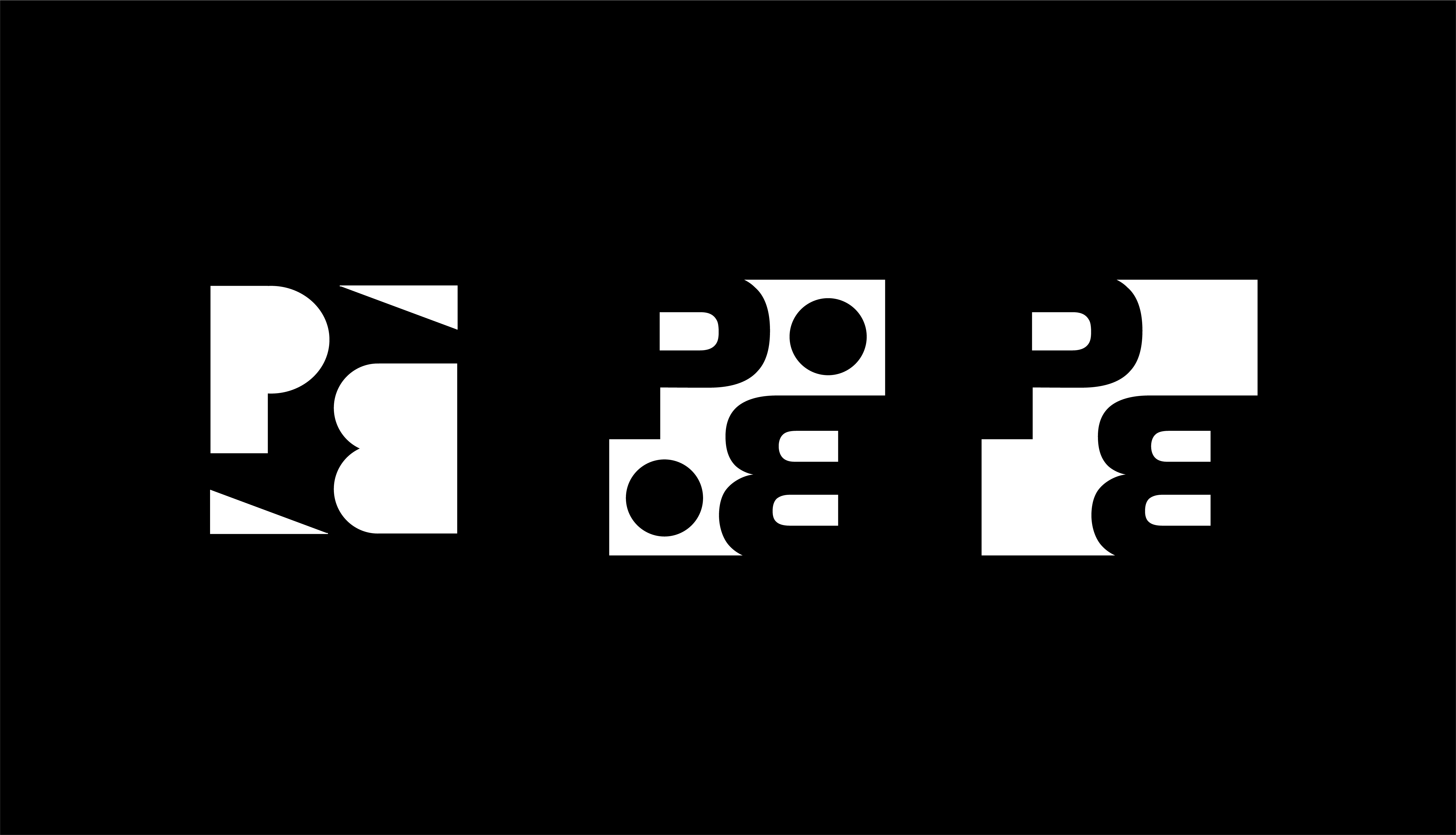
Better but not quite there …sorry (that’s just my opinion)
The ‘‘blank PB’’ variation favourite out of the three.
But they’re all too vague, also there are a couple of things on the market named point blank that already uses PB in a similar way.
Rather than just fiddling with the same elements to find ‘‘the right one’’ I say make a lot of different ones (on paper).
What I suggest is that you go here: https://www.printablepaper.net/category/dot
Print a bunch of grid paper and make about 50 of this without repeating yourself:
And here’s why: The first ideas are the ones everyone thinks about first, things like what @nikko showed are most probably the result of a lot of a serious number of iterations.
I believe that if you draw 50 logos without repeating yourself you will most definitely come up with something very good, just don’t give up at that moment when you will feel like you’ve done everything you could think of.
Hope it helps ![]()
1 Like