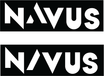
Hello there. This is my very first logo for a school project. This brand is a sportswear brand and its name is Navus. I want it to look energetic, modern and simple, but right now, it looks somewhat generic and not so unique. If you could take a look at my logo and let me know your thoughts, I would really appreciate it.
Thank you so much in advance.
When you mess with letterform stroke widths, you risk making something unpleasing to the eye. Your widths are all over the place in this, the U and S in particular. Clean it up a bit.
Yes, the U is hideous.
Very cool assignment @HarveyD!
First of all, I’m loving the restraint you’re showing designing in black and white and the clean bold geometric lines are slick ![]() I like the “A” in the first one best.
I like the “A” in the first one best.
I’m with @PrintDriver regarding the “U” and “S” - these definitely feel funny to me.
I think it’s a combination of the inconsistent thickness on the U and the fact they they both descend below the baseline:
Hope this helps! ![]()
Hello Harvey,
This is really a Nice Logo.
I like the first one best because the A is more legible.
You have a nice idea that uses the exaggerated angularity of the first three letters to created a sharp, jagged look. Unfortunately, the last two letters don’t match.
If it were me, I’d try just drawing a simple, generic, shorter U, then concentrate on making the S angular and sharp in a way that matches the first three letters.
That’s the best response @pluto Completely agree with you!
Thank you everyone for your critiques. I will try and improve it.
Hi @HarveyD,
It is a really cool attempt. Although, You have already come to know the technical improvements required to make your logo apparently good. I would also like to suggest you to try to resize it and adjust the font size to make it more appealing.


