Please let me know your thoughts on this.
I’m also trying to find a nice font that would work with it for the web site. Do you know of any fonts that have a similar look / feel to this design?
Thanks ahead,
-Line
Please let me know your thoughts on this.
I’m also trying to find a nice font that would work with it for the web site. Do you know of any fonts that have a similar look / feel to this design?
Thanks ahead,
-Line
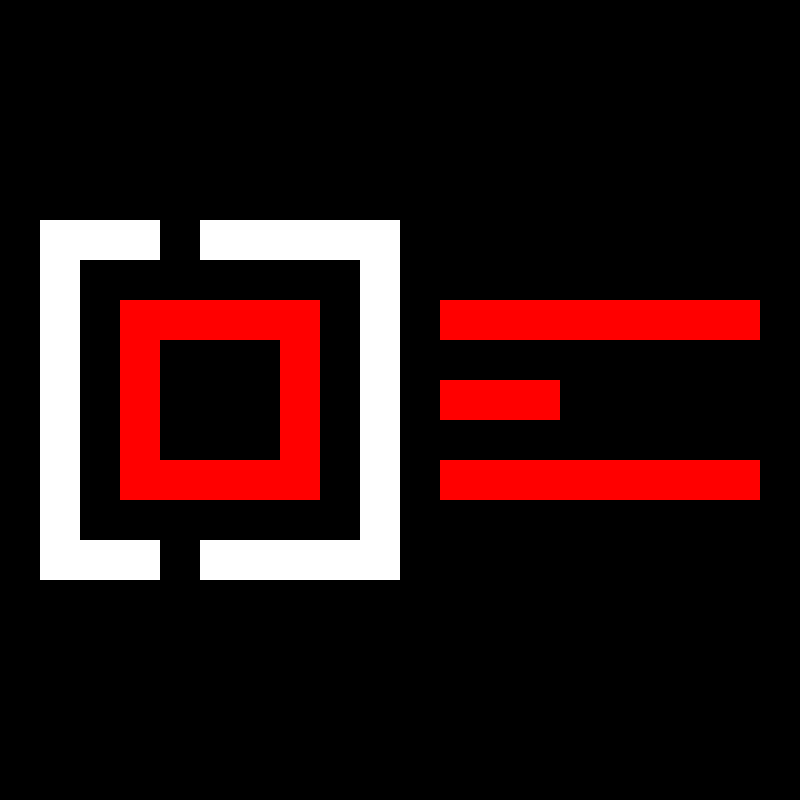
I like the idea and the feel of it, but it feels too much. Maybe you can remove some elements or make it more compact. Can you put the E inside the square?
Also, work on the colors. Black, white, red is a bit too old school and aggressive. Pick a more sophisticated color scheme. Look at these graphics, which are really cool for this subculture.
Hi @iraszl,
Hmmm I like the idea of having the E in the square but what bothers me is that it’s not going to read well C O D E. The color options you gave are neat! I will play with those too.
One back story on this design is that it is also supposed to be a picture of a finger hitting a button or key. If you turn the image -90 degrees, you’ll see what I mean.
Line
OK Guys! I took my logo a step further and animated it..

Impressive design… I like it.
Thanks:D
In my opinion, it looks a little off balanced to me. The left side has a lot more heavy elements in comparison to the right.
The difference in length between the 3 red bars also seems like too much to me. The dead (black) white space after the red center bar looks awkward.
Your logo and team are just wonderful! Wish you good luck, my friend! Sorry for offtop, but, does anyone here play mu online? It’s my favourite game and I would like to play it together with someone! I have found a cool site with the best mu online private servers.
Thanks blackd1,
I don’t know what mu is… actually.. do you mean Marvel Universe? If so, no :\
-Line
Thanks @Trent I think you’re right about the balance. The spelled out version is cool ![]() but i’d like to figure out a way to get the icon version to be weighted properly. Perhaps I need to do something using negative space.
but i’d like to figure out a way to get the icon version to be weighted properly. Perhaps I need to do something using negative space.
Back to trials / testing!
Thanks,
Line
Once I was able to decipher that the logo was in fact made up of letters and spelled something, I really liked it. I also like the animation. I do agree with Trent that the top and bottom E elements are too long and make it look off-balance. I’d cut them down by half, or however much would be needed to make the E a square.
wonderful logo