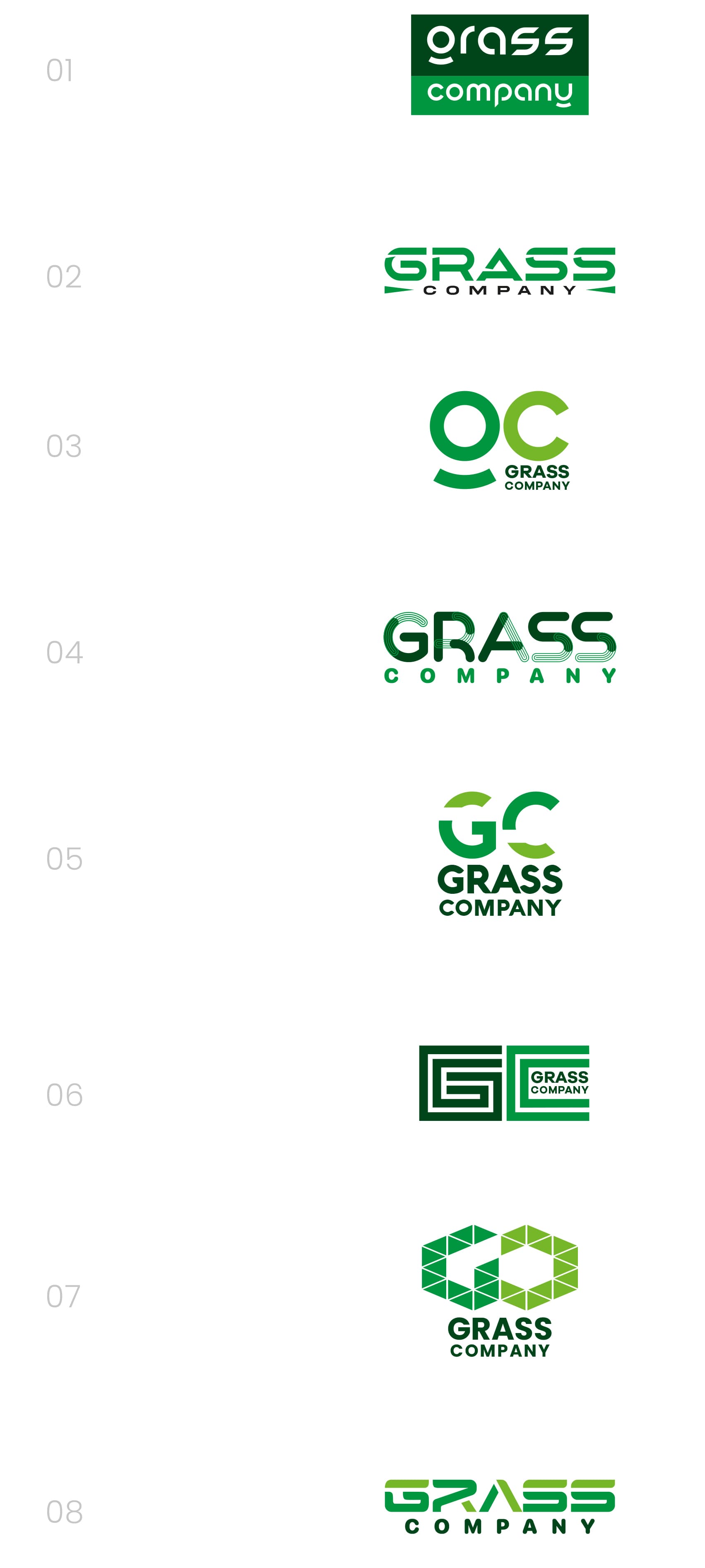
I’ve been tasked with designing a new logo for an online ecommerce website specialising in Artificial Grass. I’d really appreciate it if you could share your opinion or preference on which logo you think works best. Your feedback will be incredibly valuable in helping us make the right choice. Thanks for taking the time to help out!
I this real world or student work?
Proper job and not educational.
Who is the “us” in this ^ sentence?
You’ve presented 8 different logos and very minimal information for a brief. Hard to say. Other than ‘grass is green’ I got nothin’.
Who is buying this stuff? Home owners? Sports venues? Do they have competition? A quick web search gets me all kinds of artificial turf companies and they are 99% green in color. At least you didn’t use blades of grass.
Apologies for the initial vagueness! To clarify, the target audience is everyday online consumers looking to purchase artificial grass (mainly home-owners). While I appreciate your suggestion to avoid cliché grass blade imagery which was the intention originally, I’ve opted for a more nuanced approach. The logo incorporates a subtle “cut effect” applied to the lettering, adding visual depth and a connection to the product without being overly literal.
-
I like this, but I do think the descenders on the “g” and “y” need to be connected to the rest of the letter. At first glance, it did not immediately read “grass.”
-
Nice option.
-
I read “OC.”
-
I’d be concerned some of the details will be lost at small sizes.
-
Not my favorite.
-
Not my favorite.
-
This is nice.
-
This is nice.
Nice work showing more than one option, by the way.
1 Like
What else do you know about your target audience and what are they primarily using your product for?
I like 2 and 8 the best, but the space around A is causing an uneven kerning and density issue in both. I can think of a few adjustments that would solve the problem, but a lengthy explanation would be difficult to write.
Student opinion here, also a potential consumer.
The “g” where the circle and bottom curve are detached from the stem took a while to understand. So in #1, I thought the word began with “ora” and #3 “oc”.
#2 seems the most straightforward, easy to understand, looks professional but also unique.
I see “GO” in #7, but it is a cool design if the second letter could be reworked to look more like a “C”.
#8 is nice! I really like the color choices over #4, which comes across a bit more childlike. Also, the “A” without the cross evokes mountain, outdoor feelings.