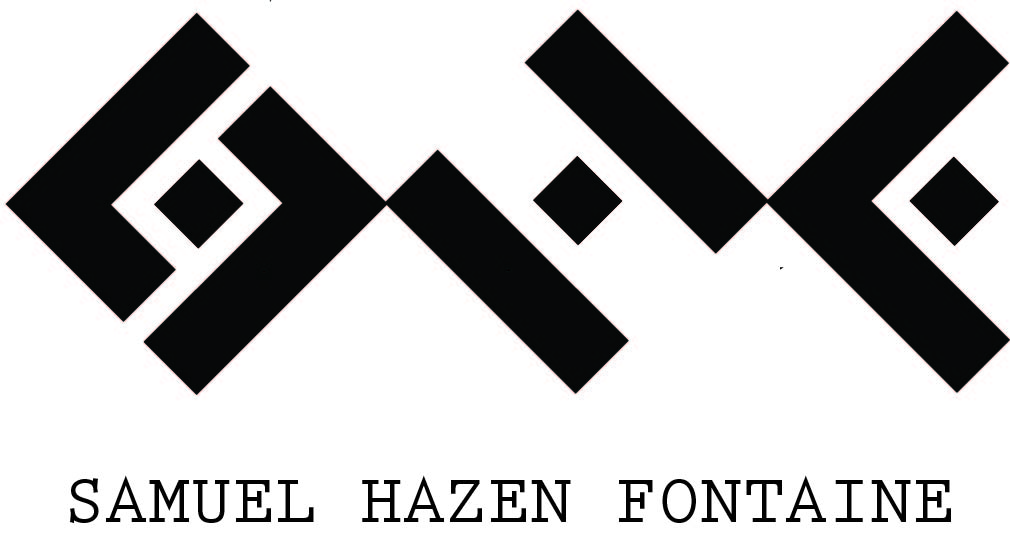
Hi everyone, I’m back with a new redesign for my personal logo. I’m trying to get a more simple geometric look and also have the letters remain a bit vague so the piece can look like a unique design on its own. I’m a graphic designer but also a freelance scifi illustrator so I want this to be an all purpose design.
I’d say it is interesting. Definitely different from what you had previously. It would probably look pretty sharp done on a card in letter press.
My only comment at the moment would be that I feel it should have some white space between the letters, maybe equal to the space around the squares in the middle of each letter. Not sure.
Haha Thanks, with how my original logo looked, there wasn’t much of a direction to go except up. I agree with you and Scribe’s comment about the type, I’m definitely going to look into some geometric style sans serif fonts.
This is a big step in the right direction. As others have said, the type needs work. Also, pay attention to the ratio of the type size to the logo size.