Hello everyone.
I’ve designed a logo for my own business and was wondering if anyone is available to run their critical eye over the attached? I was after a simplistic design that is almost like a stamp.
Regards
Tamara
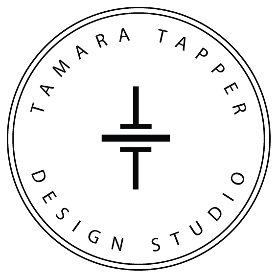
I like the two Ts, but reduce the logo down in size to something that might run on a business card, and the outside lines start blurring together. The type becomes awfully small too.
There’s a lot of leftover space in that logo that you could use to fix the problem I just mentioned.

1 Like
Yes I can see what you’re talking about… that would be hard to see smaller.
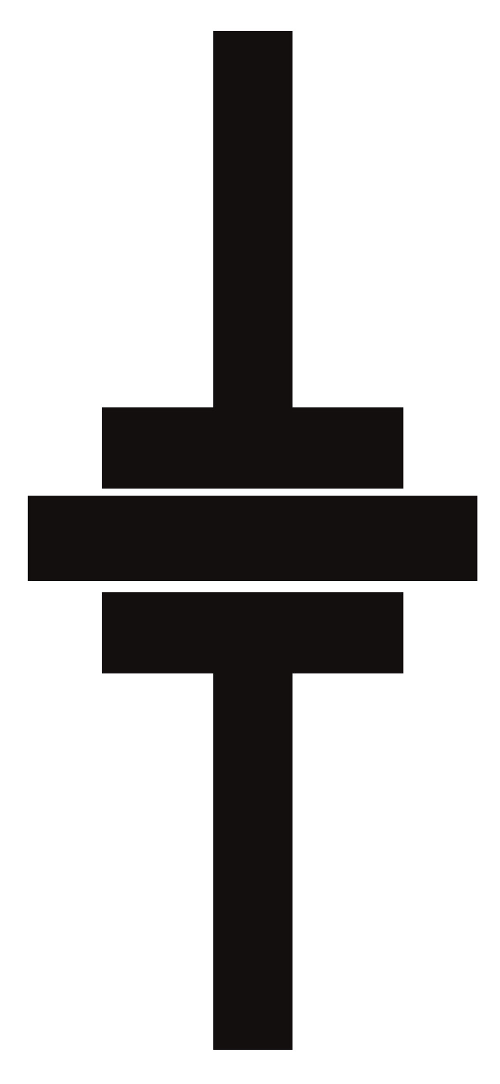
What if I took the wording and the lines away and just had the two T’s as such?
What do you design? Products? Interiors? You haven’t said anything about what your business is.
I often like to start a logo design by fiddling with letters of the name. You can change the fonts and see how they react to each other. I get ideas from doing this.
First make it mean something, then get creative.
1 Like
Hi Dox, I’m just a student doing an assignment for some signage for my own studio. We need a business card and a sign to go on a reception wall. I’m hoping I’ve posted this in the right place.
I like your initial stamp idea very much.
I think you should do what B’s suggested and tweak it so it also works in a smaller size.
Most mashups of initials are just that. Mashups. Not incredibly attractive.
The OP’s initial idea is one of the better ones I’ve seen in a long time. It’s just that the surrounding element execution could be better.
I swear I’m gonna market a vinyl kit that all design students are going to be required to buy. They have to successfully cut and weed their logo at 6" high in order to pass this exercise. Fine lines and skinny typefaces…blech. I hope this trend ends soon.
I agree with B and PD. The design itself is nice. Clean & simple. But B is right, you’re not going to be print this unless it’s pretty large. Although i could see a minimalist approach to a business card with nothing more that the logo (large) and one single line of type beneath, perhaps a URL to your website.
Like B said, you have some space to work with. Expand the two T’s in size perhaps, and enlarge the type so that is fills the entire perimeter, maybe separating the top and bottom lines with two bullets on each side.
You could use a heavier typeface. But i’m not necessarily apposed to ‘light’ fonts. My logo uses a combination of ‘Bold’ and ‘Light’ - but the entire logo in merely type. And i’m not within the confines of a defined space or shape.
I see where you’re going, but you haven’t arrived. As others have said, it won’t work well at small sizes. Also, I get the feeling that you’ve got several disconnected items. There isn’t an overall unity to the design. Did you consider any other designs or is this the first one you came up with?
Spend time brainstorming and sketching – literally sketching. Leave the computer and grab paper and pencil and work on coming up with a bunch of concepts. After that, take your favorites to develop on your computer.
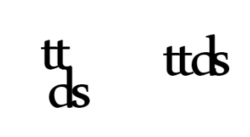
I think there’s probably something with the TT.
Also consider that all of the words in your name have four characters. There might be something there.
I really would suggest you spend some time brainstorming and sketching and then post your sketches for feedback.
I’d have to respectfully point out that “attractive” is subjective.
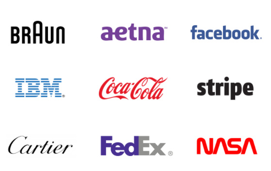
There are many businesses whose logo is a lettermark or workmark, and it seems to work out okay for them. ![]()
So it’s a valid starting point, in my opinion. And it works for me.
Well, you nailed simplicity. but perhaps a bit too simple?
I agree, as others have mentioned, about seeing it in smaller sizes and possibly filling space or using a different typeface. It almost looks like a default type.
Perhaps try filling the space or using different weight lines/text?
not saying to copy these but was looking over some on Dribbble to see what others have done with a “stamp logo”
With the exception of IBM, those are wordmarks. Different animal.
Our old forum crit pit was full of some of the most horrendous monogram mashups on record.
This one isn’t student work, but here is my most favorite example of a really bad mashup.
That is really bad, I agree. ![]()
However, a wordmark, as I learned in school, is a logo category. According to “Graphic Design Solutions” by Robin Landa, a logo is “a unique, identifying symbol.” And these are all logo categories;
Logotype (wordmark)
Lettermark
Symbol (pictorial symbol, letterform symbol)
Character Icon
So with multiple possible approaches, one needs a place to start. Fiddling with wordmarks and lettermarks is, for me, starting points to the brainstorming process.
That’s all I’m sayin’. ![]()
It looks like a schematic symbol of an electrical component like a capacitor. At a glance, I would guess that symbol was for a B2B tech company that specializes in engineering.
It doesn’t work without the circle. Sharp corners in logos are eye snags. The eye should be able to flow around a logo smoothly.
More like a cram-up.
" 'eyy, let me use all’da letta’s and put’em ina cuycle" … Quote from an unknown Jersey artist.
And Wiki’s definition of a wordmark is (my bold)
A wordmark, word mark, or logotype is usually a distinct text-only typographic treatment of the name of a company, institution, or product name used for purposes of identification and branding.
A lettermark, on the other hand is a monogram or a mark that relies on initials rather than words.
Hmmm… Wiki, textbook, wiki, text book…
I think we’re basically saying the same thing. ![]()
Merriam-Webster does not recognize Wordmark as a word at all.
Just like the internet, even with textbooks I’d consider consulting multiple sources.
https://conversations.marketing-partners.com/2013/03/logo-design-101-the-wordmark/
https://brand.uconn.edu/standards/wordmark-and-logos/primary-wordmark/
http://www.printmag.com/branding/when-to-wordmark-2/
https://www.macmillandictionary.com/us/buzzword/entries/wordmark.html
And the most definitive source of all (LOL, but at least it gets the point across.)
https://99designs.com/blog/tips/types-of-logos/
Maybe some of the other oldsters will jump in here but the convention has always been a wordmark being the full name written out with no other bug. A Lettermark is a monogram such as we are dealing with in this thread. It’s like calling a typeface a font. The intent may be there, but the terminology is still wrong.
I work at one of those fancy-pants brand places - in our shop a wordmark is the name in type with no symbol or bug.
1 Like
This probably falls into the category of professional jargon that isn’t all that well-defined.
For me, wordmark is a more recent term that means about the same thing a logotype, which is in most dictionaries and isn’t flagged by my spellchecker. I’ve never heard the term lettermark, but it seems a natural extension of the logic behind wordmark.