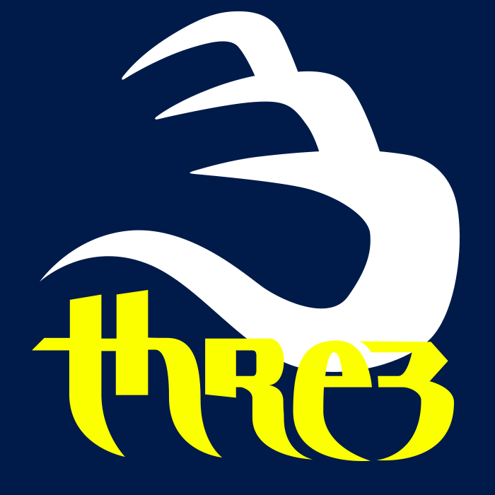
I was working on this logo for “Three” for a while but I finally found the version that I liked. THe idea came from looking at the number three. If you look at the number, there are 3 spots that add up to three, the stems. Well I was like why not make it 3 spaces instead. Tell me what you think.

Interesting, but reads “threb” or perhaps “thred”
If you stick with this concept, you might have to settle for readability in favor of double-tag trickery—that is, two actual E’s.
1 Like
i was wondering about that too. THanks for the insight