Hello, these are new pre-service graphics I created. I know both are very simple but figured i’d see if there was anything that should/could be adjusted. Trying to get better so I figured I’d share even if it seems silly.
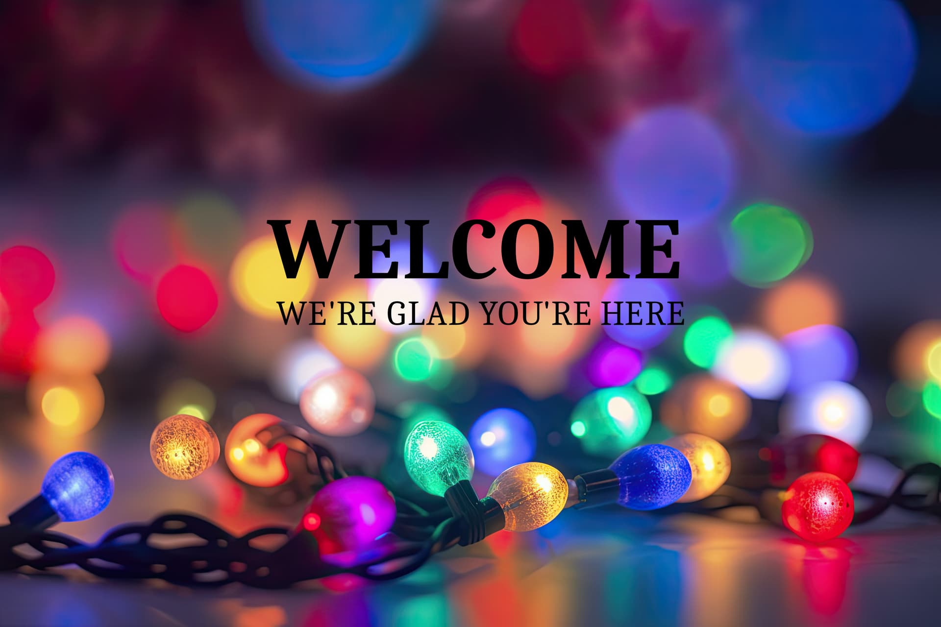
The one with the holiday lights was a free background from a website that provides free graphic still photos for churches. No text on it originally. I added text to it, so it’s not like I created that just took what they offered for free and tweaked it to suit our needs. I did try the text in white and it was too hard to read. Especially with it being so far away since this is projected onto a white brick wall.
I do test the look of these out on a 50in TV to get an idea of how it would look.
If it had been me, I would have darkened the area behind the words a little using Photoshop’s burn tool. This would have enabled me to use white type instead of black. I might even have augmented that with a transparent drop shadow to subtly darken the areas around the letters a little more.
I would also have used a different and heavier typeface to improve contrast with the background and made the type larger to better fill the space and improve legibility. In addition, I would have used lowercase type, which usually comes across as softer and more friendly than all caps.
Cloning in another colored light to replace the white light that’s behind the type would also help — again, to improve legibility and contrast.
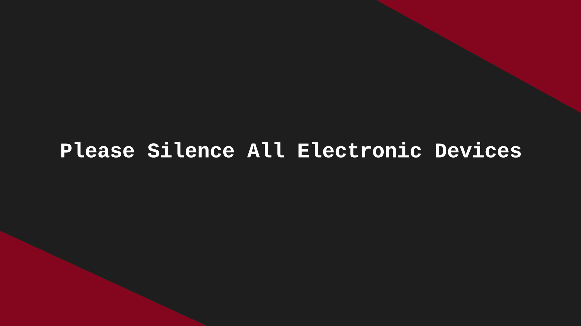
I don’t have a strong opinion on the bottom one because it’s so simple.