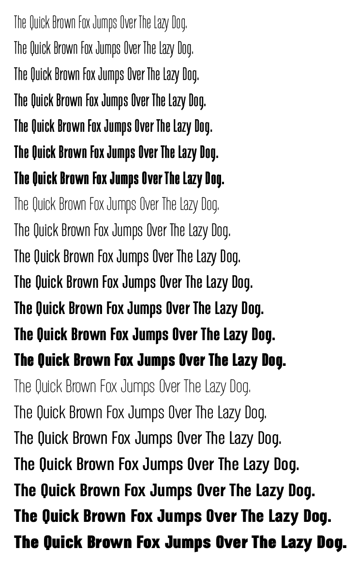
Chrsgrbr asked for comments on a nice-looking typeface he’s designing, so I thought I’d do the same with one I’ve been working on in my off hours.
I’ve intentionally designed it to be a rather generic, industrial-looking, workhorse typeface for use mainly at display sizes.
It’s a 42-font family consisting of three sets that correspond to varying widths including italics (not shown). I’m also planning on releasing it as two variable font files (upright & italic) which will interpolate all the intermediate widths and weights to whatever the user would like them to be on both web and print for those apps and browsers that support variable fonts.
Anyway, I’m still working on fine-tuning, kerning, hinting and the italics, which always seem to take longer than the uprights.
Click to enlarge, obviously. Any comments, criticisms, suggestions, etc.?
Nitpicking and a fresh perspective are good since that’s I’m looking for at this stage
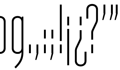
The thinnest versions get awfully mechanical since they’re so condensed and the stroke thicknesses are nearly identical, which impairs their legibility some. I’m hoping at larger sizes, like below, the smaller glyphs, like punctuation marks, will be more legible. Maybe I could avoid tapering the tails on the commas on the thinner weights and making them a bit longer and more angled.
I was concerned about the Q and the J since they’re a bit different from the other glyphs. It’s interesting that you identified both of the outliers, but I’m glad that you thought they were OK as is.
Yes, about the p, and it’s the same with every letter with descenders and ascenders. All aspects of the intermediate weights and widths gradually transform from the lightest to heaviest and from thinnest to widest, along with any idiosyncrasies they might have. The italics do the same, but they’re still under construction.
I think round dots would work well for precisely the reason you mentioned, but they’re problematic on the thin typefaces. Since they would be round, they would tend to not carry enough visual weight unless they were made much wider than the strokes. They worked just fine, though, for anything above the light weights. I made that decision about round vs. square earlier on in the sketching phase of the design. You’ve got me thinking about it, though. I just might play around with it on the actual compiled typeface to see how it works.
A typeface with quirky features, I’ve found, can be a double-edged sword sales-wise. I think you’re right about people being drawn to typefaces with personality, but when those personalities and idiosyncrasies are strong, the applicability of the typeface is narrowed down to those instance where those personality traits complement the layout and hand.
For me, it ends up being something of a measured and deliberate compromise, I think, between style, personality and practical usefulness. There are lots of typefaces that I really love, but I rarely get the opportunity to use them since they’re rarely the right ones for the job. Instead, my go-to faces tend to be those with more subtle and adaptable personalities.
For me, my goal is to sell them, and my somewhat neutral and broadly useful faces have always outsold the others by at least a ten to one. Others might have had a different experience. Free fonts and things designed just for fun are another matter.
Very nice work, I enjoy the first two weight sections. The third section may have too much horizontal stress? It just seems wider than the others. If so, Id almost like that one group to have its counters slightly wider aswell, which i believe is mostly revealed in the bolder letters.
I know you’re going for the generic, thin, industrial looking type. (the light weights work better imo) However on my 4k monitor, and my eyes (i wear glasses) sometimes the letters blend too well into…well black. There also may need to be slight adjustments with kerning: (D & O compared to the G) and (Q & U) compared with the (C & K). stuff you said you’re still working on
This is just me being slightly nitpicky, ive never designed a typeface,