Hi everyone,
Looking for some feedback on some social media graphics. I am announcing a new website that I have built and I designed these graphics (one for instagram, one for facebook). I intend on using these for all my sites from this point on. Interested in some feedback on the design and the heading. I am thinking that I may change up the heading. Let me know what you think!
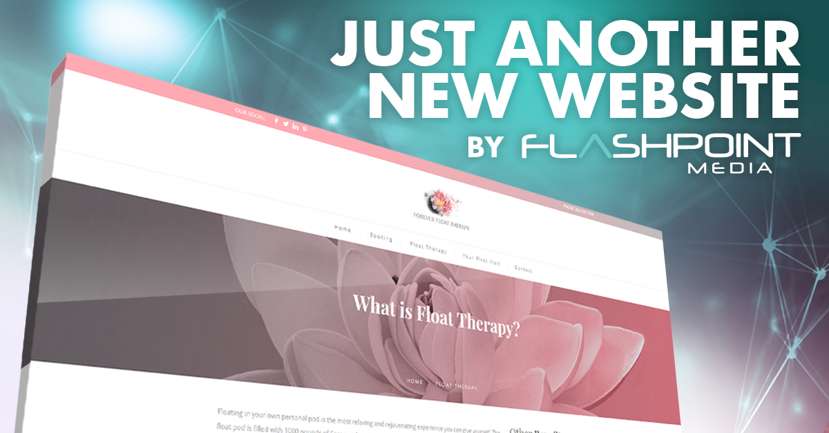
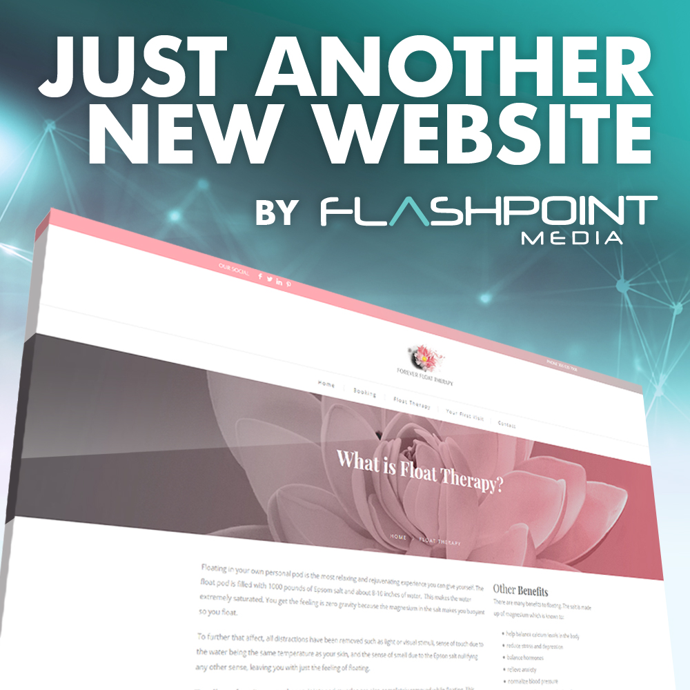
The headline is a little strange to me. “Just another new website” makes me not really interested in wanting to view your site.
This kind of looks like an ad for a website builder like wix or something.
1 Like
Interesting. What would you use for a better headline?
what type of site are your promoting? I don’t think its inherently clear from your post. Also you mention you have multiple sites, I think you need to figure out what makes each site special because “just another website” doesn’t have a good connotation.
Yes that is true, it does not have a good connotation. I build all types of sites so I should tailor the headline to promote each site / business.
1 Like
Changing the headline to provide more information on the page is a good idea in my book!
And how about the visual, what needs to be done so it doesn’t look like a Wesbite Builder?
I personally would like to see the background be of less importance than the web site screenshot. I believe there’s not enough contrast between the two. Perhaps having a flat / darker background would work.
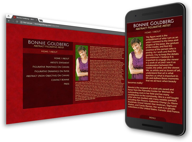
If it’s a responsive site, I would have a screenshot of the mobile and the desktop to show the difference.
Here’s how i displayed a site in my own portfolio. You get to see the web browser in the screenshot as well to know what it’s being displayed from.
I would modify the text to say “Here’s a New Site We Designed” -Flashpoint Media (logo). The actual text in your social media post could also be more descriptive of the type of site you created including the link to it.
-Line
Along these same lines, I might be initially attracted to the imagery because of the looks. But my interest would fade rapidly because I’d have little idea what they’re for, what they’re promoting or what their purpose might be. I don’t know what you mean by placing them on all your (social media) sites. I don’t understand the context, where they would appear on those sites or what they’re about.
Like I mentioned, I like the looks. The colors are interesting. The graphics are attractive, and the headline really jumps out. Unfortunately, it all adds up to me as eye-catching imagery that doesn’t say anything I understand. Maybe if I saw them on those sites, it would all make sense.
It’s really important that visitors can immediately understand what a website is about. You’ve got mere seconds to tell them, or else they’re gone, looking elsewhere for what they need or want.
So my opinion is, don’t try to be mysterious or interesting or different. Visitors aren’t there for puzzles. Describe, in the top real estate, what you provide. If they’re looking for that, they can stay, and if they aren’t, they can go.